62% NPS
Writing feature
Validated active beginner practice in testing.
01 Case Study
Designing an AI-powered language learning experience around confidence, motivation and retention.

As Founding Product Designer, I owned the product experience end to end—from customer research and product strategy through UX, interaction design, visual design, testing, analytics and delivery.
02 Product challenge
Kaizen used conversational AI to help people practise speaking with digital tutors. The challenge was not simply to create a chat interface. We needed to make unfamiliar technology feel human, provide enough structure for complete beginners and build habits strong enough to support both learning outcomes and a sustainable subscription product.
03 Product-level strategy
Rather than concentrating only on advanced content, the product focused on beginners who needed confidence and structure first.
I tested photography, illustration and hybrid routes, then adapted the strongest evidence to an early-stage budget.
Conversation became a structured learning environment with progressive support, recovery and measurable iteration.
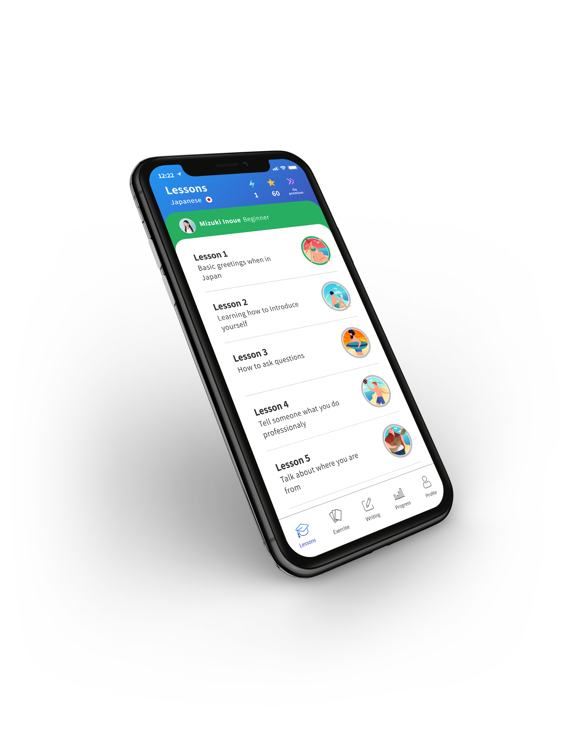
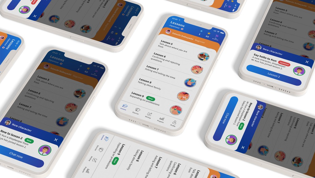
Hiragana and katakana practice gave novice learners a stronger foundation before harder lesson progression.
Practice, shipped streak mechanics and progress feedback helped learners return. Recovery concepts such as freezes were explored for a later phase.
Free-access limits, paywall hierarchy and pricing emphasis were tested against customer value and business sustainability.
04 Combined impact
Across three years, the strongest gains came from connecting learning behaviour, product confidence and commercial experimentation rather than treating them as separate activities.
05 Explore work
Six feature stories cover the major product areas I shaped as founding designer. Each page goes deeper into the problem, evidence, design decisions and outcomes.
 01
01I explored four contrasting art directions and tested how photography, illustration and hybrid approaches affected trust in an unfamiliar AI product.
An evidence-led recommendation adapted to early-stage budget constraints.
Read feature story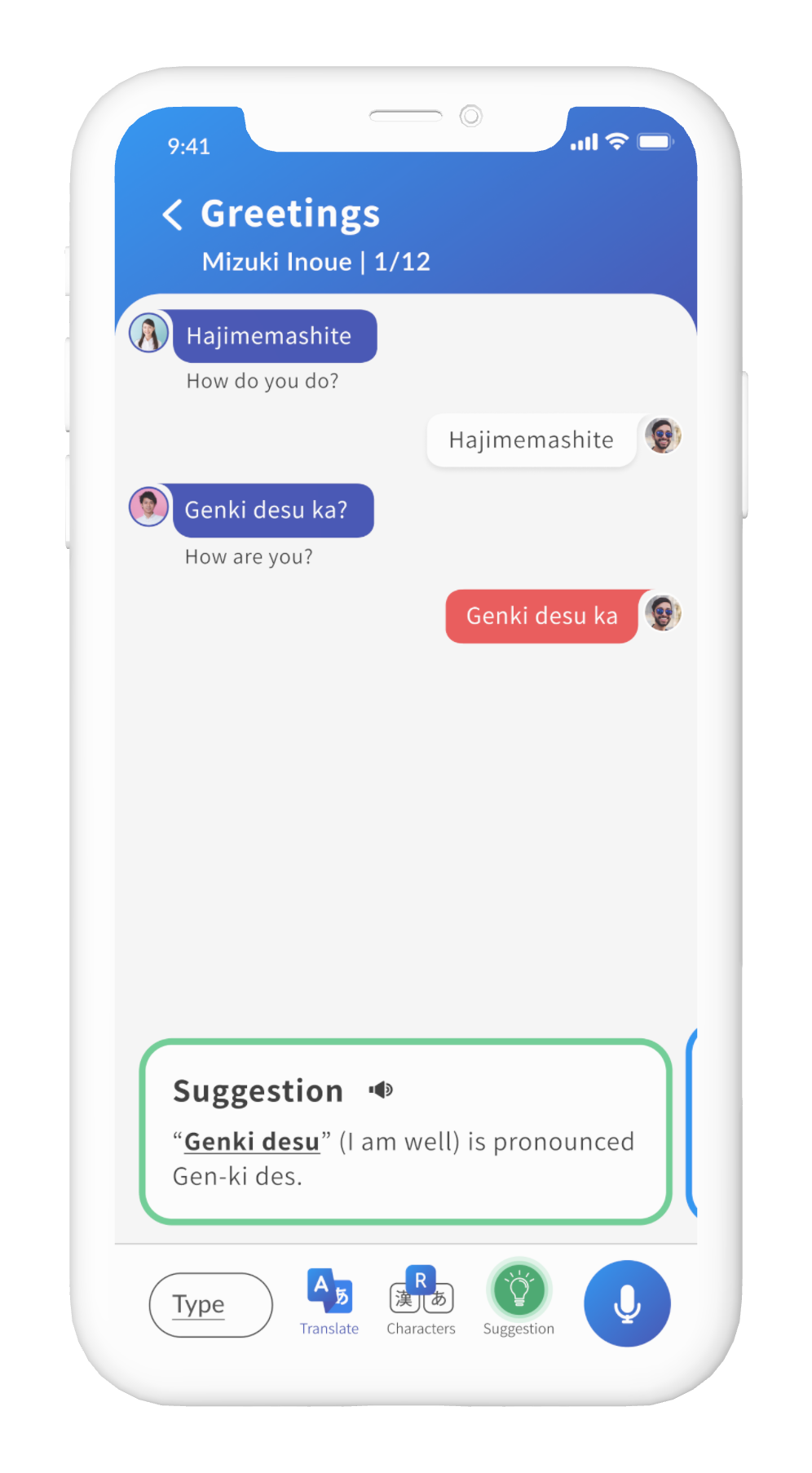 02
02I developed the core AI conversation model, then iterated the lesson experience using observed frustration, funnel behaviour and repeated product versions.
Lesson completions increased by 25% after introducing Suggestions.
Read feature story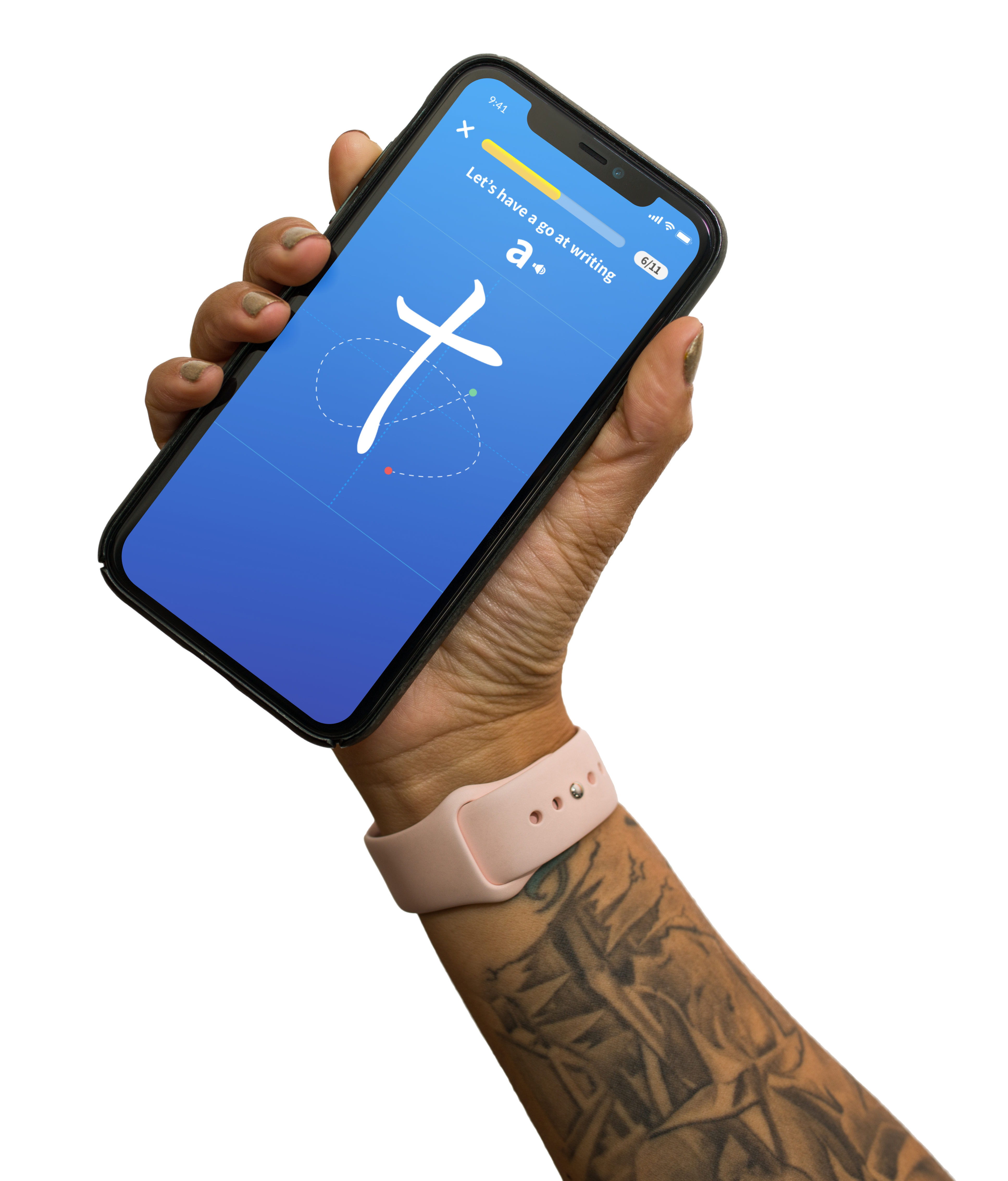 03
03I challenged the proposed advanced-content roadmap and designed a progressive system for learning hiragana and katakana.
Created a clearer progression route for the product’s novice audience.
Read feature story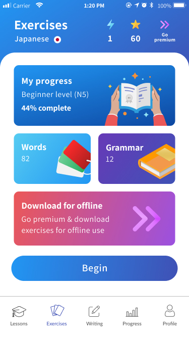 04
04I designed practice tools that helped learners revisit vocabulary, recognise weak areas and continue learning outside structured lessons.
Connected lessons, revision and confidence-building into one learning system.
Read feature story 05
05I introduced shipped streak and reward mechanics to encourage regular learning, while exploring recovery concepts for a future phase.
Retention increased by 35%, with 40% day-one and 22% week-one retention.
Read feature story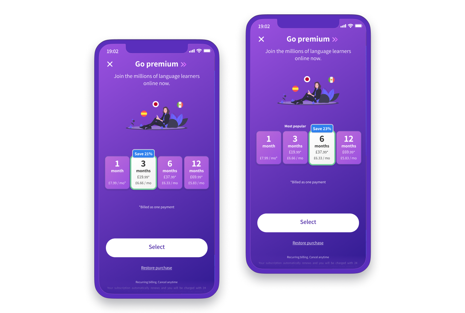 06
06I tested free-access limits, subscription hierarchy and pricing emphasis to balance customer value with business sustainability.
Approximately 13% relative conversion uplift and more than 20% growth in six-month-plan selection.
Read feature story06 Reflection
Kaizen required me to move continuously between product strategy, detailed interaction design, learning behaviour and commercial decisions. The strongest outcomes came from treating those areas as one connected system rather than separate design activities.