
01 of 06 · Product direction
Defining how an AI tutor should feel.
I explored four contrasting art directions and tested how photography, illustration and hybrid approaches affected trust in an unfamiliar AI product.
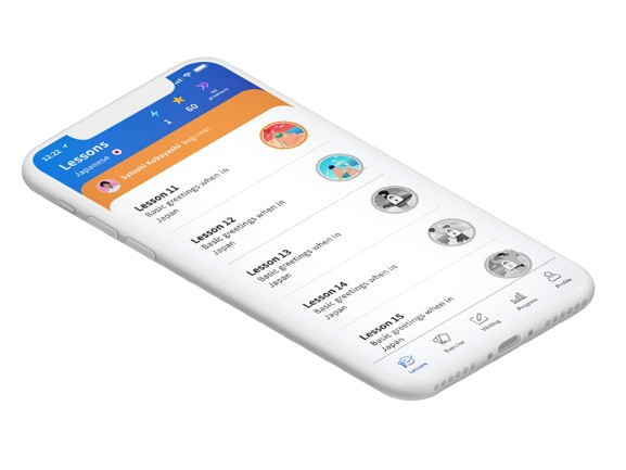
At a glance
- Problem
- Conversational AI was unfamiliar, and the product needed to feel trustworthy, approachable and human before the first lesson began.
- Key insight
- Learners responded most strongly to photography because real people made the experience feel more authentic and tutor-like.
- Decision
- Retain the warmth learners valued, but translate it into a scalable illustration system the startup could afford to maintain.
- Result
- A distinctive visual direction that balanced customer trust, product personality and early-stage production constraints.
01 Context
Building trust in an unfamiliar AI experience.
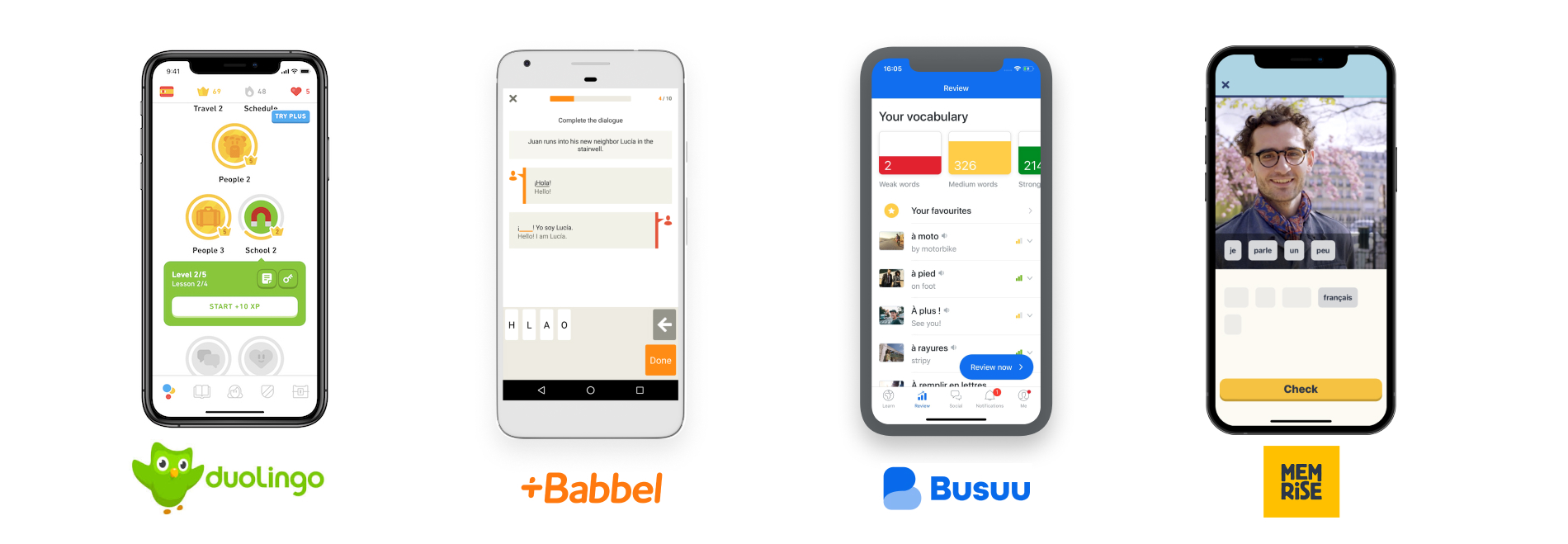
Before designing the core lesson experience, I reviewed established language-learning products to understand their onboarding, learning flows, visual conventions and how they introduced learners to a new language.
None of the products offered the same AI conversation experience as Kaizen. Competitor analysis gave me useful reference points, but it could not provide the final answer. I needed to explore what would make our product feel credible, approachable and distinct.
02 Competitor analysis
Useful conventions, but not the answer
I reviewed onboarding, lesson structures, visual tone, tutor representation and learning progression across established language-learning products. They offered useful patterns for introducing a new language, but none answered how an AI tutor should appear before conversational AI was widely understood. The visual direction had to build credibility for technology learners had not yet experienced.
03 Exploration
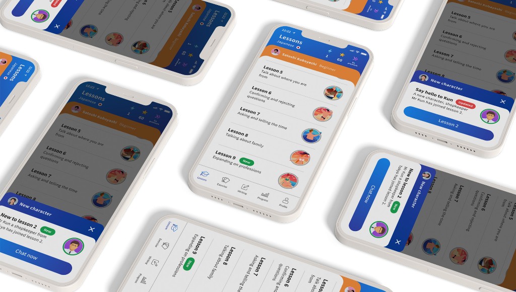
Four contrasting routes.
04 Testing
What learners responded to
I tested the four directions through guerrilla research with people interested in learning Japanese, the first language we planned to launch.
The photography-led direction received the strongest response. Participants felt that seeing real people made the experience feel more authentic and reinforced the impression that they would be learning with a genuine tutor rather than interacting with an abstract piece of technology.
This was particularly important because conversational AI was still unfamiliar. Photography helped humanise the proposition and build trust before the first lesson had started.
05 Final direction
Adapting the evidence to an early-stage budget
I recommended the photography-led direction to the founders, but as an early-stage company, Kaizen did not have the budget required to produce and maintain a scalable photography library.
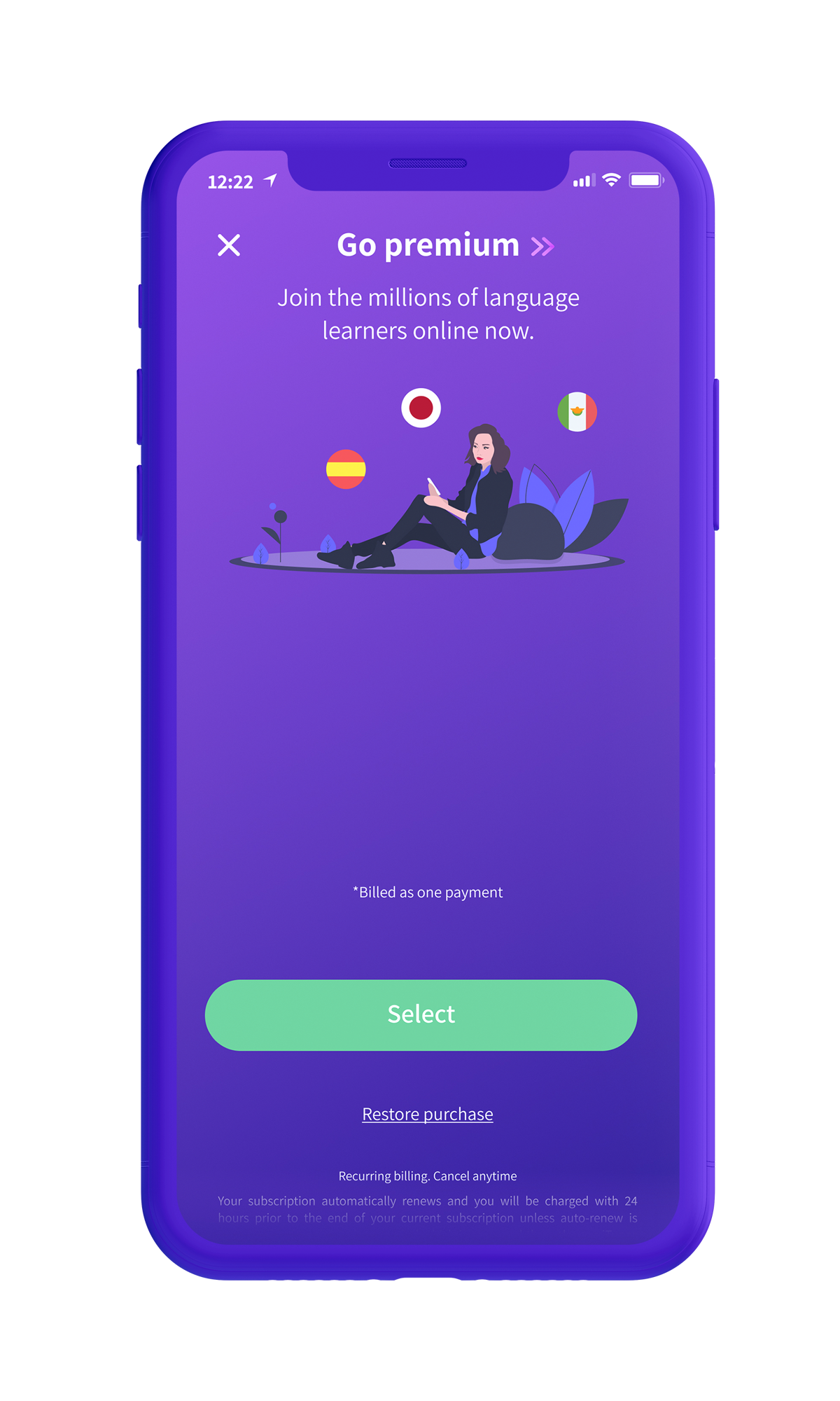
The team selected one of the illustration-led routes instead. I created the illustration system from scratch and adapted it to retain as much warmth, personality and human connection as possible while remaining affordable and scalable.
Decision and trade-off
- Alternative
- Photography-led direction — strongest learner preference in testing.
- Chosen direction
- Scalable illustration system retaining warmth and human connection.
- Evidence or constraint
- Unsustainable production cost for an early-stage startup.
- Consequence
- A distinctive visual identity the business could maintain while preserving approachability.
06 Results and learning
Trust before the first lesson.
Photography received the strongest response in testing, but the startup could not sustain that production model at scale.
The illustration system retained warmth and human connection within a direction the business could maintain — evidence-led design adapted to real constraints.
Establishing a trustworthy visual identity helped learners approach the product. The next challenge was making the AI conversation itself feel clear, supportive and recoverable.
Continue to AI conversation lessons