
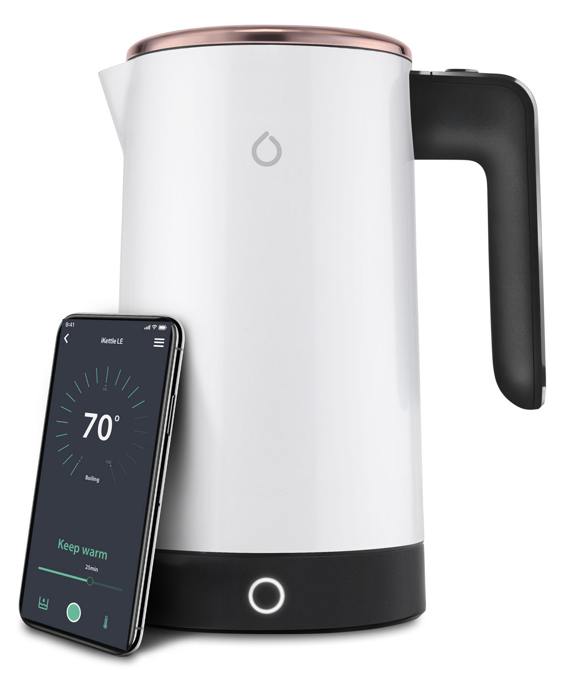
iKettle
- Remote boiling
- Temperature selection between 20°C and 100°C
- Wake Up and Home modes
- Formula mode
- Water-level information
- Keep-warm controls
01 Smarter · Connected kitchen ecosystem
Smarter brought the iKettle, Smarter Coffee and FridgeCam into a single mobile ecosystem. Customers could connect each product to their home network, complete its setup and control it remotely, but every appliance had different physical behaviours, controls and potential points of failure.

Over 16 months, I led the UX and UI design across the Smarter mobile ecosystem, covering connected-product onboarding, device pairing, product controls and the wider FridgeCam inventory experience. I worked directly with the physical products to ensure the app guidance reflected what customers needed to do with the hardware.
02 Project overview
Customers experienced Smarter as one connected ecosystem, but the products beneath it behaved very differently.
The iKettle involved temperature, boiling and scheduling. Smarter Coffee introduced brew strength, grind, quantity and preparation choices. FridgeCam combined physical installation, image capture, inventory, expiry dates and shopping-list management.
The challenge was not simply designing three sets of screens. It was deciding what should remain consistent across the ecosystem and what needed to adapt to the physical product.
Product capabilities at the time
03 The system challenge
The app sat between the customer, their phone, the home network, a cloud service and a physical appliance. FridgeCam also introduced the fridge environment, camera placement, product recognition and external grocery services.
A failure anywhere in that chain could make the entire product appear broken.
How might we make three very different connected products feel like one reliable ecosystem, while giving each product the instructions and controls it required?
04 Mapping the ecosystem
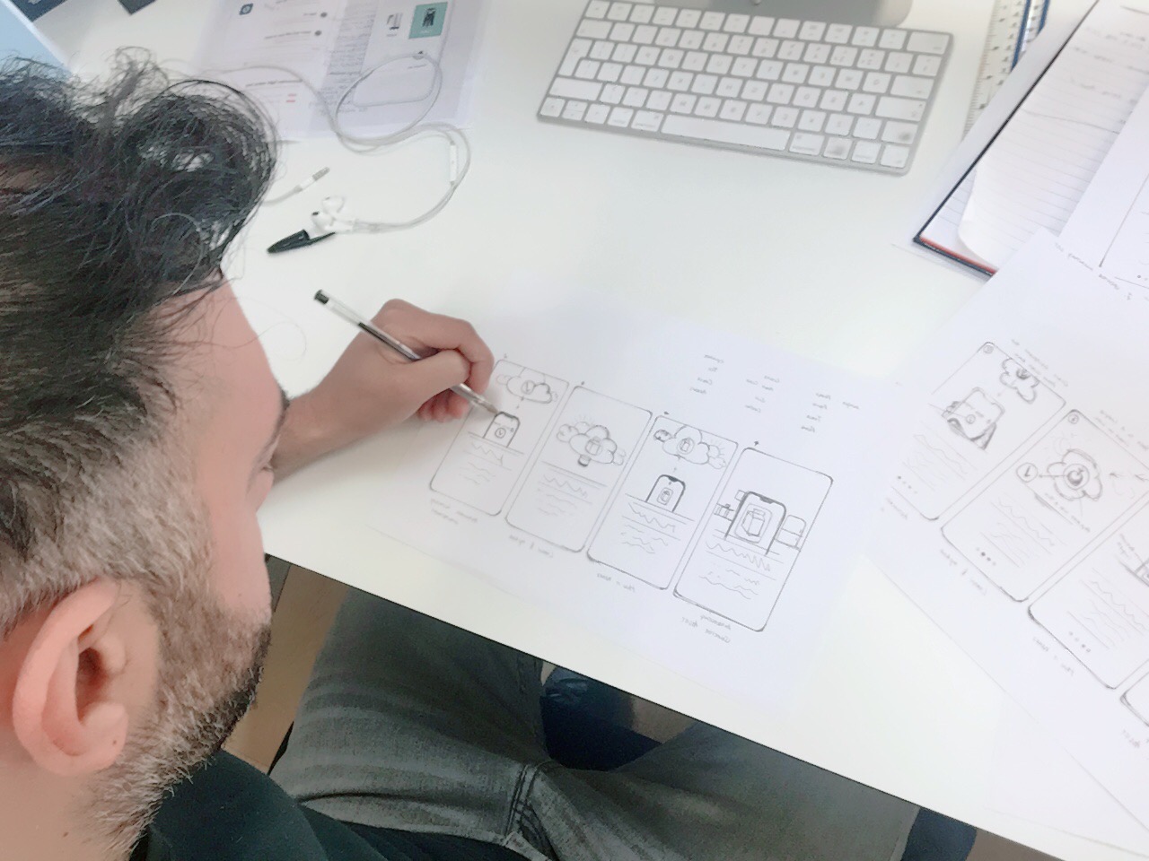
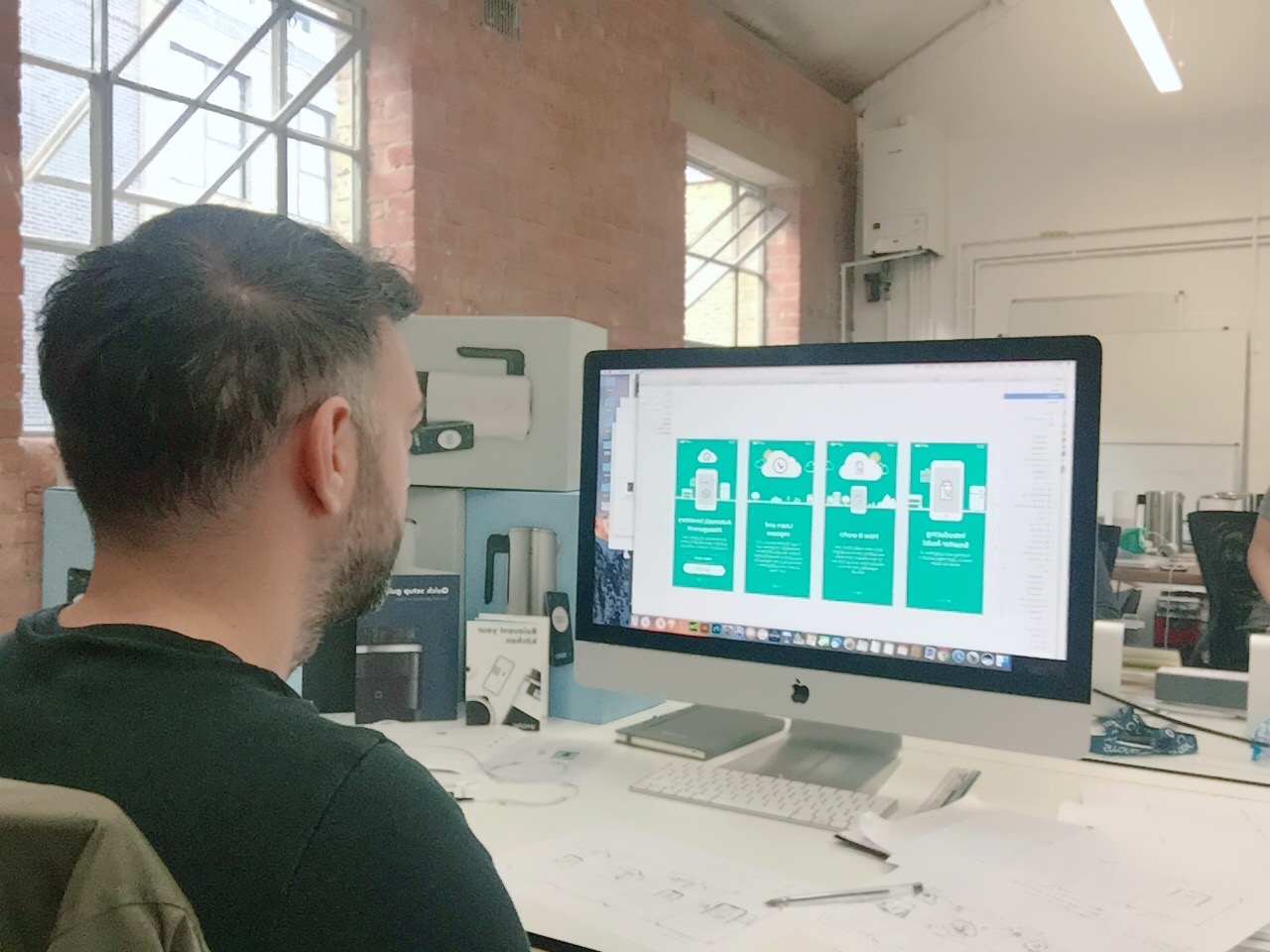
I began by mapping the complete journey around each product rather than designing isolated app screens.
That included what the customer was doing, what the phone was displaying, what the appliance was doing and what needed to happen when those states did not match.
05 A shared setup model
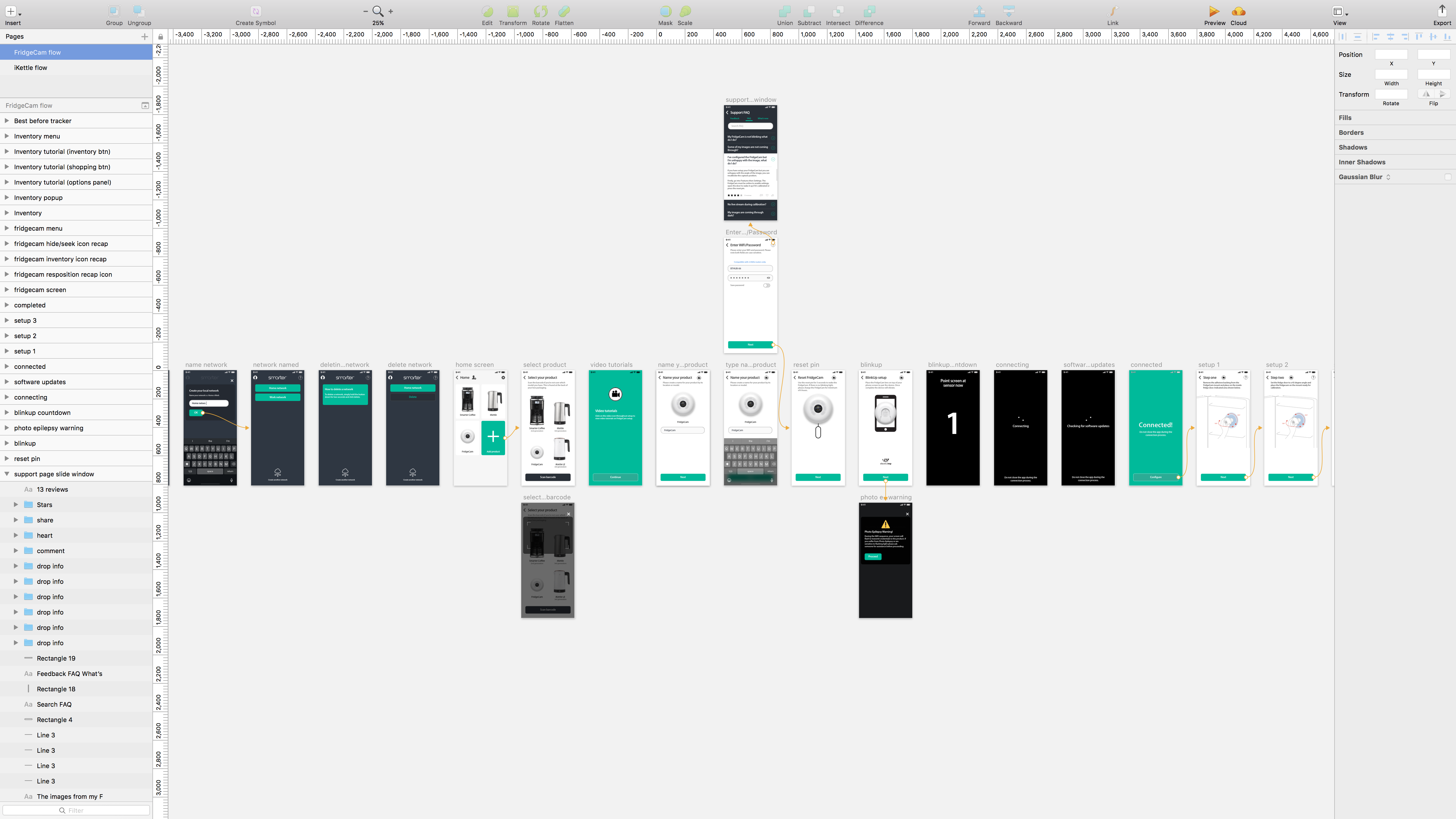
Although every product required different physical instructions, the overall setup journey needed to remain predictable.
Customers first selected and named their product, prepared the hardware, connected it to their network, waited for the connection and any software updates, and then completed product-specific configuration.
The structure stayed familiar. The imagery, instructions, physical actions and recovery guidance changed according to the product.
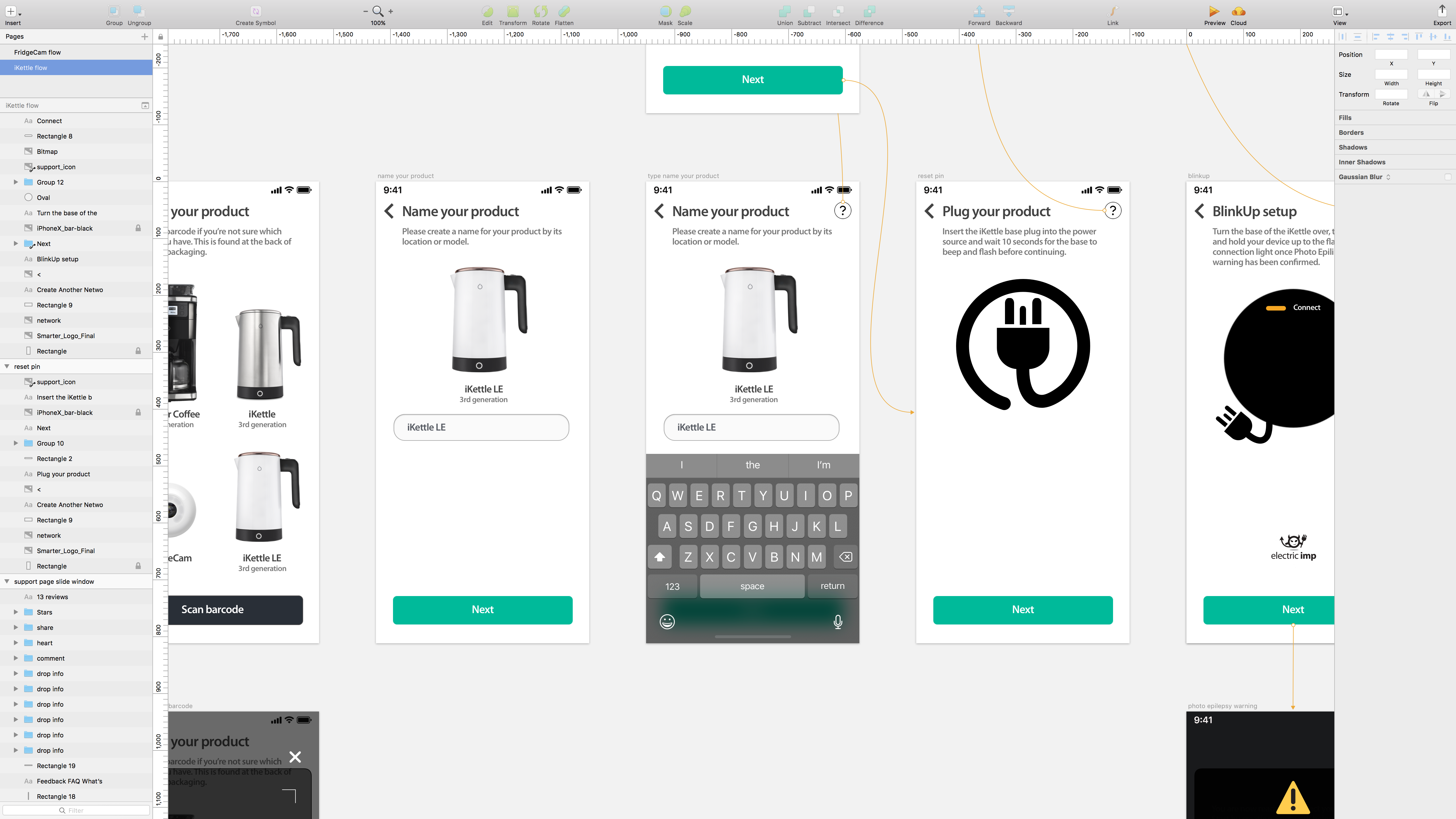
06 Guiding customers through BlinkUp
The products used BlinkUp during setup. Customers needed to enter their network details, prepare the appliance and position their phone correctly while the connection process took place.
Unlike normal mobile onboarding, success depended on the customer, phone, network and physical product reaching the correct state together.
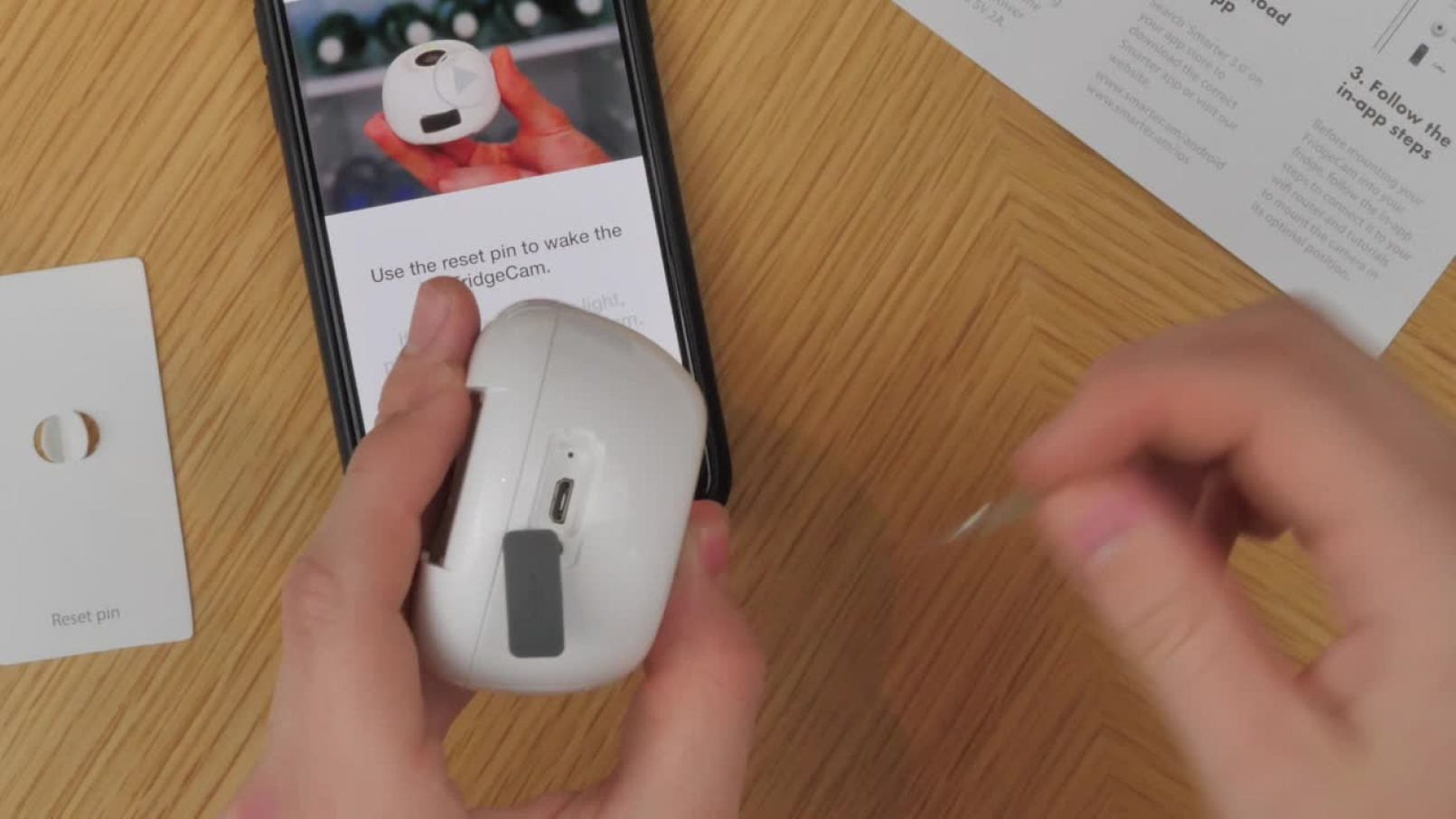
07 Designing with the physical product
Working directly with the hardware exposed issues that would not have appeared in a screen-only prototype.
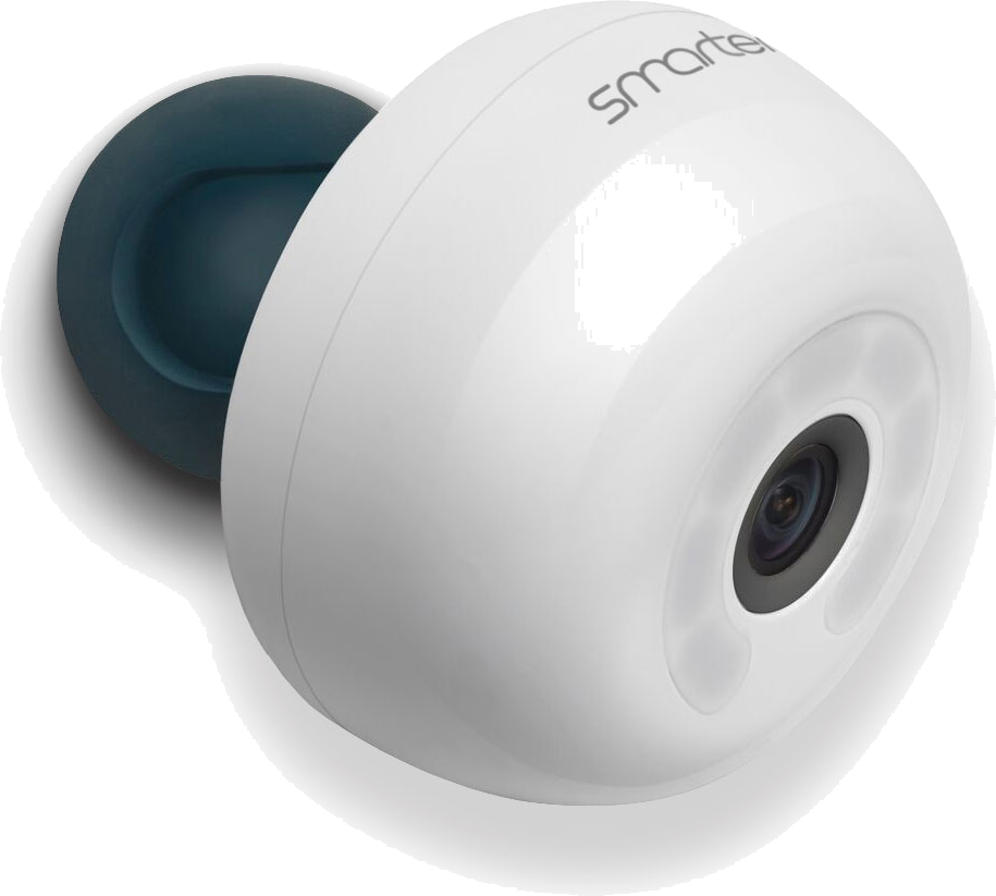
For FridgeCam, the experience depended on customers finding the reset point, mounting the device, selecting an appropriate camera angle and understanding when a new image would be captured.
Lighting, shelf position, fridge layout and door movement could all influence what customers eventually saw in the app.
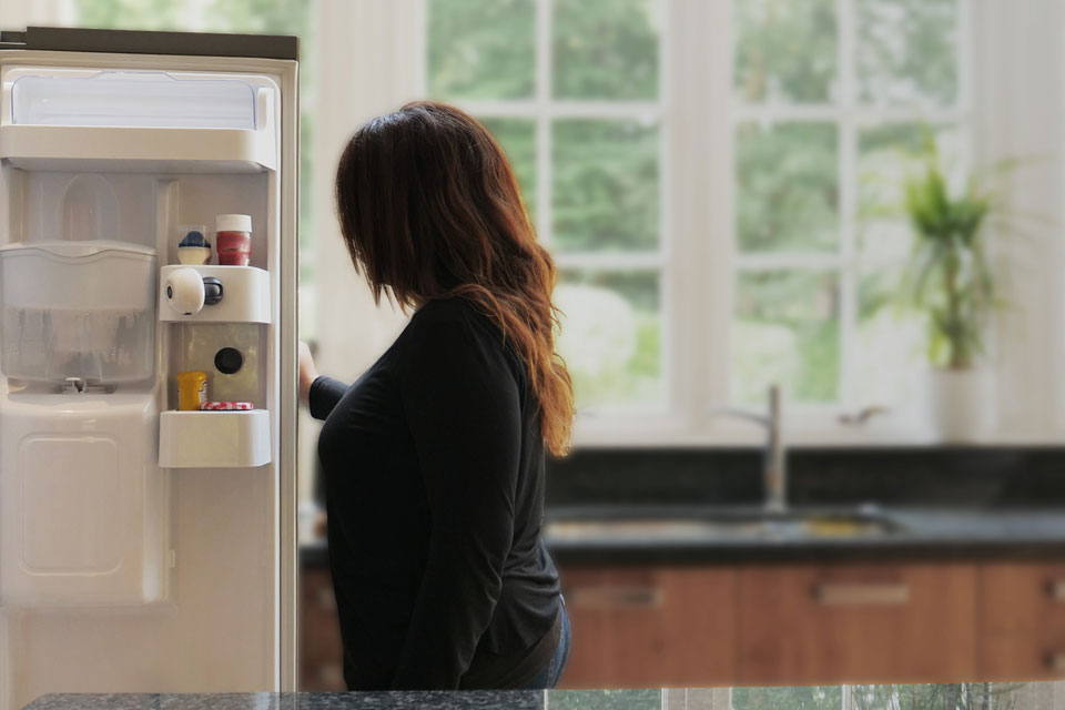
“Connected-product design meant treating the hardware, app and physical environment as one experience.”
08 The FridgeCam opportunity
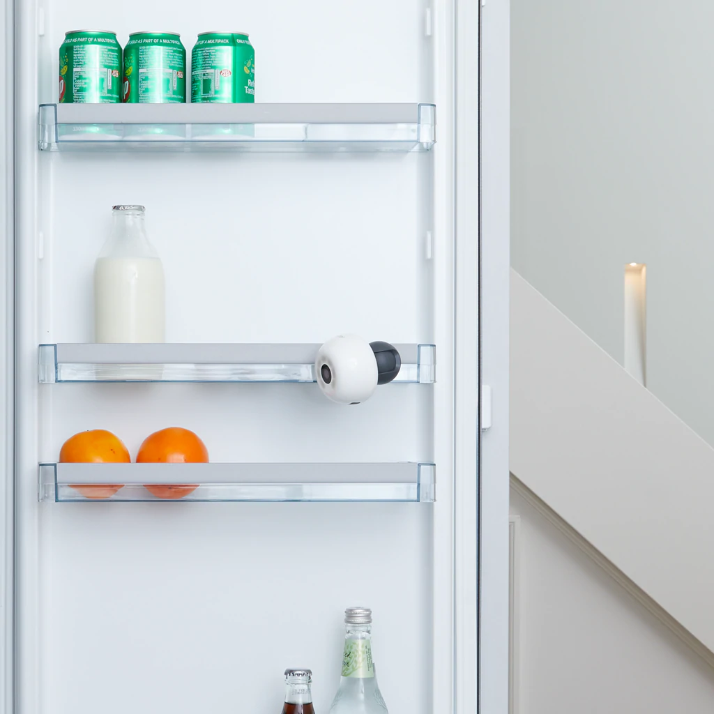
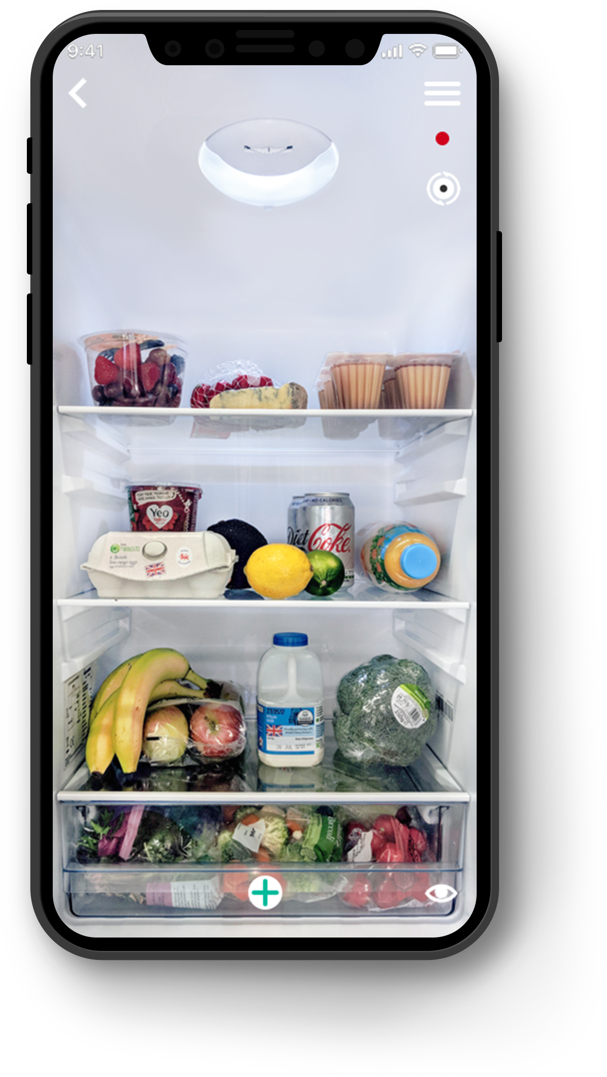
FridgeCam captured an image when the fridge door closed and made the latest view available through the app.
This solved one immediate problem: helping customers check what they had at home while they were away.
The wider opportunity was to connect that visibility with inventory, expiry dates, food-waste prevention and grocery planning.
09 Food-waste context
Smarter framed FridgeCam around reducing unnecessary purchases and avoidable food waste.
Company research used at the time suggested that households were throwing away a significant proportion of the food they purchased, creating both a financial and environmental cost.
Company research used at the time
£700
Average annual household food waste stated in the company research.
60%
Food waste described as avoidable.
20%
Share of purchased food described as being wasted in the UK.
7.3m tonnes
Household food waste per year cited in the company research.
88%
Of households spending up to £100 per month on food.
77%
Of households admitting to regularly throwing away food.
98%
Of households throwing away some chilled products.
£3.7b
Potential UK savings if avoidable food waste were reduced, as framed in the research.
These figures provided the problem context for the product. They are not presented as measured outcomes of my design.
10 Smarter Assist
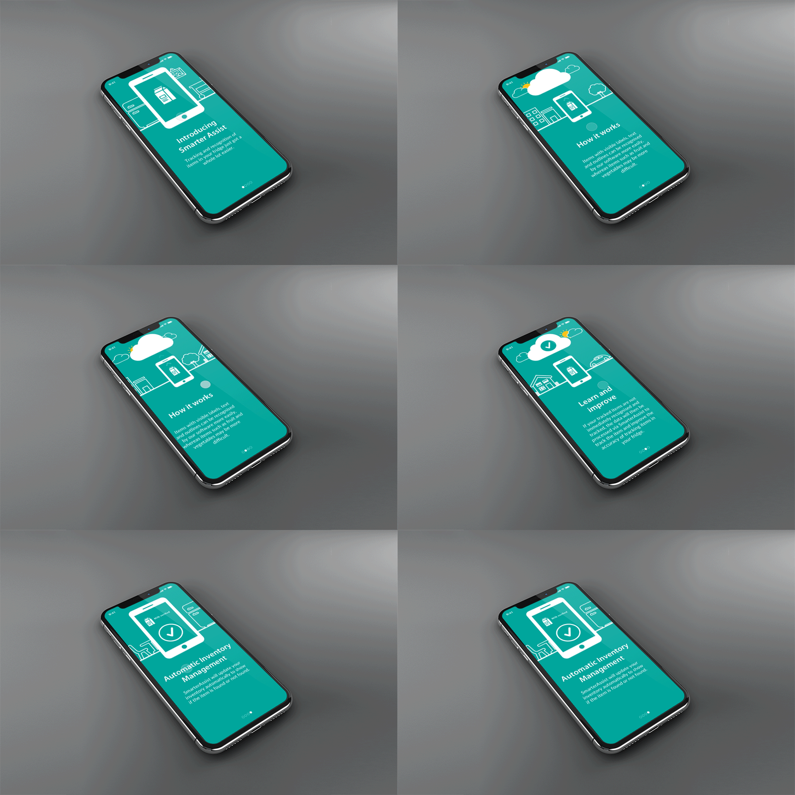
Smarter Assist extended FridgeCam from passive visibility into household management.
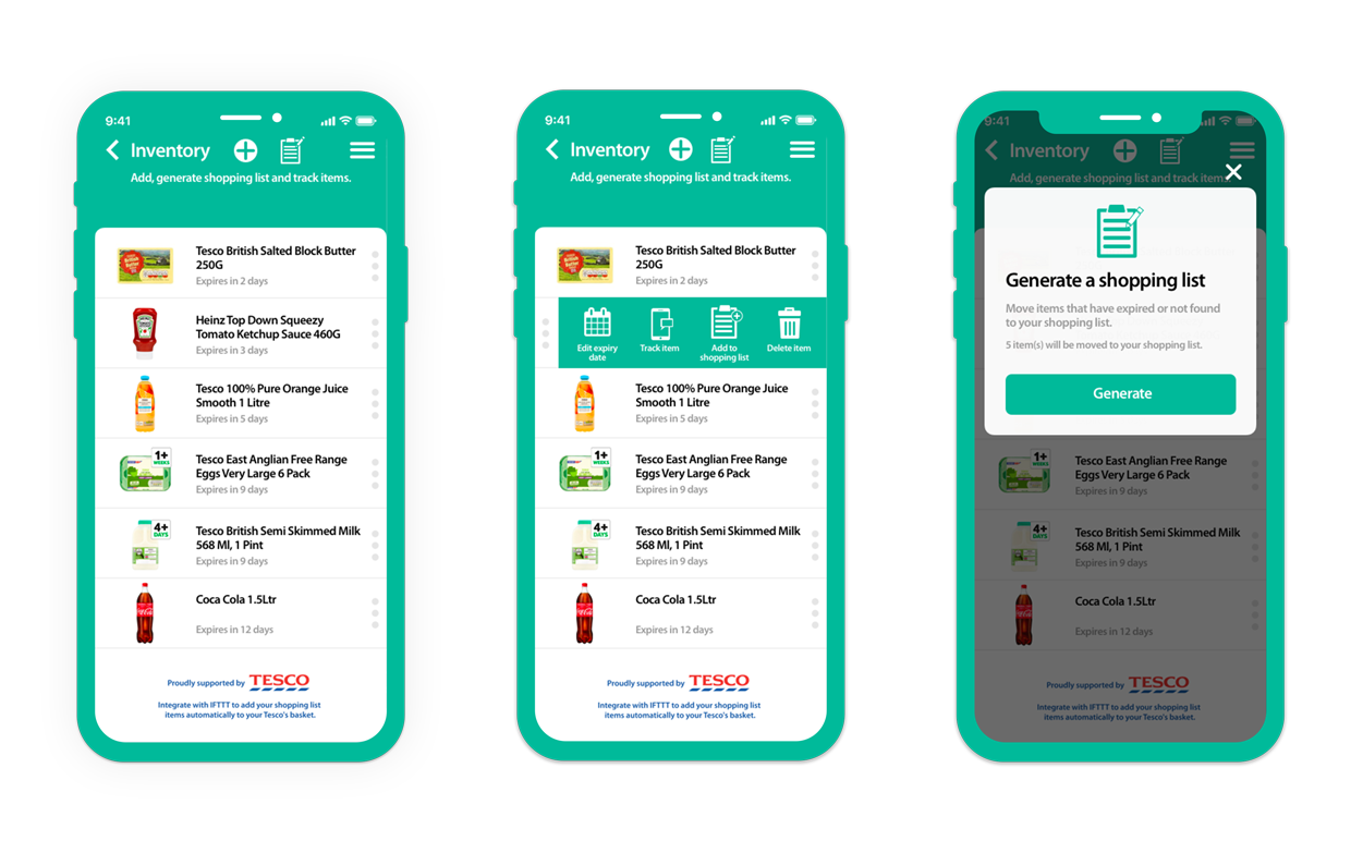
Customers could scan products as they stored them, add them to an inventory, record an expiry date and move items into a shopping list when they were missing or approaching expiry.
At the time, Tesco customers could connect the experience through IFTTT so shopping-list items could be added to their Tesco basket.
11 Design principles
A shared app structure created familiarity, while individual setup and control journeys reflected the needs of each appliance.
Instructions needed to show customers what to touch, position, reset or wait for, not simply what to select on screen.
Connection, firmware and appliance states needed to remain visible so customers understood what was happening.
Incorrect network details, failed connections, hardware resets and interrupted setup were expected product states, not edge cases.
12 Constraints and trade-offs
Too much consistency would make the instructions vague. Too much variation would make the app feel like three unrelated products. The shared structure remained consistent while content and actions changed by product.
The fastest possible setup was not always the clearest. Customers needed enough guidance to complete sensitive physical actions correctly.
Inventory and expiry features provided value, but they depended on products being scanned and maintained. The experience needed to make this effort understandable.
The app could communicate an intended state, but success still depended on the appliance, Wi-Fi connection, installation and surrounding environment.
13 What I delivered
The work established a single mobile ecosystem across three connected kitchen products while allowing each product to retain the behaviours and controls it required.
The final experience connected physical visibility, household inventory and shopping activity through one app.
14 Reflection
This project changed how I thought about mobile product design. The interface could not be considered separately from the appliance, network, sensor, physical environment or external service.
A clear screen was not enough. The experience had to help all of those parts reach the correct state together.
It reinforced the importance of visible system status, specific physical guidance and designing recovery with the same care as the successful journey.
Smarter was also an early introduction to the relationship between household inventory, replenishment and food waste, themes that later became relevant to my grocery work at Waitrose.