84,000
Customers contacted
01 Case Study
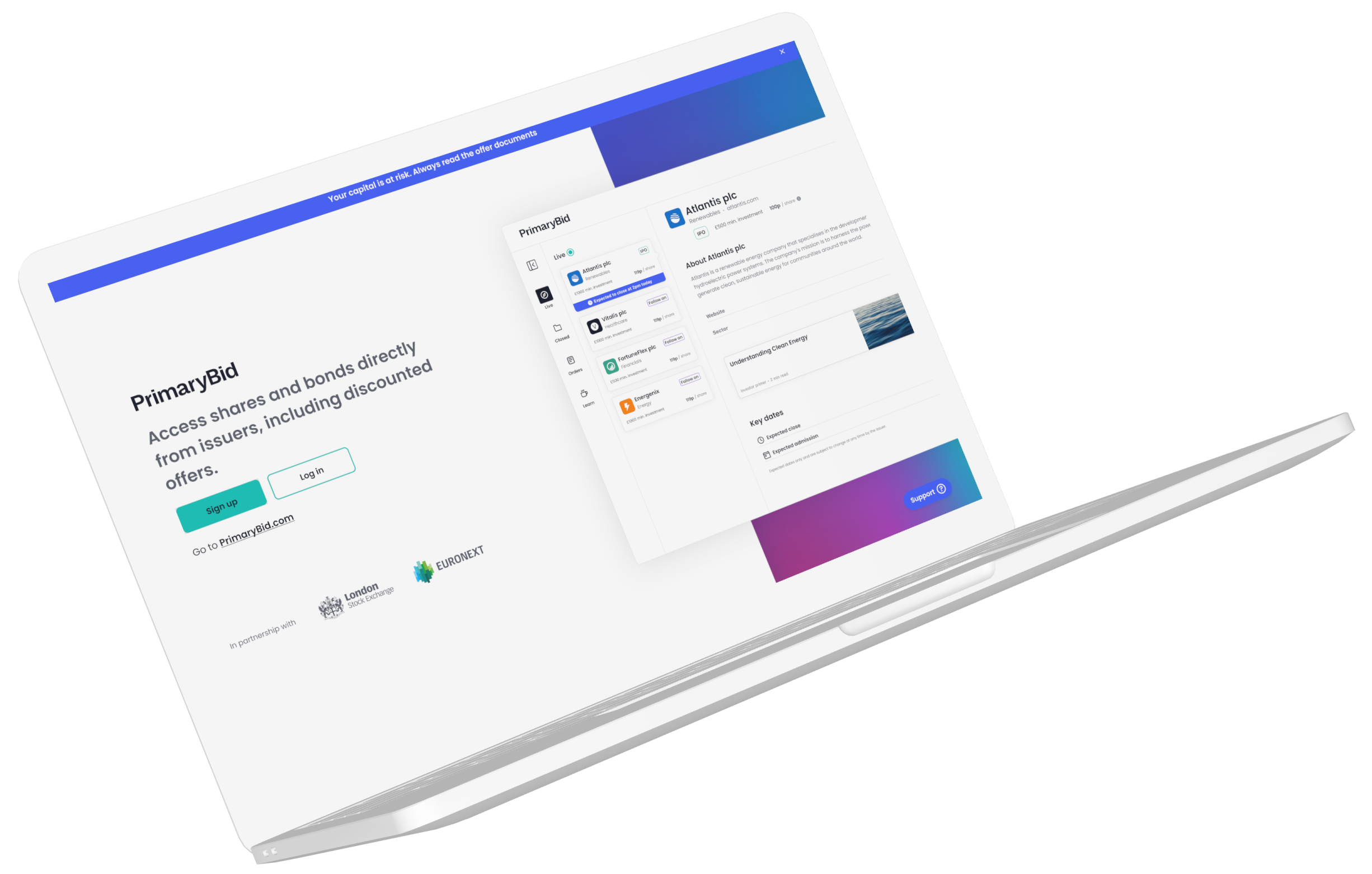
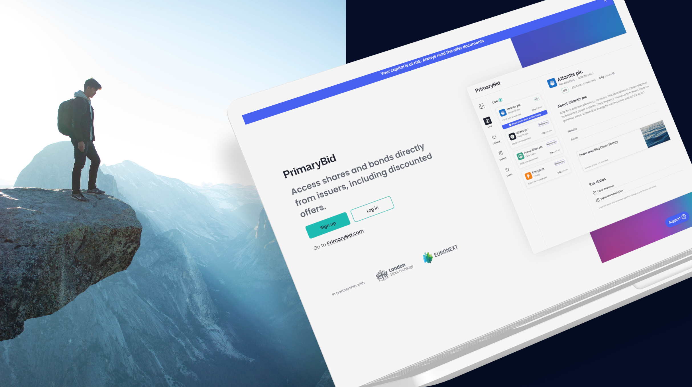
Creating a responsive transactional web experience that helped retail investors research opportunities, apply for offers and manage their investments across desktop, tablet and mobile web.

As Senior Product Designer, I led the end-to-end product design of T-Web, PrimaryBid’s transactional website, across desktop, tablet and mobile-web breakpoints.
I worked across discovery, product definition, information architecture, interaction design, prototyping and delivery. The experience covered onboarding, offer discovery, company and investment information, applications, payments, broker confirmation, order tracking and account management.
Alongside T-Web, I oversaw and supported work on the broker dashboard, created interface concepts used in IPO pitches and developed reusable patterns for the supporting design system.
I collaborated with product, research, engineering, compliance and commercial teams, supported implementation through staged releases and mentored designers working across the wider product ecosystem.
02 The challenge
PrimaryBid enabled retail investors to access public-market opportunities, but the experience had become increasingly app-led.
Research showed that the native app worked well for immediacy and time-sensitive transactions. However, many investors preferred desktop when reading offer documents, reviewing financial information, comparing opportunities and making considered decisions.
Some customers also found app-only access difficult because of accessibility needs, small-screen limitations, technical issues or a lack of access to a suitable device.
The opportunity was not to reproduce the native app on a larger screen. It was to design a connected transactional website that supported research, decision-making and investment across desktop, tablet and mobile web.
03 The product opportunity
Rather than treating the native app and T-Web as competing products, I helped define the role the transactional website could play within the wider investment journey.
04 Validating demand
Before defining the product, the team tested whether there was meaningful demand for transactional web access among existing and previously active PrimaryBid customers.
The experiment gave us enough evidence to continue, while still treating T-Web as a hypothesis that needed further behavioural research and beta validation.
84,000
Customers contacted
16,500
Opened the invitation
~1,100
Interacted with the campaign
866
Registered for the T-Web beta
105
Previously interviewed customers who preferred web access
The beta registration figure demonstrated interest, but it was not treated as proof that the final product had already been validated.
05 Understanding different investors
Our research identified five investor archetypes with different levels of experience, confidence and investment behaviour.
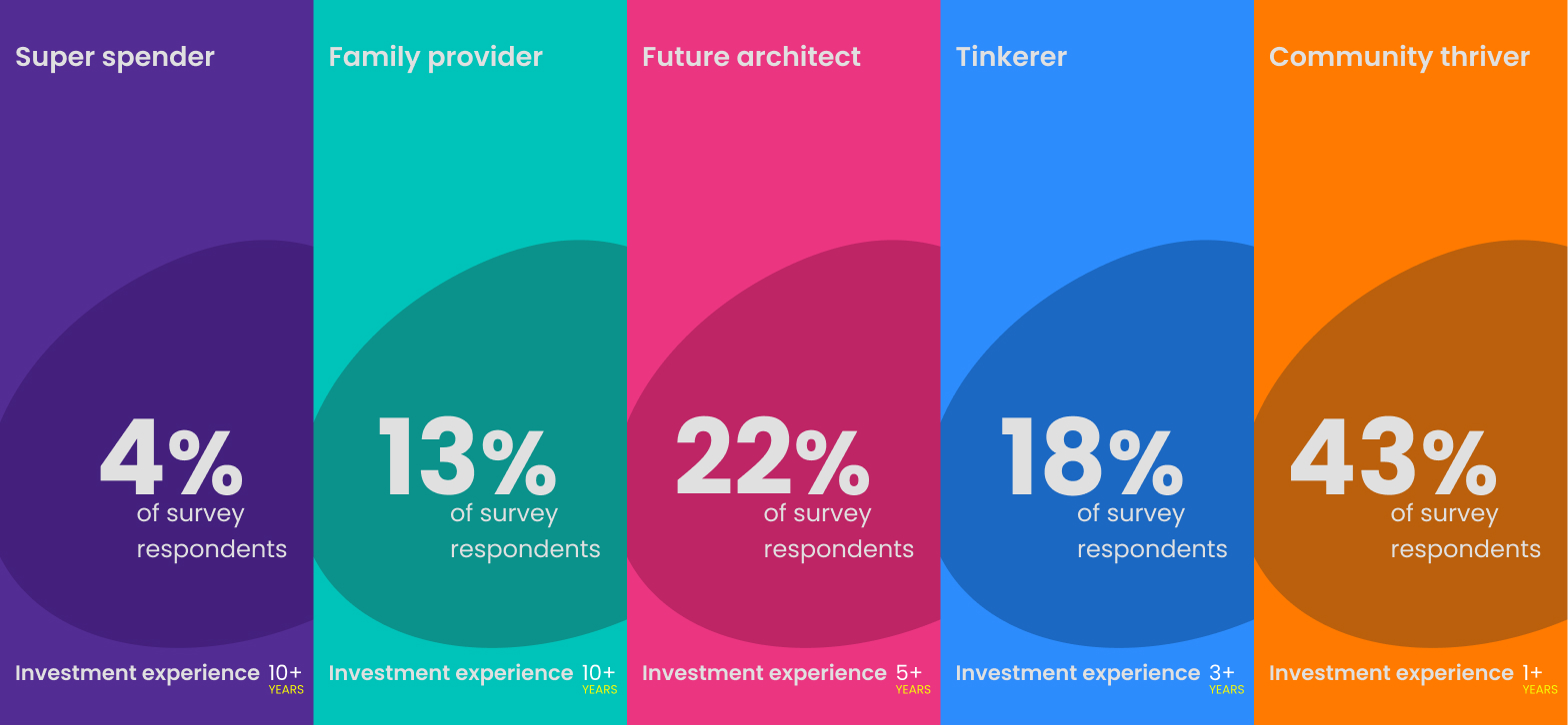
4% of users
Highly experienced and confident investors who valued depth, speed and access.
13% of users
Considered investors focused on stability, clarity and long-term outcomes.
22% of users
Less experienced investors building towards future financial goals.
18% of users
Opportunity-led investors attracted by movement, timing and market activity.
43% of users
The largest group, generally less experienced and more reliant on accessible information and external guidance.
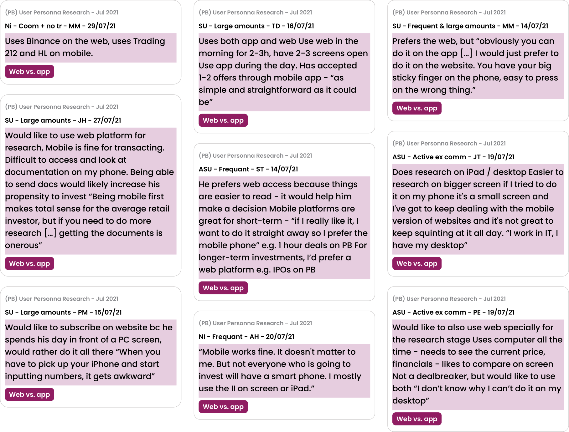
06 Customer verbatims
“I’m trying to log in but it keeps directing me to get the app. I don’t want the app — I just want to log in as normal.”
“If someone at your company could allow PC-only people to take part in IPOs, you might get a lot more business from older folk like me.”
“As someone with severe arthritis, it is really impractical to use my phone or iPad to make investments rather than my desktop.”
“I avoid using a mobile phone for financial transactions, as my desktop is a much more secure environment.”
These comments exposed overlapping problems around access, accessibility, screen size, confidence, security and the effort required to move between PrimaryBid and external banking or research tools.
07 Observing investment decisions
We designed a mixed research study combining discovery interviews with observed investment tasks.
Participants responded to a realistic offer notification and shared their screen while showing how they investigated it. This helped us compare what customers said they did with what they actually did in practice.
08 Defining the cross-channel role
Rather than reproducing the native app at a different size, I designed T-Web around the research, comparison and transactional behaviours that web supported best.
The native app was owned by the Principal Designer and is shown here to explain the wider channel strategy.
09 Product principles
Time-sensitive opportunities needed to be visible without using manipulative pressure patterns.
Customers needed enough information to understand an opportunity before entering a regulated transaction.
Navigation, terminology and investment information needed to remain recognisable between T-Web and the existing native app, while allowing each product to use the interaction patterns best suited to its context.
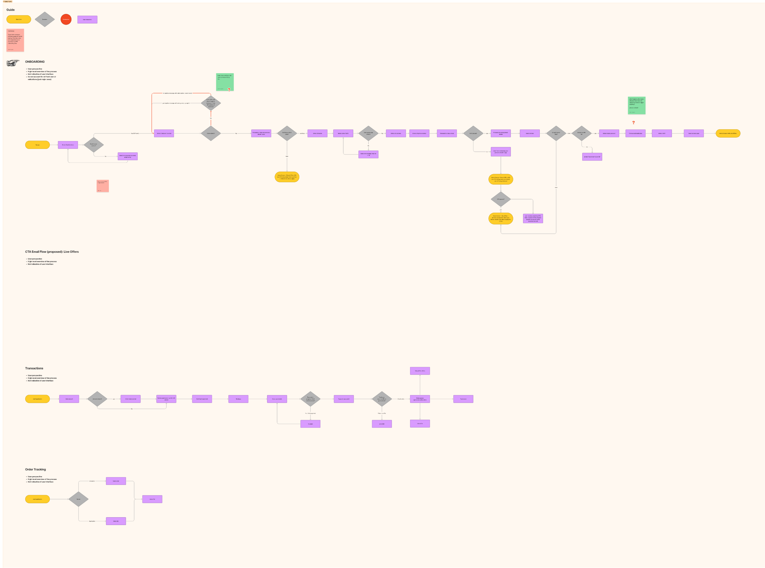
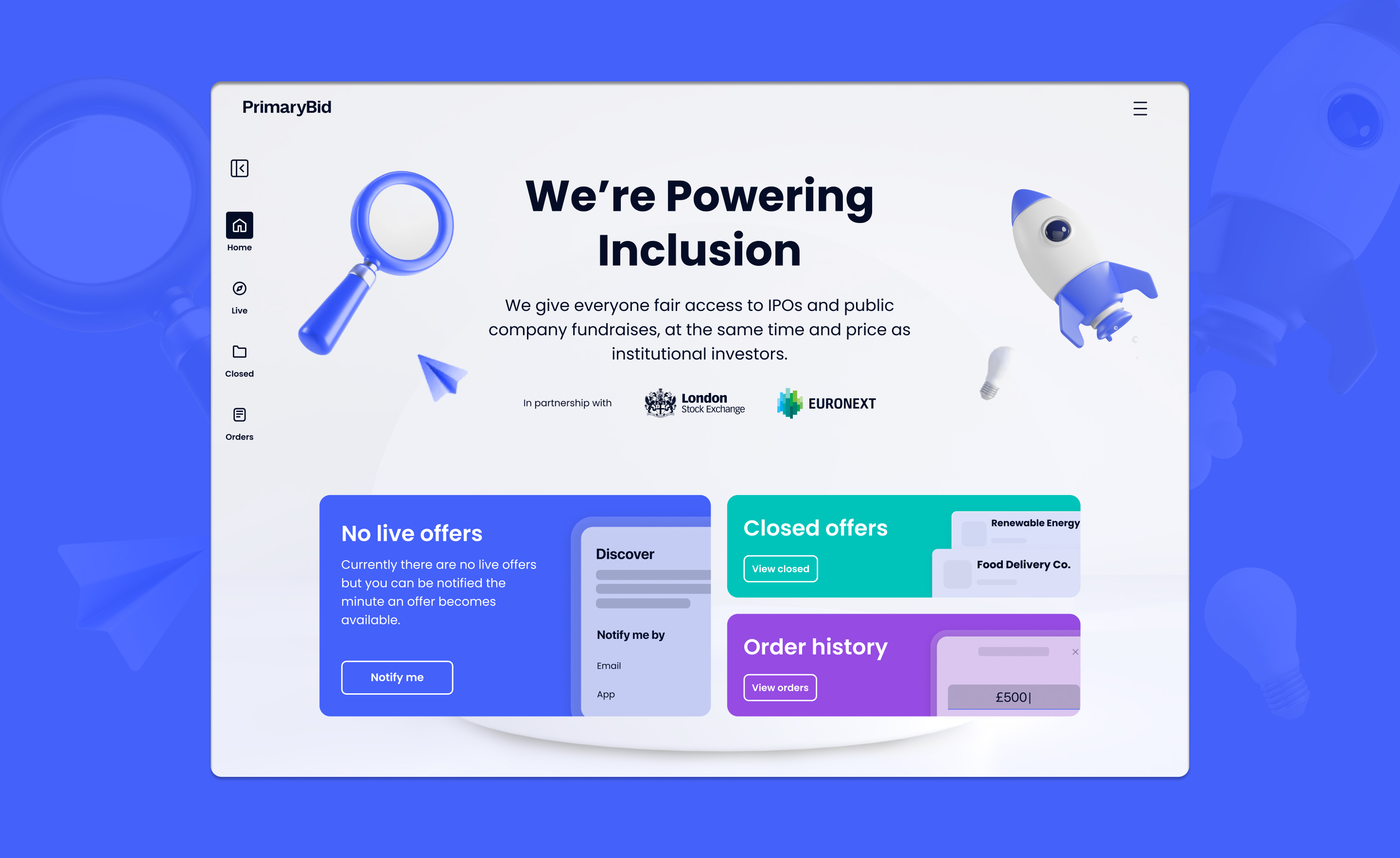
10 Structuring the platform
The information architecture was organised around the customer’s investment lifecycle rather than around isolated product features.
Browse live opportunities
Review the company, offer and supporting information
Choose an amount and confirm eligibility
Select an appropriate payment method
Review applications, allocations and previous orders
Scroll to view full diagram
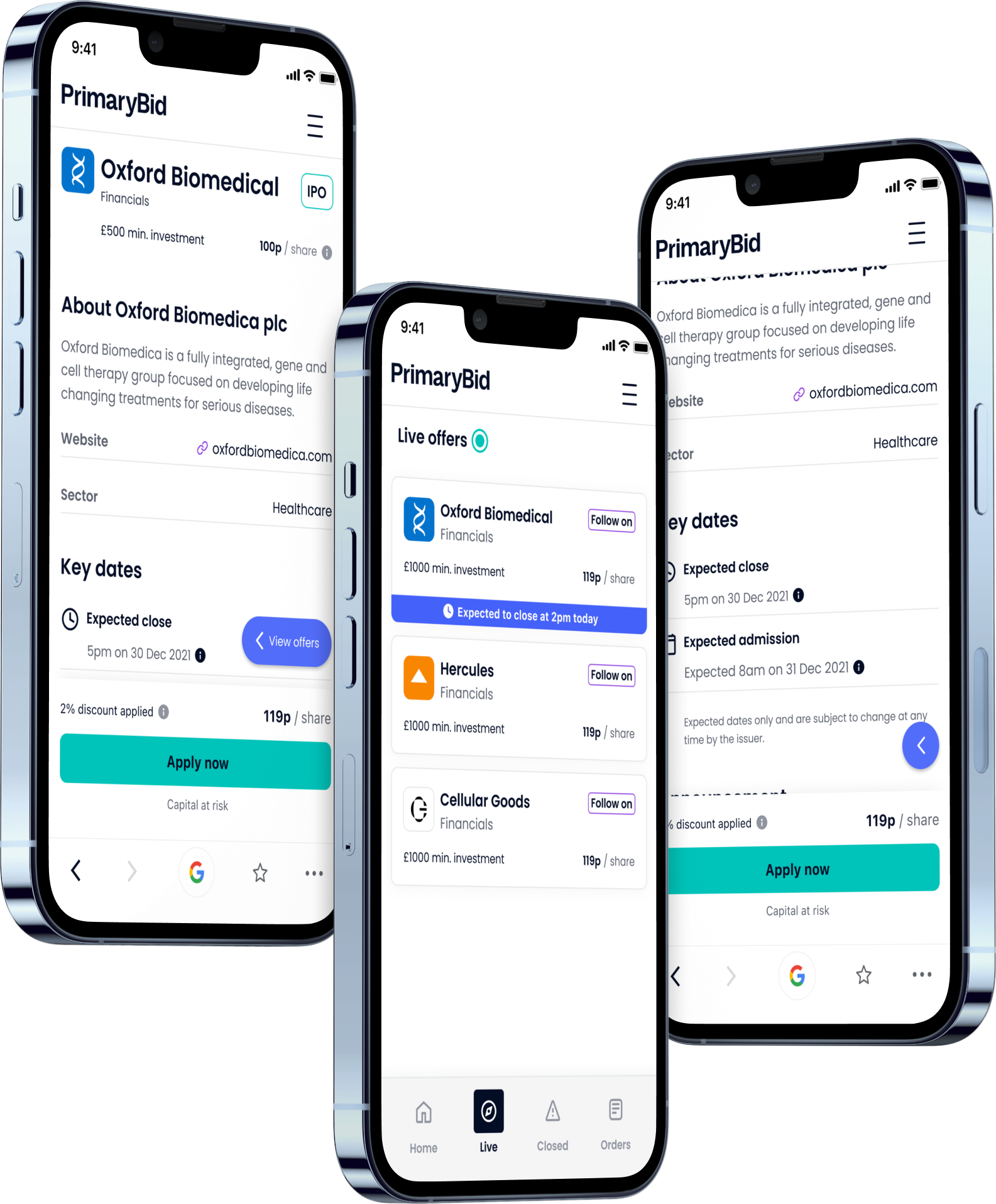
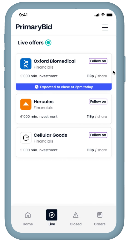
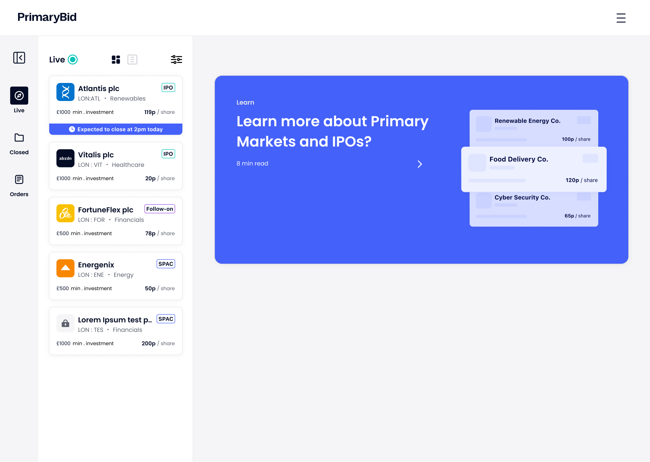
11 The responsive offer experience
T-Web was designed responsively across desktop, tablet and mobile web. It was not simply reduced from a desktop layout: the information hierarchy, navigation and interaction model adapted to the available space and the customer’s likely context.
Persistent navigation supported browsing while keeping offer detail visible.
The layout retained depth while allowing customers to review orders and account information in a more portable format.
The responsive website prioritised the active offer, timing, price and primary action, with supporting information revealed progressively.
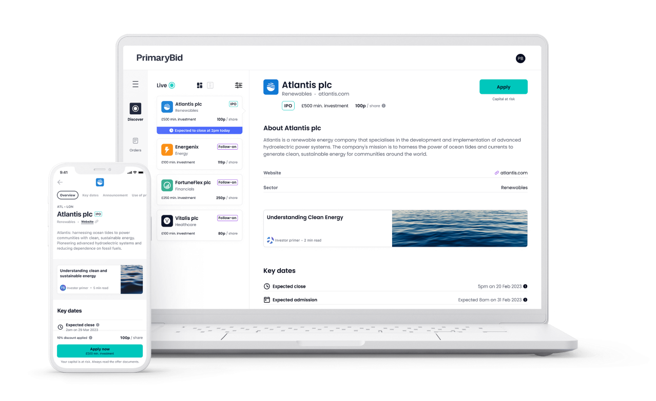
12 Time-sensitive offers
Some PrimaryBid opportunities were available only briefly. Customers needed to understand when an offer was expected to close without the interface becoming unnecessarily alarming or manipulative.
The responsive T-Web offer experience surfaced offer status, expected close time, minimum investment, current share price, investment type, access to further information and the primary application action.
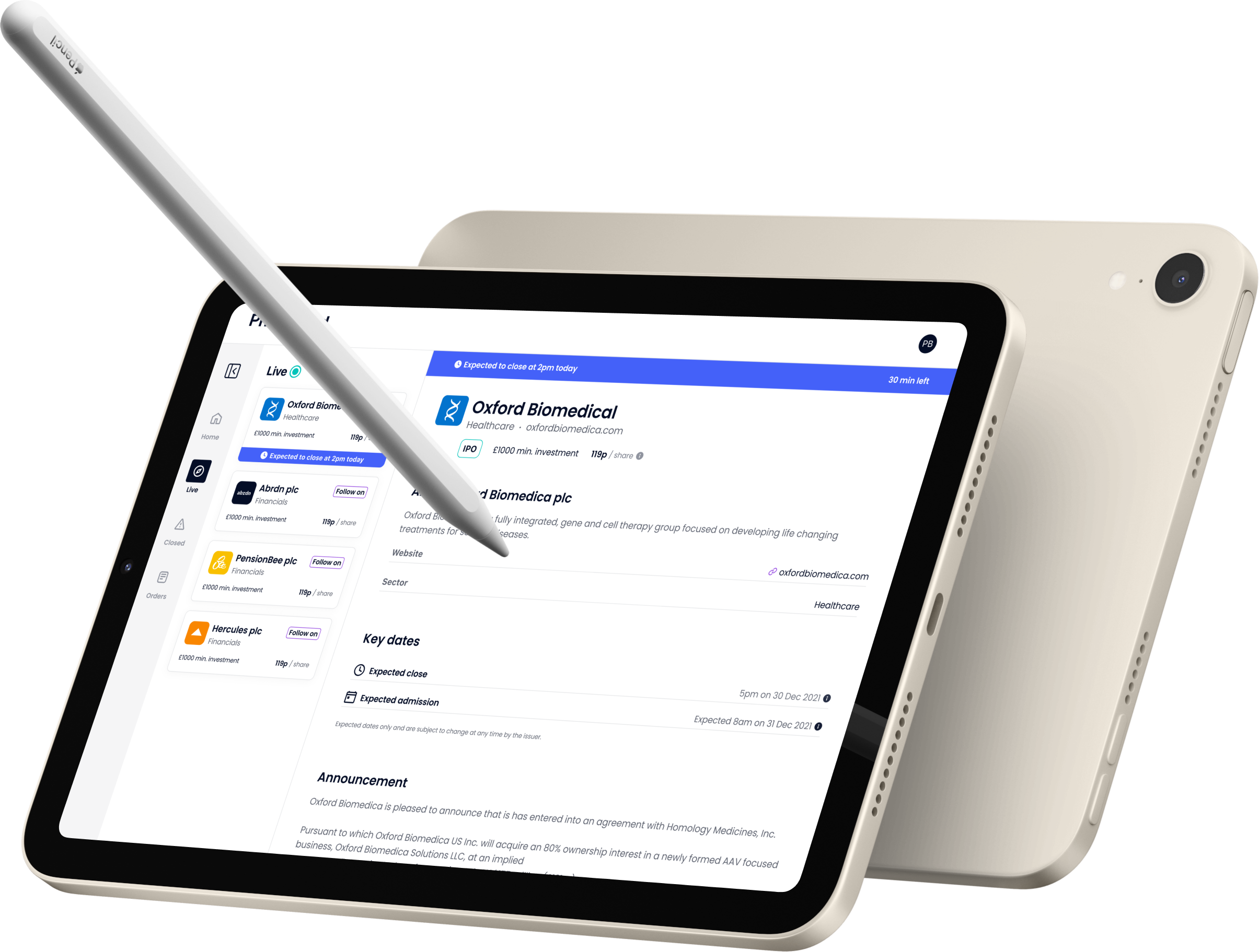
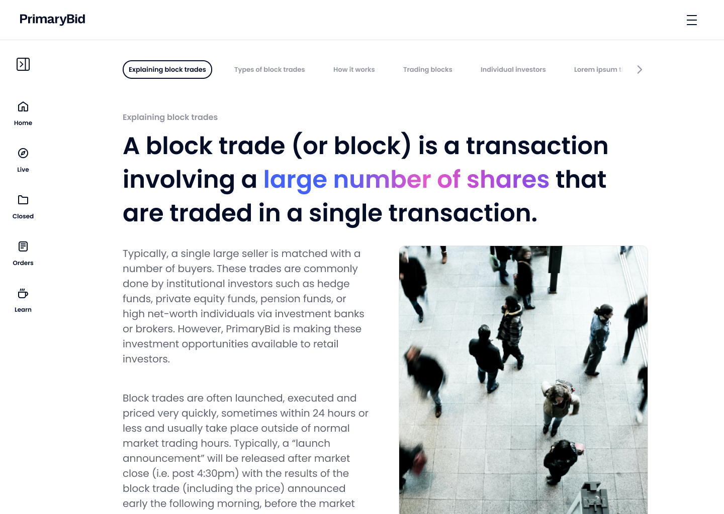
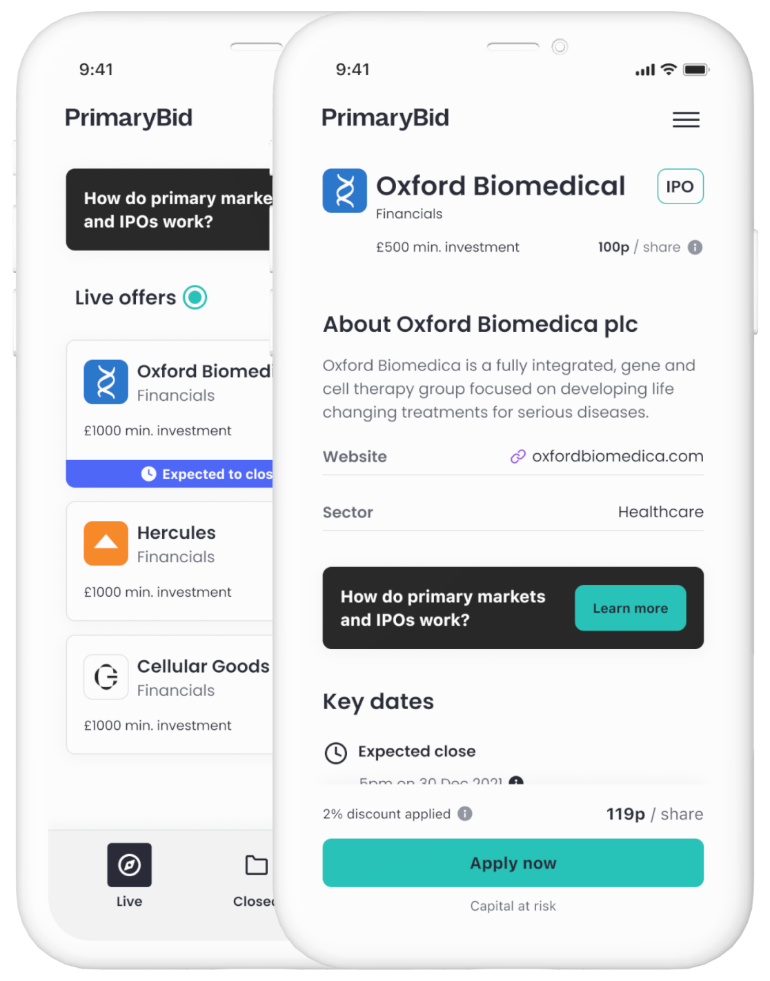
13 Supporting research
Research showed that customers frequently left PrimaryBid to understand unfamiliar investment types, assess a company or compare market information.
I explored how educational content could sit closer to the investment decision without turning the transaction journey into a publishing platform.
When the full Learn index was removed from the initial release, I adapted the approach so that individual articles could still be surfaced contextually from relevant offers and product journeys.
Show information that relates to the customer’s current task and position in the journey.
Help customers find the information they need without introducing another complex navigation system.
Allow customers who want more depth to continue exploring related content.
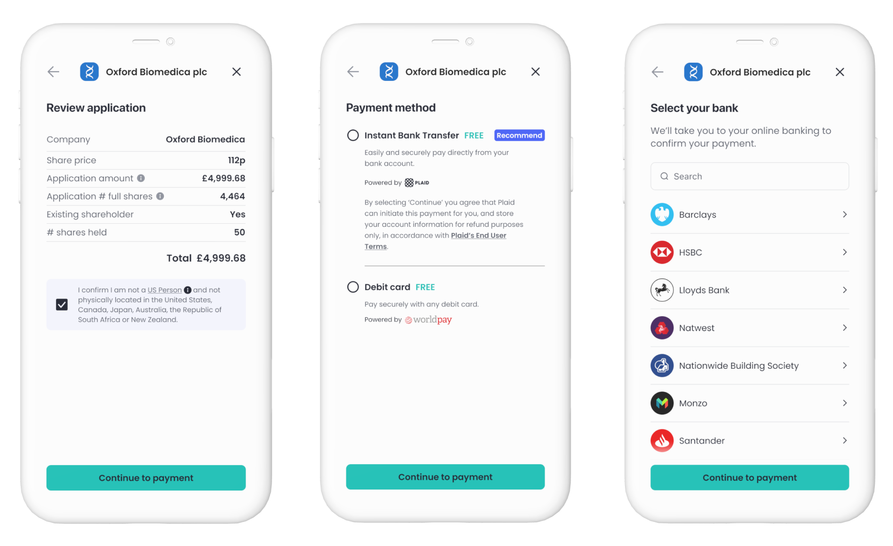
14 Application and payment
The application journey needed to balance commercial speed with regulatory clarity and customer confidence.
Customers reviewed their application, confirmed eligibility and selected between supported payment options before leaving PrimaryBid to complete payment.
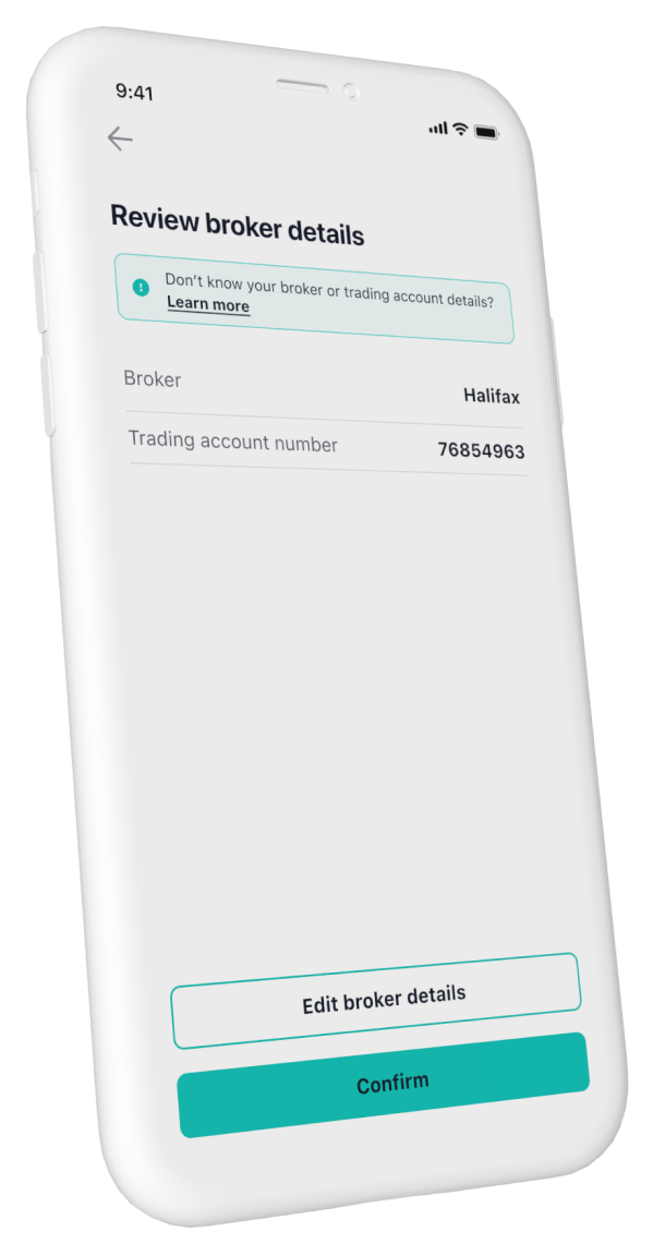
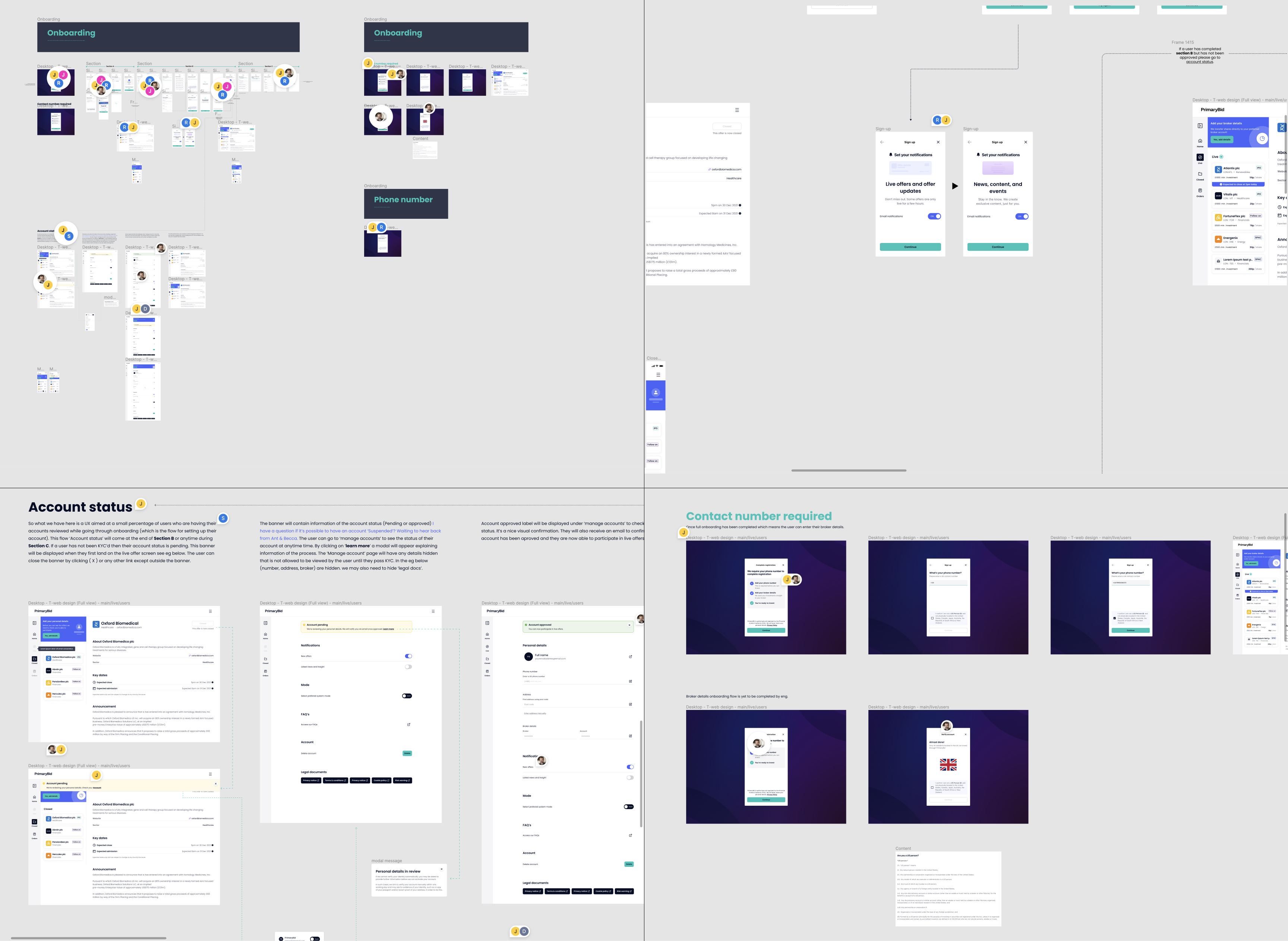
15 Broker confirmation
The existing payment journey did not allow customers to confirm or correct their broker details before completing an application.
This formed part of the responsive transactional-web journey across T-Web breakpoints.
Rather than rebuilding the transaction flow, I introduced a confirmation step using patterns and components that already existed.
Customers could review their broker and account number, edit either field where necessary and then continue into the existing payment journey.
I kept broker selection and account-number editing within one connected sequence. Treating them as separate isolated edits would have forced customers backwards and forwards and increased the risk of submitting mismatched information.
16 Orders and account management
The T-Web journey did not end when a payment succeeded. Customers needed to understand application status, review allocations, revisit previous orders and maintain regulated account information across desktop, tablet and mobile web.
The platform therefore connected transaction history, allocation status, account management and future discovery.
Customers could review applications and confirmed allocations.
Customers could update contact, address and broker information.
Completed investments connected back to relevant future opportunities.
17 Onboarding journey
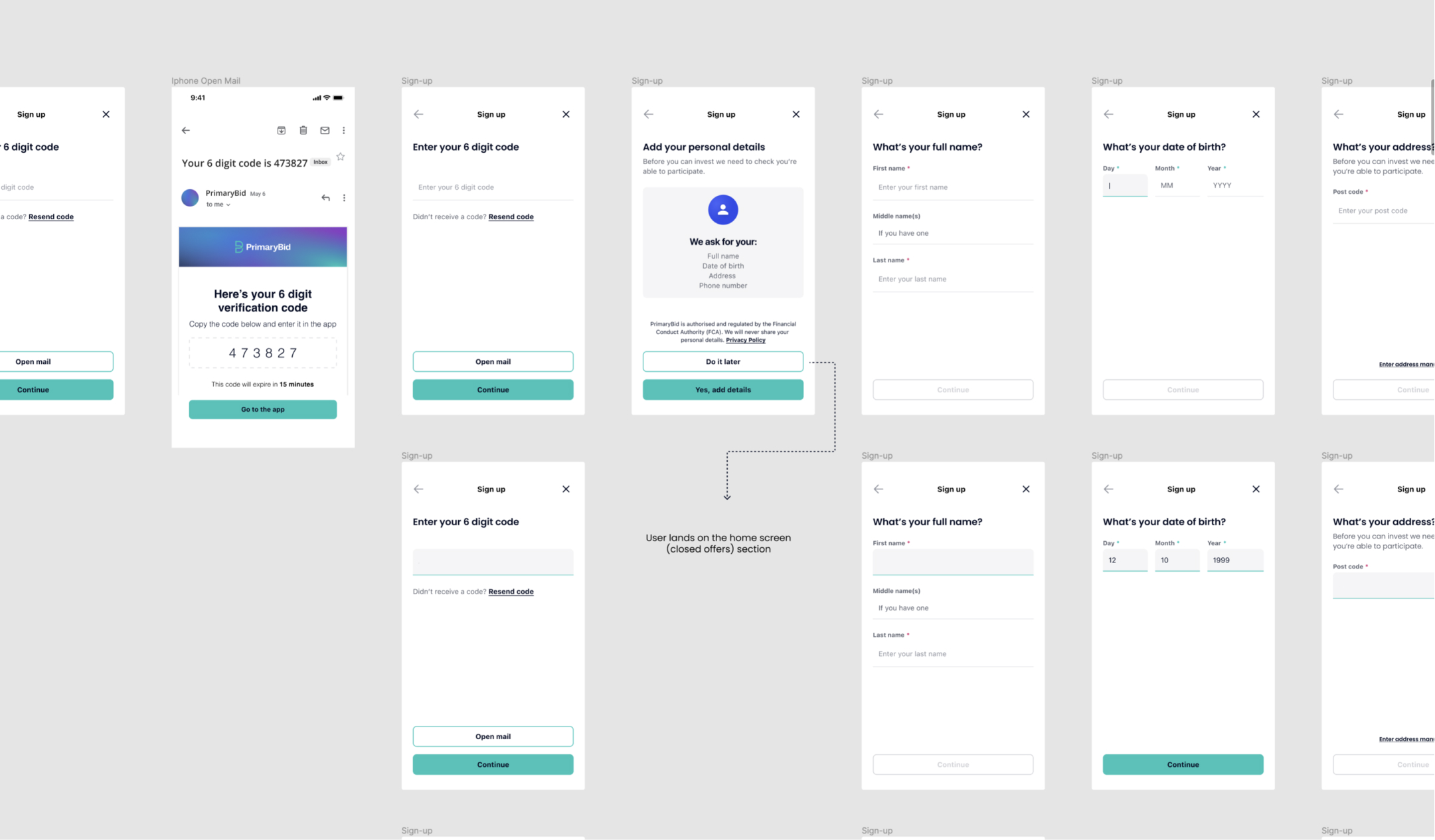
The onboarding journey progressively collected the personal, eligibility and broker information customers needed before they could invest. Explore each stage of the experience below.
Stage 1 of 7
Screen 1 of 3
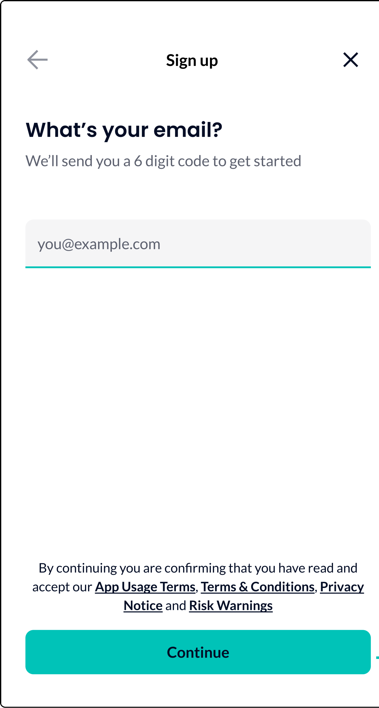
Screen 2 of 3
Screen 3 of 3
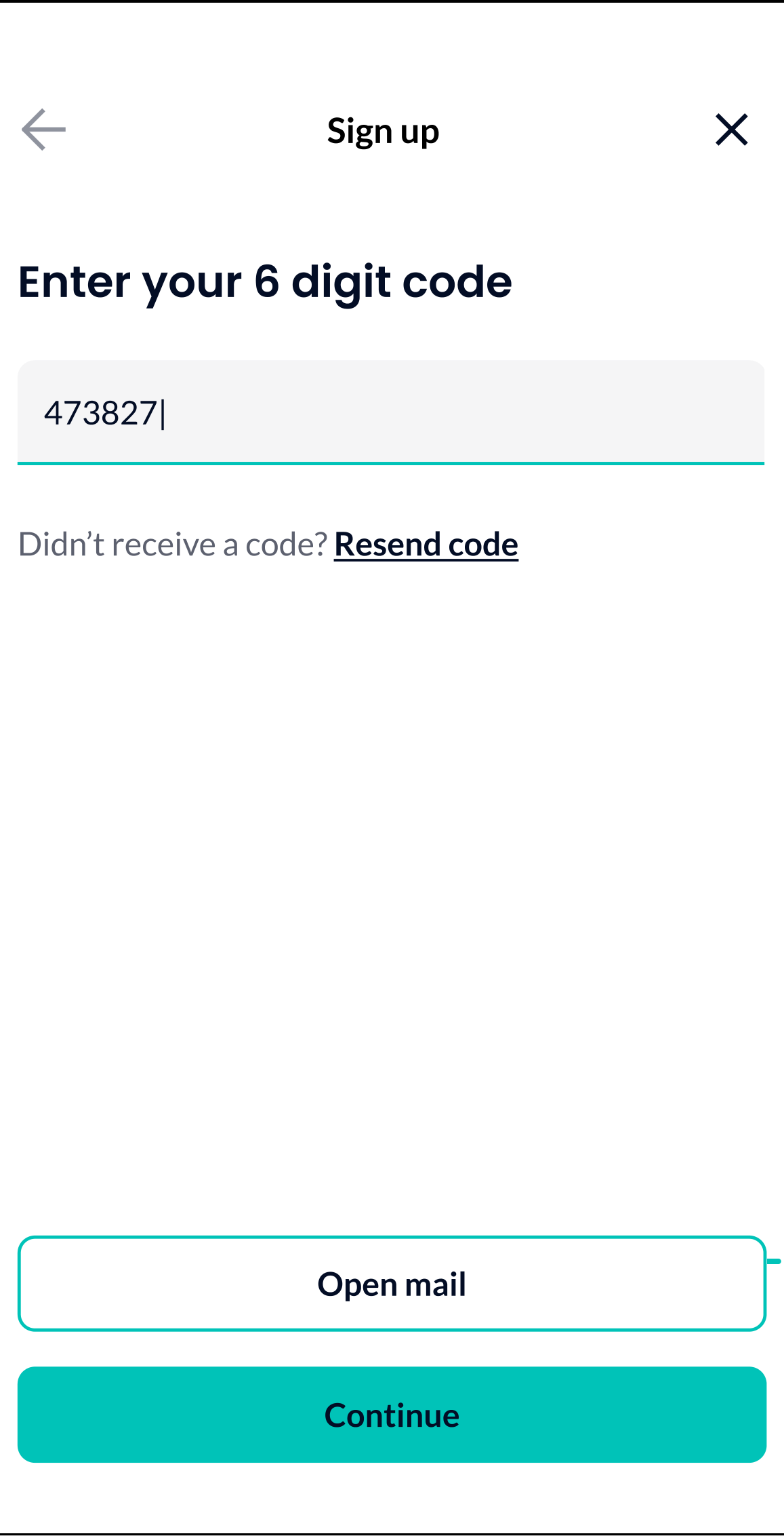
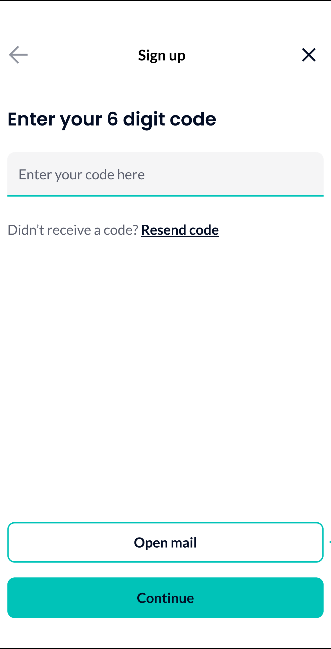
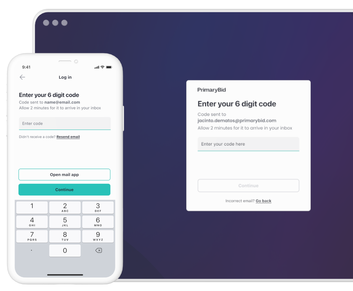
Customers began with their email address and verified access using a six-digit code, creating a focused entry point before personal information was requested.
1 of 7
18 Designing recovery paths
Analysis of onboarding drop-off showed that failure was rarely caused by one screen.
Customers could abandon because a verification email was delayed, the message entered a spam folder, an email address was mistyped, a code had expired, a customer entered an incorrect code, registration and login were not clearly differentiated, the customer used a different email from their PrimaryBid account, or moving between email and the product interrupted the journey.
I led a cross-functional workshop with product and engineering to map these scenarios, identify backend dependencies and agree where intervention would have the greatest effect.
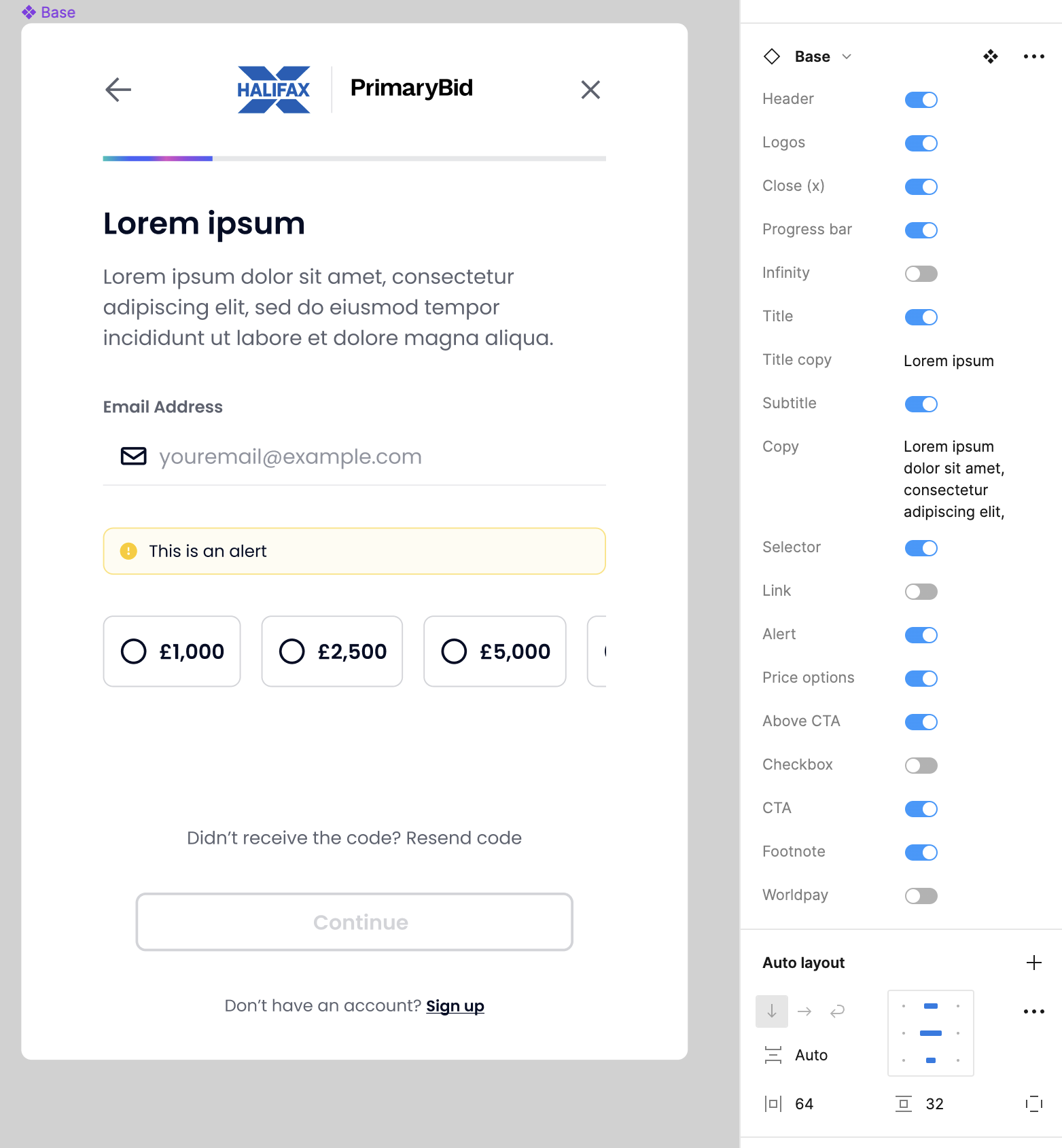
19 Reusable platform components
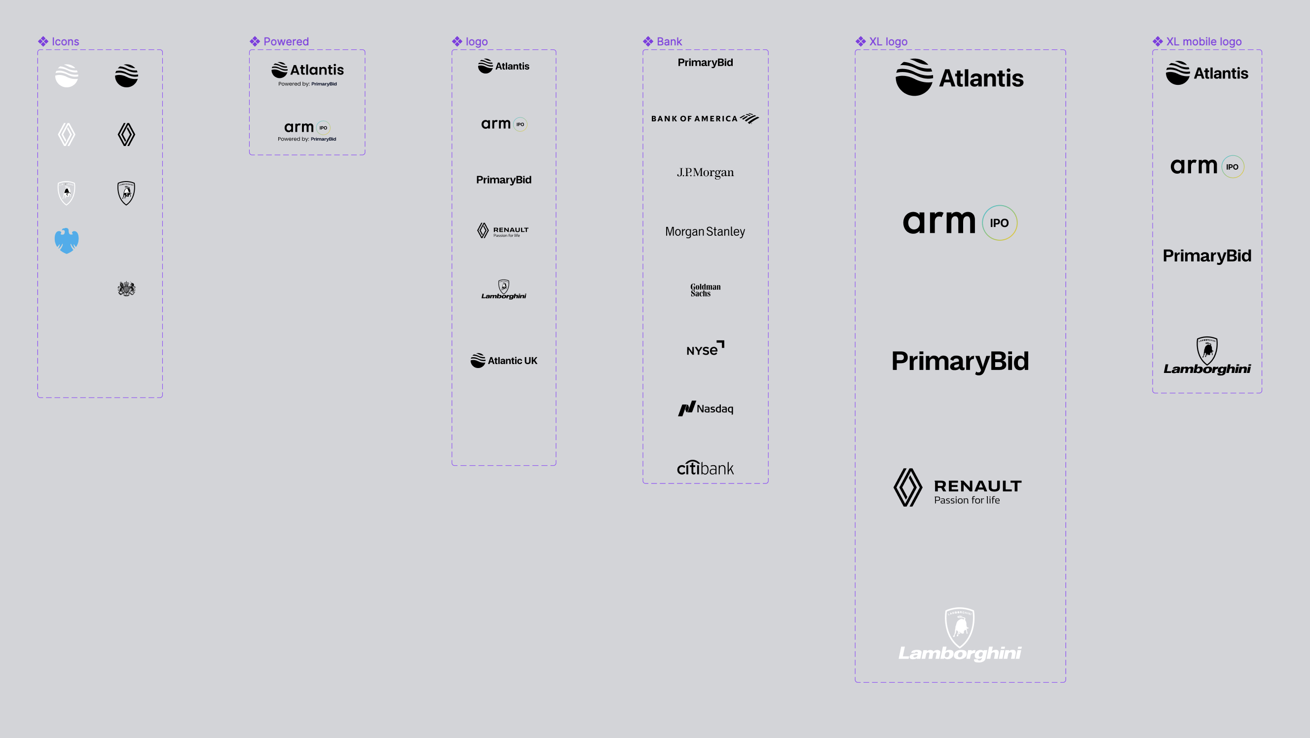
PrimaryBid worked with a growing network of issuers, banks and brokers. Rather than designing every partner experience from scratch, I developed configurable components that could adapt to different brands, content and transactional journeys.
The system covered modular layouts, partner logos, progress indicators, alerts, investment controls, regulatory information and payment states — creating a consistent foundation that could scale across propositions.
These same foundations also supported product concepts used during IPO pitches, allowing different issuer, bank, broker and partner propositions to be represented without rebuilding every experience from scratch.
20 Wider contribution
My principal ownership was T-Web, but my role also extended into the broker dashboard and the product system used to support IPO pitches.
I oversaw and supported design work for PrimaryBid’s broker dashboard, reviewing journey structure, information architecture and interaction patterns.
I helped the designer responsible for the detailed execution work through complex regulated workflows and ensured the dashboard remained consistent with the wider product ecosystem.
I created adaptable interface concepts and reusable patterns used to support IPO pitches across issuers, banks, brokers and partner brands.
The system covered configurable branding, logos, content, progress indicators, alerts, investment controls, regulatory information and payment states.
I later handed the design-system work to another designer and supported the transition so it could continue evolving beyond my direct involvement.
21 Working with engineering
My involvement continued beyond design handoff. I worked with product and engineering throughout feasibility discussions, acceptance criteria, implementation reviews and staged releases for T-Web.
Validate the concept and interaction model
Test whether the proposed capability solved a meaningful problem
Expose the experience to a controlled customer group
Validate production behaviour before wider availability
Release to the broader customer base
Improve the experience through ongoing learning
22 Mentoring and team contribution
Alongside my direct ownership of T-Web, I supported designers working across the broker dashboard and IPO design system.
I reviewed work, helped structure complex regulated journeys, provided critique on information architecture and interaction design, and supported the handover of reusable patterns.
This allowed the wider team to continue evolving the products consistently while keeping detailed execution with the relevant designer.
23 Outcome
The work established the foundations for a transactional website shaped around how investors researched opportunities and made decisions, while complementing the existing native app.
Established evidence that a meaningful group of customers wanted transactional web access.
Defined how T-Web could support deeper research and considered transactions alongside the native app’s more immediate experience.
Linked discovery, research, applications, payments, order tracking and account management within one transactional website.
Created a consistent T-Web experience across desktop, tablet and mobile web.
Developed configurable components for partner, issuer and IPO pitch experiences.
Supported broker-dashboard quality through design review, guidance and mentoring.
Supported the structure and quality of broker-facing workflows through design review, guidance and mentoring.
Mapped onboarding failure scenarios and designed clearer validation and recovery states.
Supported T-Web from prototype through validation and staged release.
24 Additional improvements
Mapped drop-off causes and introduced clearer validation and recovery paths.
Allowed customers to verify and correct critical information before payment.
Created adaptable interface foundations that helped the team present branded investor experiences more consistently.