Customer need
Customers wanted inspiration, but also needed structure. Planning meals across the week created too much decision-making when the journey relied on browsing individual recipes.
01 Case Study
Designing a meal-centric shopping experience for Waitrose.
A personalised meal planning experience that transformed recipe browsing into a guided, meal-based shopping journey. The goal was to help customers move from inspiration to planning, then towards ingredients and basket creation with less effort and more confidence.

I led the product design across the Meal Plans experience, shaping the journey from early research and competitor analysis through to information architecture, recipe-card improvements, MVP design, accessibility refinements and post-launch optimisation.
02 Overview
Customers were using recipes for inspiration, but the experience did not fully support how people actually plan meals. They still had to browse recipe by recipe, decide what was suitable, work out ingredients, check what they already had at home and manually move from inspiration into shopping.
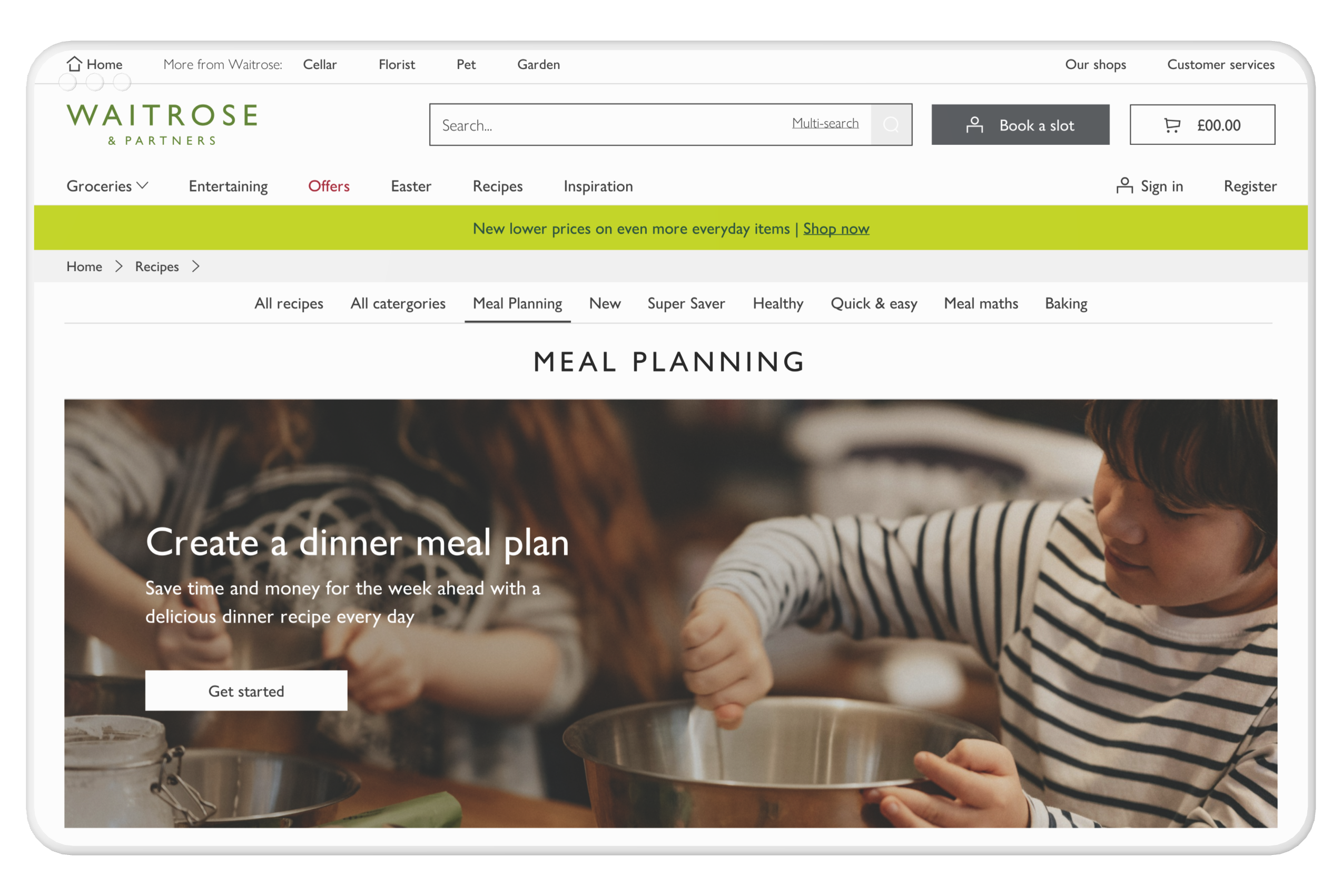
Meal Plans explored how Waitrose could move from passive recipe browsing into a guided planning journey that helped customers build a weekly plan around their dietary needs, routines, household size and lifestyle.
Key idea: Customers do not just shop for ingredients. They plan meals around routines, households, time, budget, dietary needs and the reality of a busy week.
03 Why this mattered
Meal Plans mattered because recipes were already a strong source of inspiration, but the journey was fragmented. Customers could find recipes, but there was no clear system to help them turn those recipes into a plan, then into a shop.
Customers wanted inspiration, but also needed structure. Planning meals across the week created too much decision-making when the journey relied on browsing individual recipes.
Recipe users were commercially valuable, with recipe-led journeys linked to higher spend and stronger engagement.
Recipes helped customers discover meals, but they did not provide enough support for planning, saving, personalising and turning recipes into basket-ready ingredients.
04 Behavioural insight
The core problem was not just usability. Customers understood recipes, but confidence dropped when they had to make repeated decisions across a full week.
They needed guidance, but not a loss of control.
Observed behaviours
The challenge was not showing more recipes. It was helping customers turn inspiration into a practical plan.
05 Competitor analysis
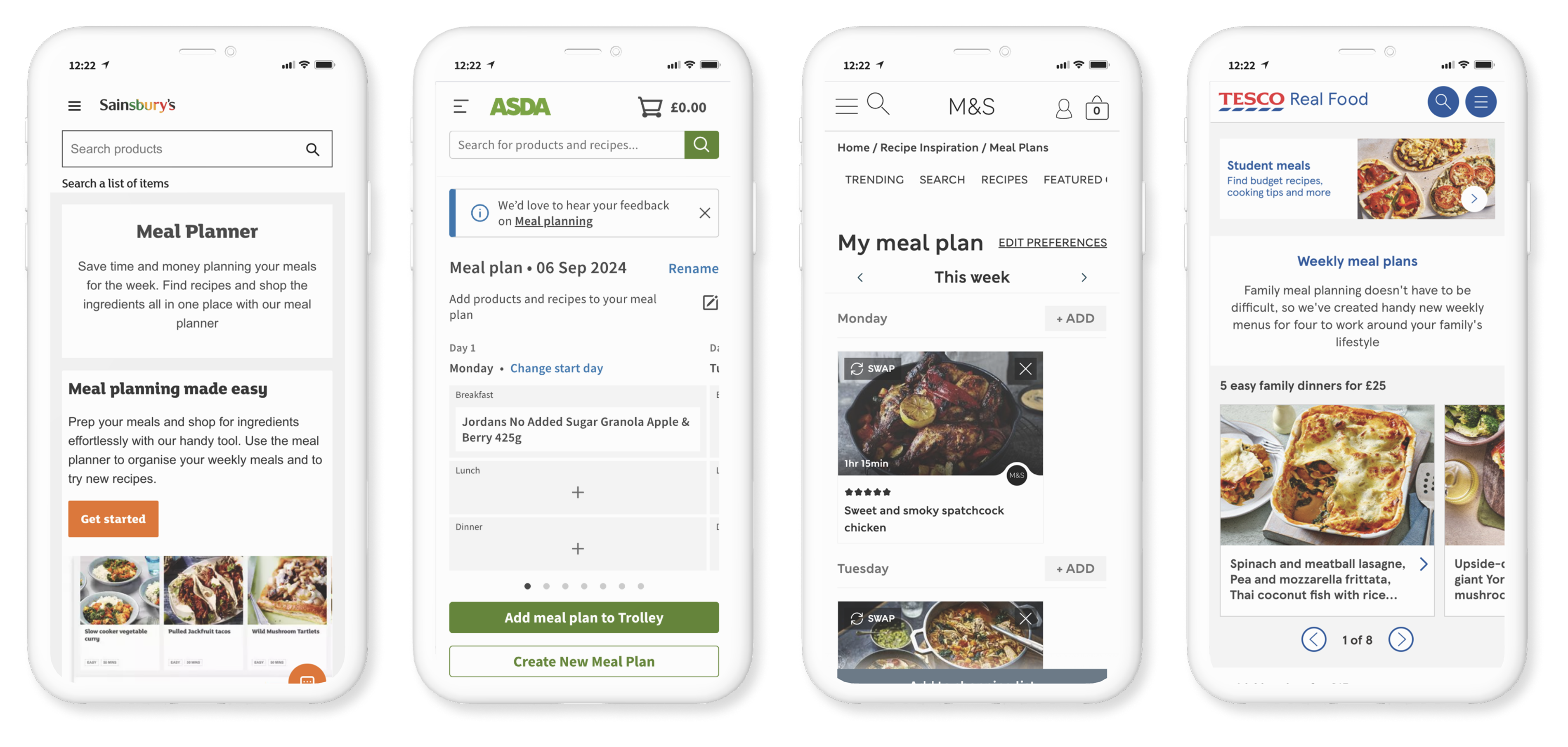
Before designing Meal Plans, I analysed Tesco, M&S and Sainsbury's to understand how each brand approached recipes, inspiration and meal planning.
The important learning was not just what each competitor displayed on the page. It was why they had chosen that direction, and what customer behaviour they were trying to influence.
A strong meal planning experience depends on strong recipe foundations. If customers do not trust, understand or feel inspired by the recipes, they are unlikely to commit to building a weekly plan around them.
Tesco focused on customer confidence by highlighting ratings, reviews, save, share and customer feedback.
This made sense because recipes require customers to invest both time and money. Ratings and reviews reduce uncertainty by showing that other customers have already cooked, tested and trusted the recipe.
What this told me
For Meal Plans to work, recipe cards needed to build confidence quickly. Customers needed social proof, clear ratings and useful decision-making information before selecting meals for the week.

M&S leaned heavily into social reach, using social media, campaign content and influencer-style inspiration.
This was a strong strategic choice because 75% of users looking for food inspiration use social media. M&S targeted customers directly at the source of inspiration rather than relying only on traditional recipe browsing.
What this told me
Meal Plans could not rely only on functional planning. It also needed to feel inspiring, visual and emotionally engaging enough to compete with the way customers already discover food ideas.

Sainsbury's focused on quick and easy recipes as a core category.
This aligned with customer behaviour during the working week, especially Monday to Thursday, when customers have less time and need practical meal solutions. Quick and easy recipes also generated the highest revenue as a recipe category because they solved a frequent, high-intent customer need.
What this told me
Meal Plans needed to prioritise practical weekly use cases, not just inspirational cooking. Plans around quick dinners, budget meals, batch cooking, leftovers and healthy weekday options would likely create stronger repeat value.
The opportunity for Waitrose was to combine the strongest parts of each competitor approach:
This shaped the direction for Meal Plans: create a guided planning experience that felt inspiring, trustworthy and useful for real weekly routines.
The goal was not just to help customers find recipes. It was to help them confidently turn food inspiration into a practical meal plan and, eventually, a shop.
06 The problem
Customers faced multiple friction points when trying to move from recipe inspiration into meal planning.
Customers had to browse, compare, remember and decide across multiple recipes.
Recipes could inspire customers, but the next step into planning and shopping was not clear enough.
Dietary needs, serving size and lifestyle preferences were not always reflected strongly enough.
Customers needed a way to return to recipes and plans later, especially if planning ahead.
Customers needed stronger decision-making information before selecting a recipe.
Recipe tagging, AEM authoring, shop-able recipes and content structure limited how personalised and flexible Meal Plans could become.
07 Recipe cards as decision engines
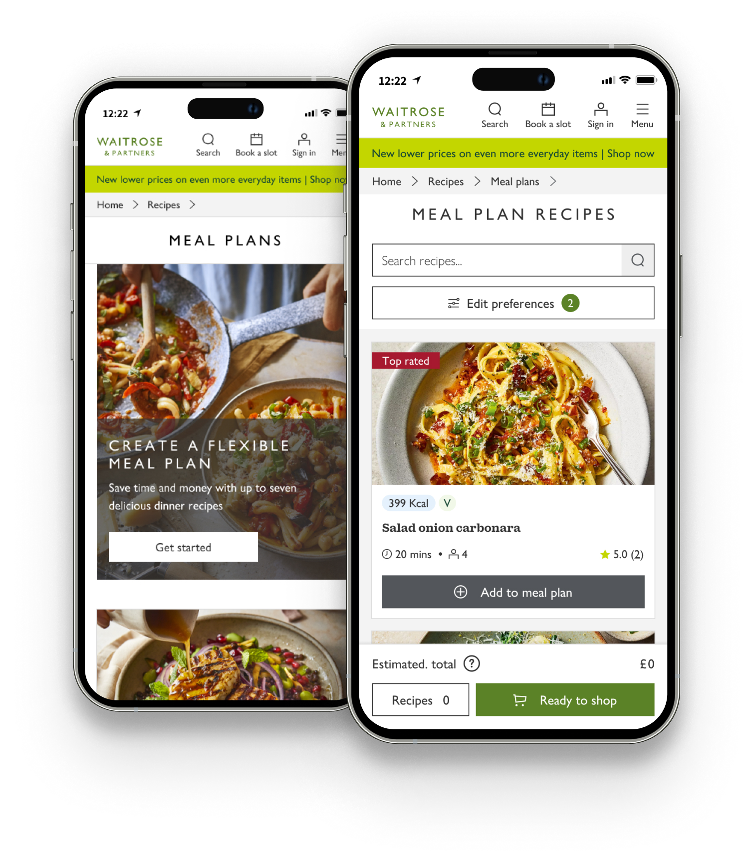
Recipe cards became a critical part of the experience because customers make quick decisions based on a small set of signals.
The recipe card needed to answer

The recipe image creates the first moment of attention.
Customers were more confident when recipes had strong ratings, especially around four stars or higher.
Reviews gave customers social proof, tips and reassurance from people who had already tried the recipe.
Dietary information needed to be visible because it directly shaped whether a recipe was usable.
Convenience was critical, especially during the week.
Too many ingredients, or hard-to-find ingredients, could put customers off.
Customers wanted recipes that felt achievable, especially for weekday cooking.
This shifted the design focus from simply displaying recipes to helping customers make confident meal-planning decisions.
08 Product direction
The strategic direction was to move away from isolated recipe discovery and towards a guided meal planning system.
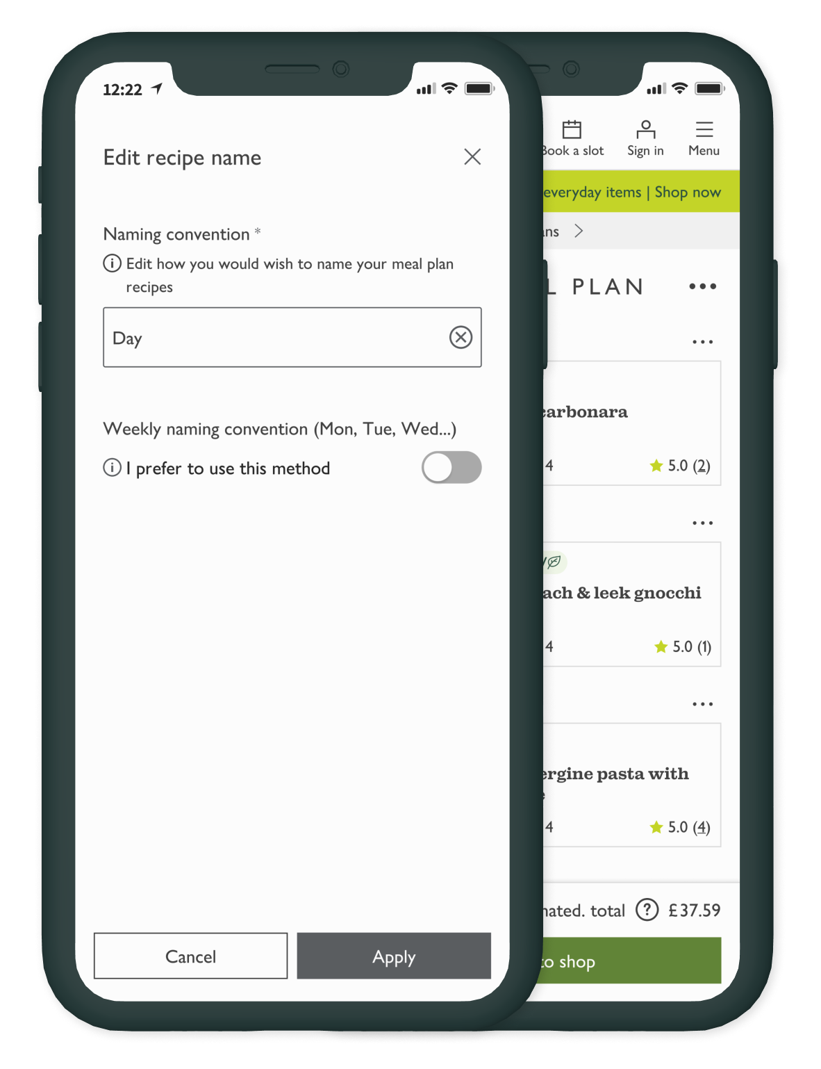
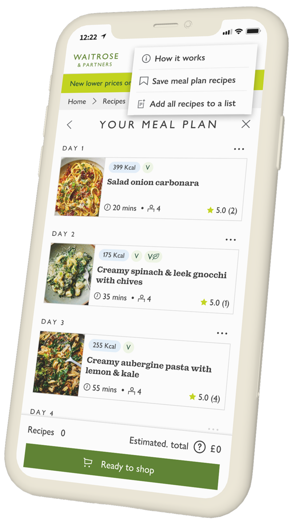
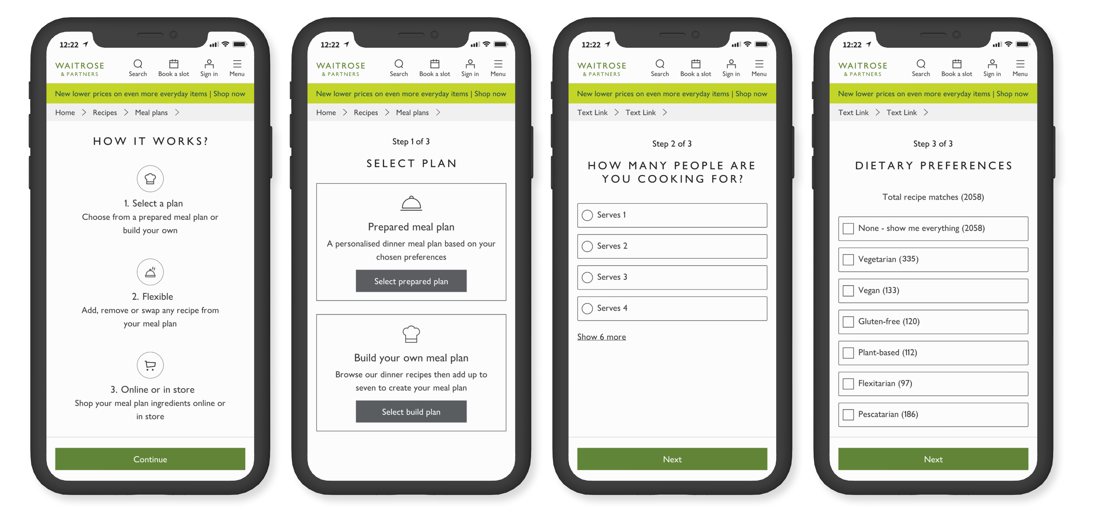
Instead of making customers browse recipe by recipe, Meal Plans helped them set preferences, review recipes, build a weekly plan and move towards ingredients.
Before
After
09 Design principles
Meal planning needed to reflect real constraints such as time, diet, budget, household size and food waste.
Customers needed help narrowing options rather than being left with open-ended recipe browsing.
Recipe cards needed to surface the most important decision signals quickly.
Customers needed to adjust meals, servings and preferences before committing.
Personalisation depended on better tagging, shop-able recipes and content structure.
Customers needed to review what was selected before moving towards ingredients or basket creation.
10 Collaboration and prioritisation
I worked with engineers to compare potential features by customer value and backend/frontend complexity. This helped the team understand what should be prioritised for the MVP and what needed to move into later phases.
Features considered
Ratings, reviews, save, adjust servings, recipe videos and price helped customers make better decisions.
Some features needed deeper backend, frontend or data support before they could scale.
The MVP focused on proving the guided meal planning journey while identifying which recipe and data foundations needed improvement next.
11 System constraints and trade-offs
Meal Plans showed that product design was not just about the interface. The quality of the experience depended on recipe data, tagging, content governance, AEM constraints and whether recipes were shop-able.
The design had to work within existing AEM components and tight delivery timelines.
Limited tagging reduced how personalised filtering and plan generation could become.
Not all recipes were shop-able, which limited the route from meal planning into basket creation.
Changes in content ownership created inconsistencies in how recipes were created, tagged and published.
Recipes were not editable in some areas to avoid customers accidentally replacing ingredients that affected dietary or tolerance needs.
Broad serving ranges helped coverage, but reduced confidence for customers planning around exact household needs.
12 The solution
Phase 1 gave customers a way to create a weekly meal plan tailored to dietary preferences and lifestyle choices, with the aim of providing convenience, variety and healthier eating options.
13 Accessibility improvements
Accessibility testing identified that the journey was understandable, but some interaction patterns needed more clarity.
Initial score
88%
Updated score
95%
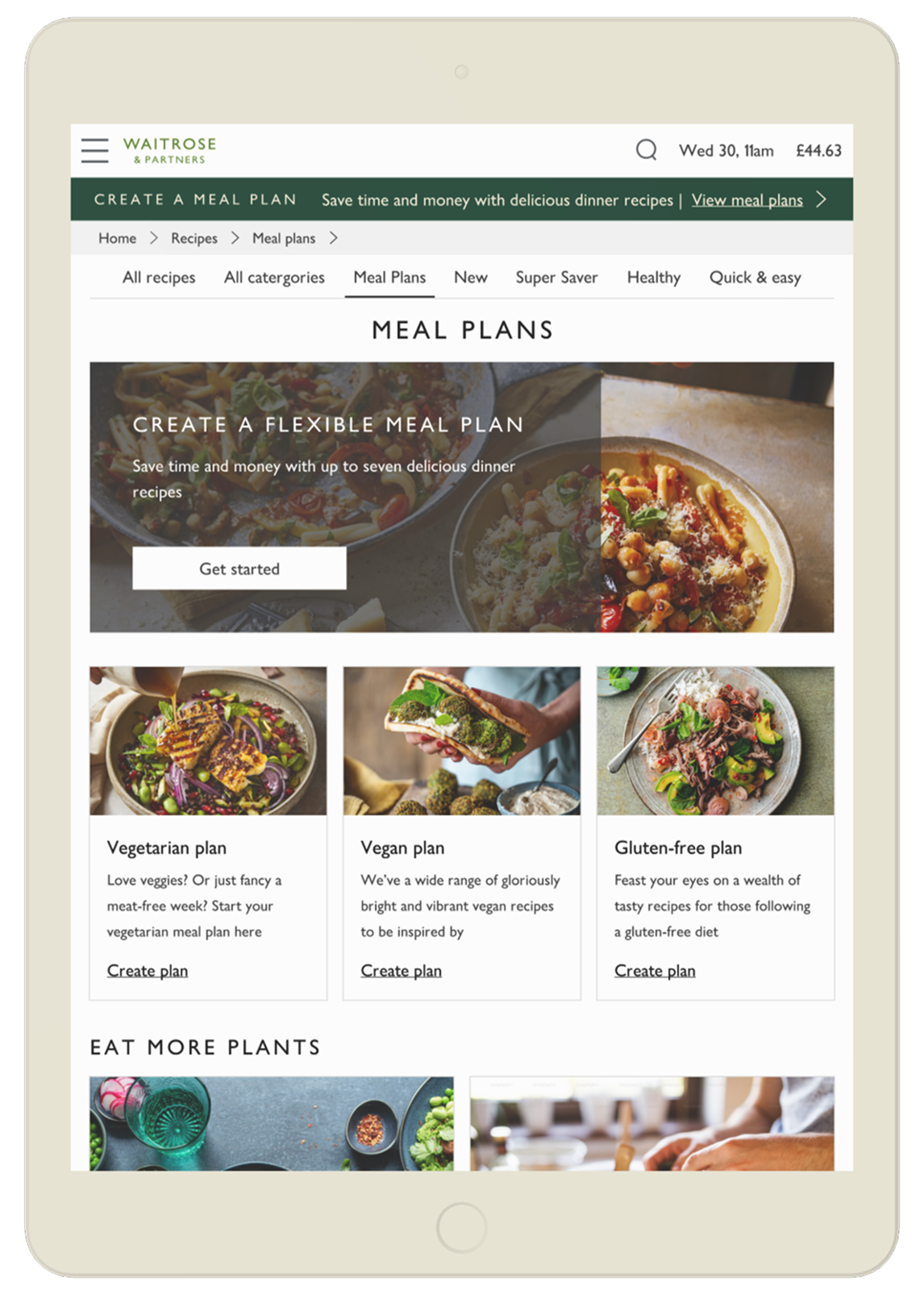
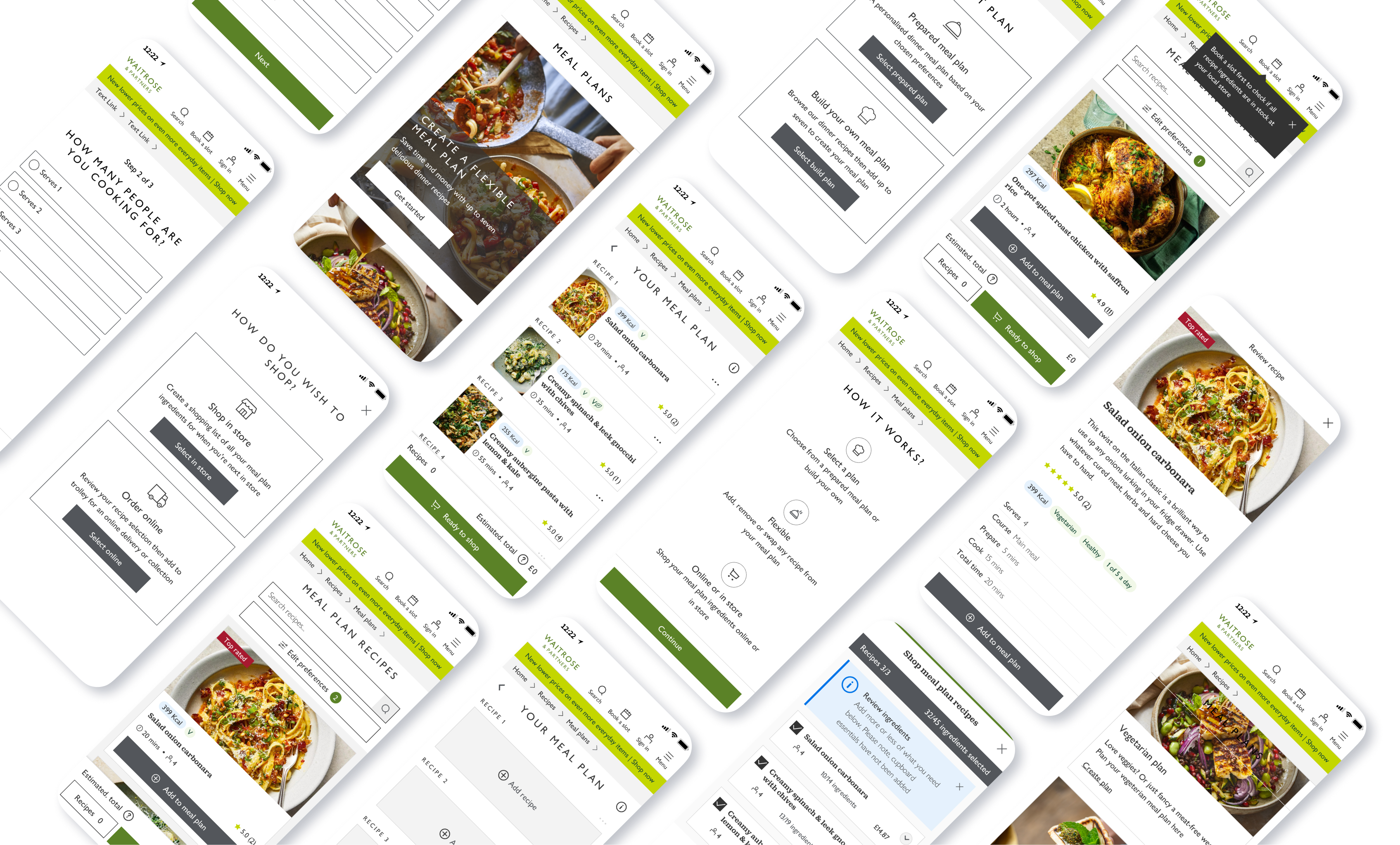
Adding numbers helped users understand where they were in the onboarding journey.
Darker chevrons made ingredient sections easier to discover and open.
Changing the CTA from secondary to primary improved contrast and made the action clearer.
Adding a "none / show me everything" option matched the pattern from previous screens and reassured users they had made a selection.
The accessibility work showed how small, practical interface changes could materially improve clarity without large development effort.
14 Validation and feedback
Hotjar feedback and user testing showed that customers found the experience useful and inspiring, but they wanted more control, more filters and more recipe depth.
Customers found the experience easy to use, quick and inspiring.
Customers wanted more dietary filters, clearer serving sizes, save functionality, more recipe options and fewer duplicated ingredients.
The concept had value, but the next phase needed stronger personalisation, better recipe data and more flexible planning controls.
15 Trade-offs & delivery constraints
Meal Plans was not only a UX challenge. The experience depended on recipe content, dietary tagging, backend rules, author confidence and trolley logic all working together. Several constraints shaped what we could ship for MVP and what needed to move into later phases.
Content risk
Many vegan and gluten-free recipes were available for customers to read, but not to add directly to trolley. This was due to concerns around allergens, dietary accuracy and author confidence.
That created a major constraint for Meal Plans because dietary preferences were a core part of the proposition. If those recipes were excluded, customers with specific dietary needs saw less variety and the experience felt less useful.
Trade-off
I worked with recipe authors and content teams to identify which recipes could be reviewed and potentially made shoppable. This created a long dependency, taking around six months of review and back-and-forth, but it helped create a safer path for expanding dietary coverage.
Backend logic
Recipes were tagged by authors with dietary labels such as vegetarian, vegan and pescatarian. However, when customers selected multiple dietary preferences, the backend treated them as combined requirements.
For example, if a customer selected vegetarian and pescatarian, the system only returned recipes that matched both tags. Instead of expanding choice, selecting more dietary preferences reduced the number of available recipes.
Trade-off
The ideal solution was to move towards more inclusive matching, so customers could see vegetarian recipes, pescatarian recipes and recipes that matched both. This required more delivery time than the project allowed, so we worked within the existing logic for MVP and captured it as a future improvement.
Content structure
Because the available recipe pool was limited, serving sizes were grouped together in the backend. Customers could choose ranges such as 1, 2–4, 5–7 and 8+.
This made the experience appear broader, but it created friction. A customer cooking for two people could still be shown a recipe serving four, which made some recommendations feel less relevant and harder to act on.
Trade-off
The frontend had to mirror the backend structure. Showing individual serving sizes in the UI would have created a misleading experience because the returned recipes would still be based on grouped ranges. We kept the grouped model for MVP and captured more precise serving logic for phase two.
Scope control
The original journey allowed customers to build a meal plan, send ingredients to trolley, then complete their final review there. This matched existing shopping behaviour because customers already use trolley to check quantities, remove items, review availability and complete their shop.
During delivery, an additional ingredient review step was added before trolley. I challenged this direction because it duplicated the review behaviour that already existed in trolley, while creating a less reliable experience. Availability, sold out items and duplicate ingredients were clearer once items were in trolley, especially when linked to the customer’s booked slot.
Trade-off
We moved forward with the extra review step for MVP, but it added frontend and backend complexity and contributed to the project timeline extending from an expected 9–10 months to around 14 months. The key learning was that reassurance needs to sit where it creates the most value. In this case, trolley was the stronger review environment.
Looking back, these constraints shaped one of the biggest lessons from the project: a meal planning experience is only as strong as the operational systems behind it. The UX had to work with recipe governance, dietary confidence, backend rules and trolley behaviour, not around them.
16 Impact and results
Despite limited placement on the recipe index, Meal Plans generated meaningful commercial performance and positive customer feedback.
Meal Plans generated more revenue than the Mother's Day placement despite having far lower exposure, showing strong appetite for guided meal planning.
17 What we learned
The project showed that customers valued guided planning, but scaling the experience depended on improving the recipe ecosystem underneath it.
18 Next steps
The next phase should focus on strengthening the foundations that allow Meal Plans to become more personalised, flexible and repeatable.
Enhance AEM data, authoring, chips and recipe tagging.
Surface the decision-making information customers need earlier.
Allow customers to build more personal plans around diet, budget, cuisine and household needs.
Let customers rearrange meals and make the plan feel more flexible.
Introduce planning patterns that reduce waste and support practical weekly routines.
Give customers more control over diet, cost, calories, cuisine and cooking time.
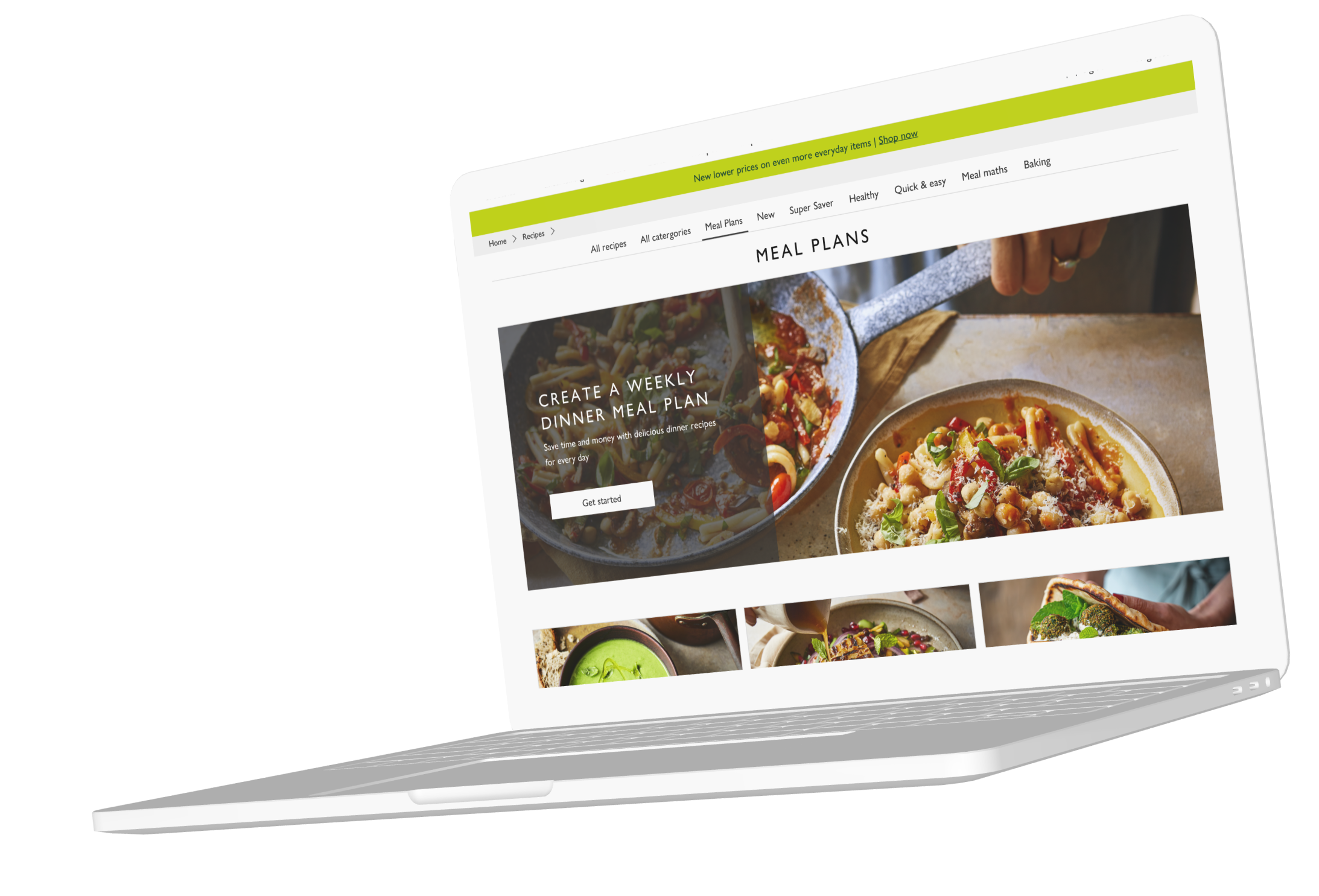
We were not just designing a meal planner. We were designing the bridge between inspiration and shopping.
19 Closing thought
Meal Plans proved that customers saw value in guided planning, but it also revealed that the strongest experience depends on the systems beneath the interface: recipe data, tagging, content quality, accessibility, personalisation and basket logic.
The value was not just helping customers pick recipes. It was helping them turn food inspiration into a practical, repeatable shopping journey.