The Big Group
Top 50 UK London-based design marketing agency that has been helping clients connect with their markets and customers for over 25 years
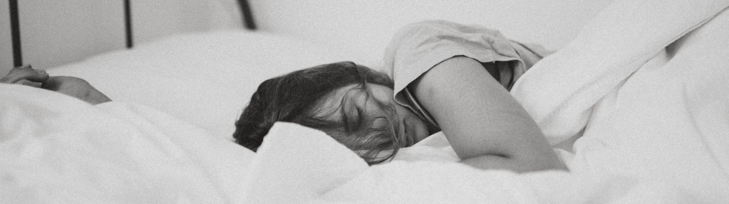
Breathe and relax
Project
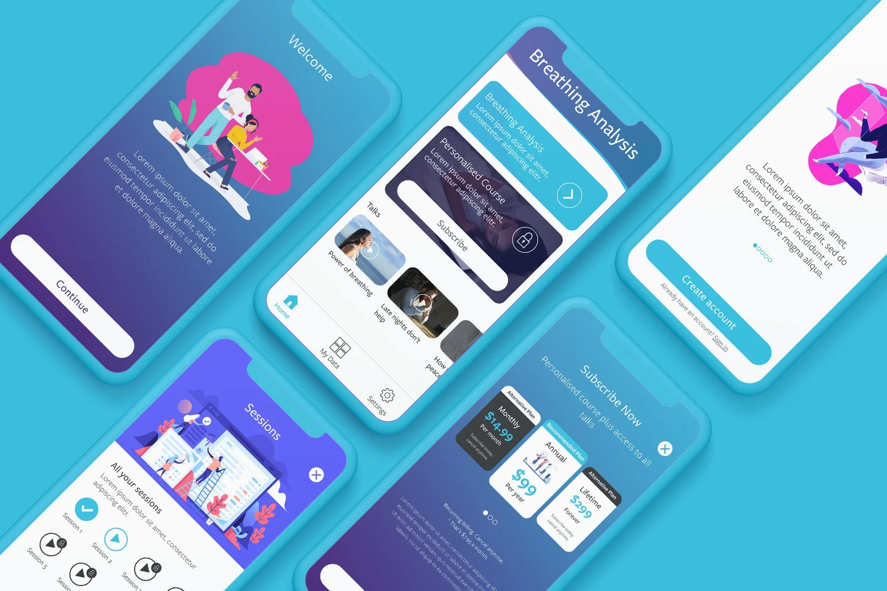
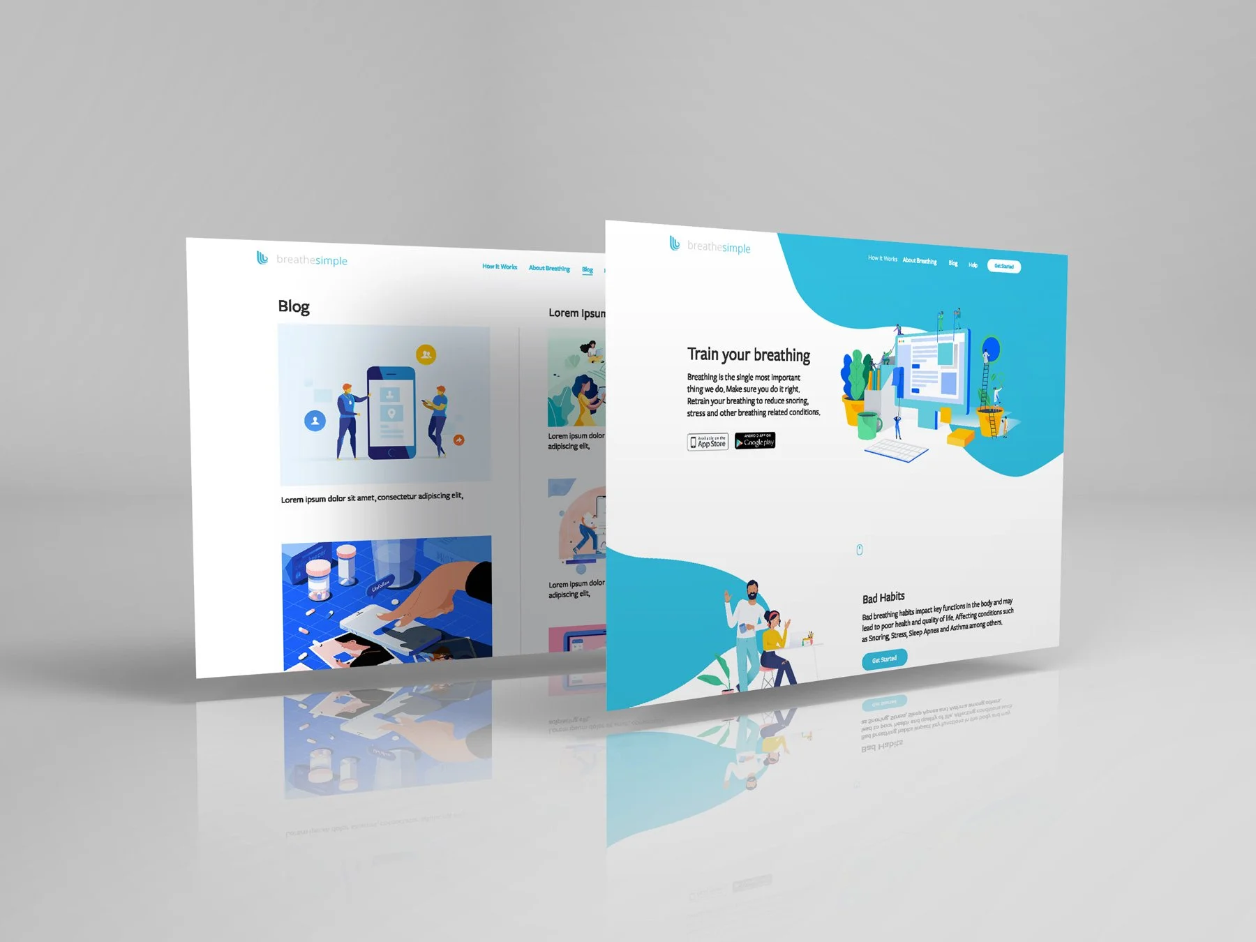
UX/UI Digital Designer | June 2018 - July 2019My first role at The Big Group was to lead the team in creating the UI UX for breathesimple. A company helping people with health issues such as snoring, sleep apnea and stress. Breathing might be straightforward but many of us surprisingly don't breathe how we should and this affects our sleep with can cause health issues. The aim is to help users test their breathing which would then create a personal course to improve the breathing over time.
Logo & Design system
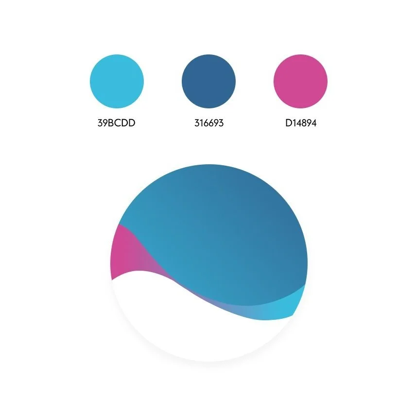
When deciding the style of the brand I had to think of the clients who would be using the platform and what the brand should represent. There had to be a connection with the users who were dealing with these symptoms. I wanted the app and website to portray a calming but clinical professionalism as the scientist behind this concept who patented the idea had worked many years to help people. Light blue is a peaceful, calming colour. According to colour psychology, blue is associated with trustworthiness and reliability. Blue is also said to promote feelings of tranquillity; light blue's gentle appearance means it is particularly likely to make that impression. I wanted the wave effect of breathing to run through the whole brand so I introduced a wave effect to the logo which represented a wave in the ocean which many associated with calm and a sense of tranquillity when by the ocean.
Before creating any idea of the direction I had to understand the product, its capabilities and what exactly it offered the user before putting ideas to paper. The breathing basics course is completely free. It's a 4-day course which will teach you the fundamentals of good breathing. Over the 4 days, we will measure your current breathing behaviour and recommend a longer-term personalised training course tailored to your needs. Once the specific course is ready which is tailor costumed to its user the user can then purchase that course.
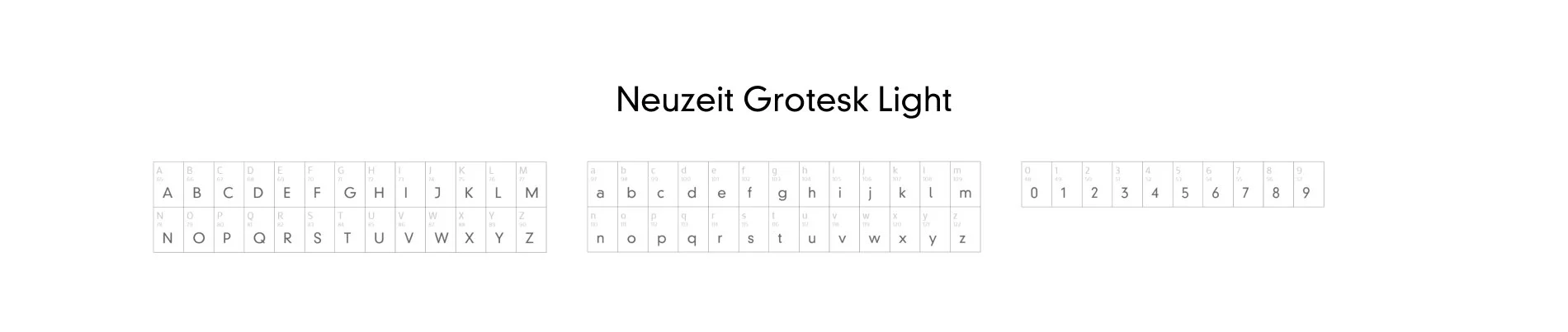
I also wanted to bring a sense of sophistication and this font I felt suited the brand perfectly. The separation of characters were far apart to clearly identify each letter clearly. As most of the users that will be using this platform would be mostly of the elder generation.
Understanding the patients
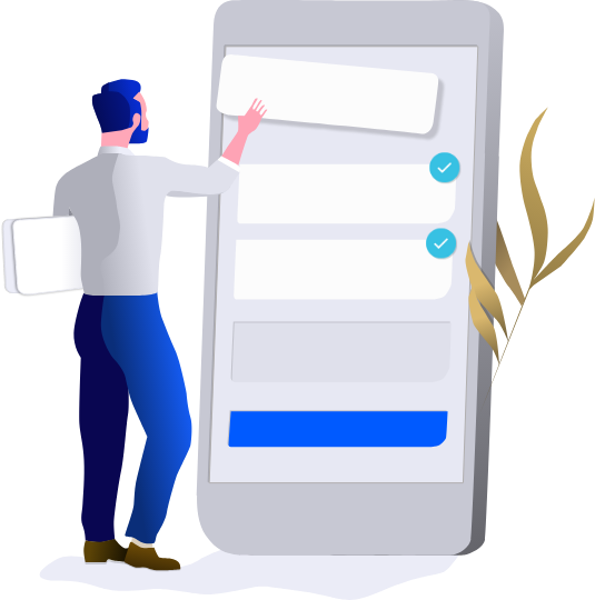
Record your breathing
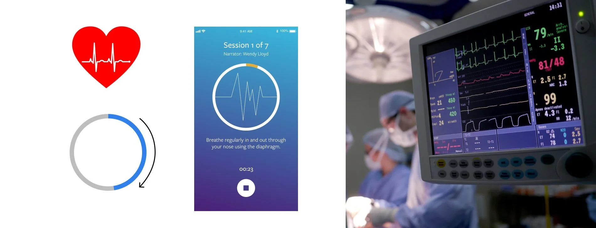
So firstly the patient needs to give us their pattern of breathing for a number of days before we can recommend them a plan. I need to design a screen to tell users that they had to breathe normally for a few minutes so their breathing patterns can be recorded. The user will need to do this in a quiet place and to be sitting upright. The audio narrator that will be speaking to the user is Wendy Lloyd, an English voice-over artist and radio and TV presenter. I researched other apps that helped users to be calm and meditate, it was a great insight of how to tell a story with a clear and calm voice. I felt apps such as Headspace, Calm & Fabulous did it best when showing a timer, countdown and audio calming the user as they gave instructions.
I studied the heart and its wave pattern. How a medical wave reads on a screen in a hospital when being examined by a doctor. The indicator also had to show a visible timer and countdown. The user needed to be able to stop and play at any time even though this could interrupt their breathing. Indication of sessions and how far along they are. All this was taken into consideration when creating the main screen.
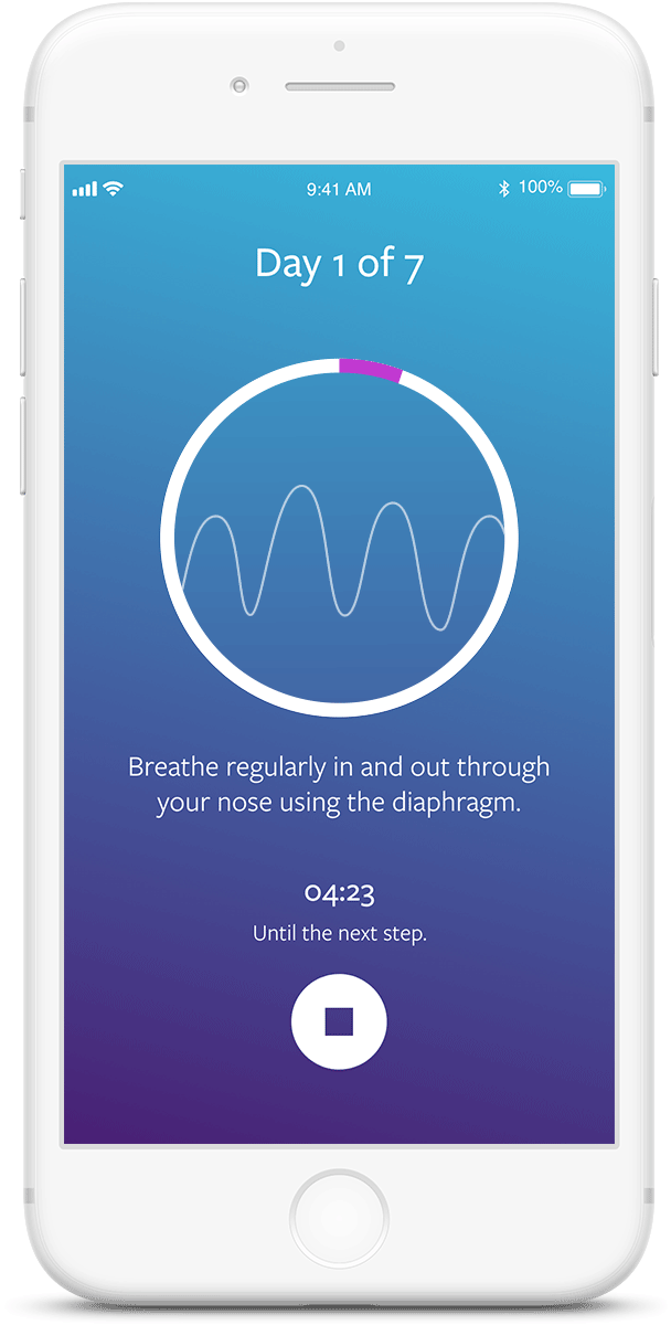
Let’s start recording
Did you know your brain is constantly changing? As we go through life, new experiences, challenges and even physical injuries can all stimulate the brain to create new neural pathways or reorganise existing ones. This re-programming of the brain is called Neuroplasticity and is key to improving your breathing.
Tell me your symtons
My first protocol when beginning a project is to start with research, even though I couldn't compare this type of project with another as it was the first of its kind I still had opportunities to look closely at other medical apps, websites and designs to help me with my creativity. When I have built up a group of designs I dissect each part and it helps me put together a plan on how to move forward when creating my first prototype and workflow.
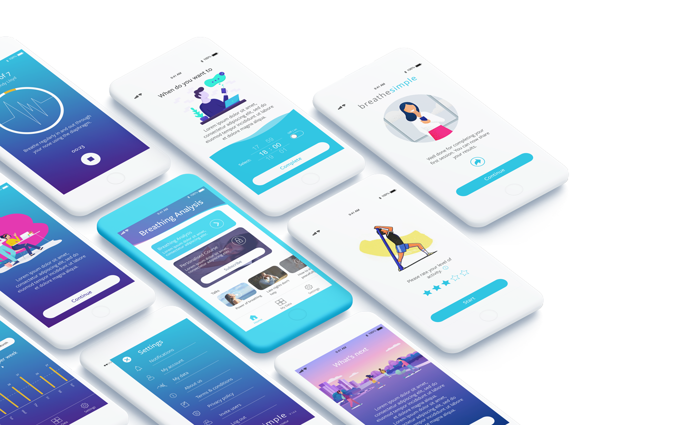
I wanted to keep it simple, clean and fun but still have a look which meant we're professional after all we're advising users on their health so when used people would have to feel confident when using the app which will be the main focus of the project as it is the app which would provide the training for users breathing. After some research, I knew that the colour blue was a common style in the medical field and colour users would feel comfortable with. The font was clean and had a rounded style to it and to complete the overall look a beautiful but strong gradient completed the foundation of the design.
Over the years I've grown to have a style which you can see throughout my designs. I like to keep things simple, clean and minimalistic. Adding popping colour brings a sense of vibrancy and receiving feedback from users just confirms that it works great.
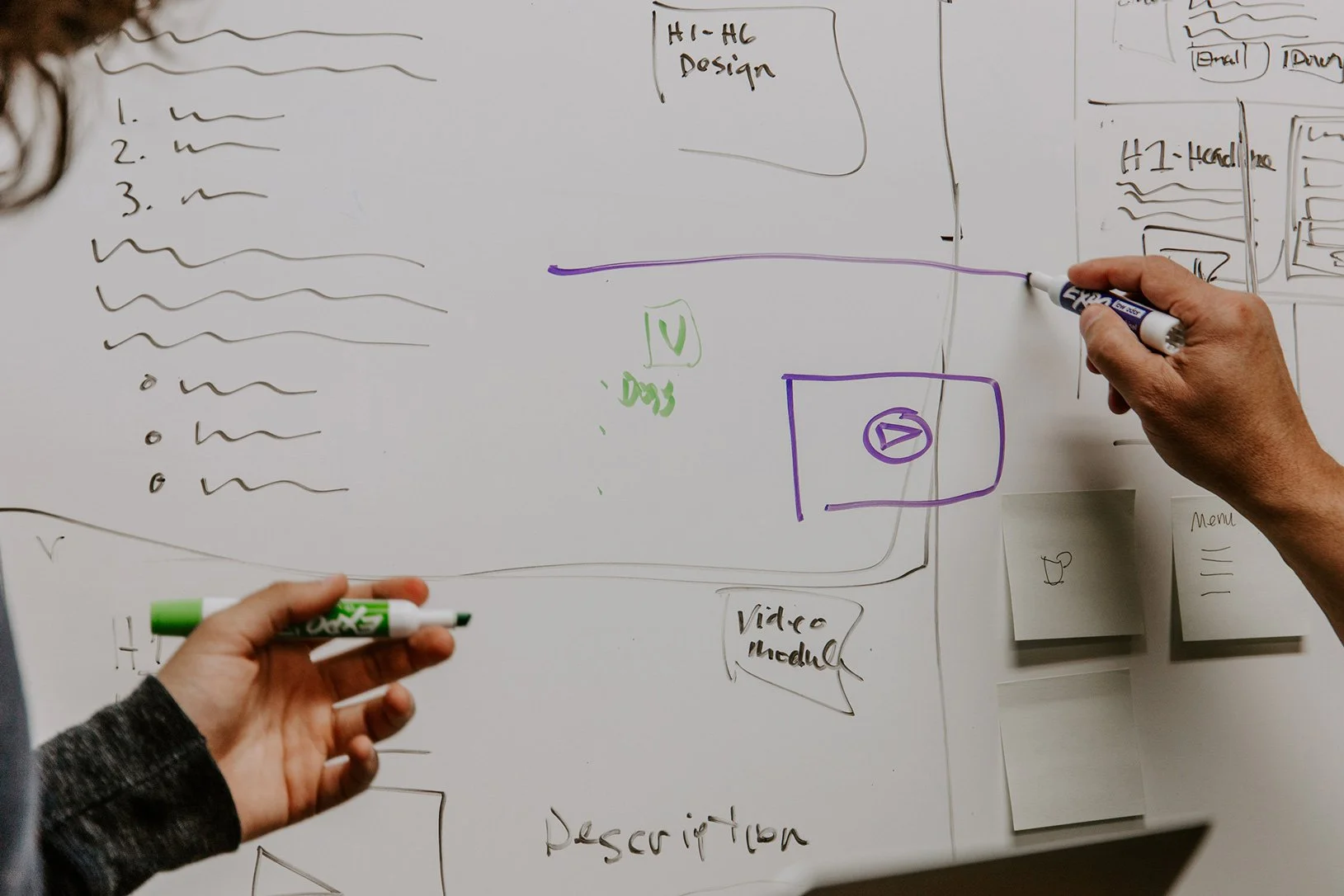
What is great a bout placing thoughts onto the wall is that we can have some fun with it, tasks don't have to be tedious and the team can get together and lay down their thoughts.
I put together a final design to show off the app and hopefully, this animation does just that. What you're viewing is the first draft of the design but creating a prototype and putting it together to allow the team to see how it would function is always a step I like to take as it's a great opportunity for feedback.
Guerilla testing
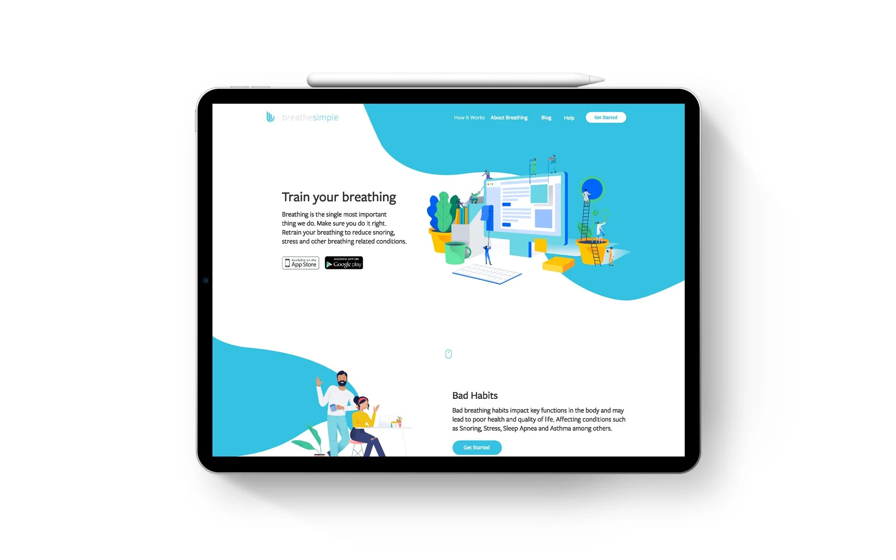
Building the company website
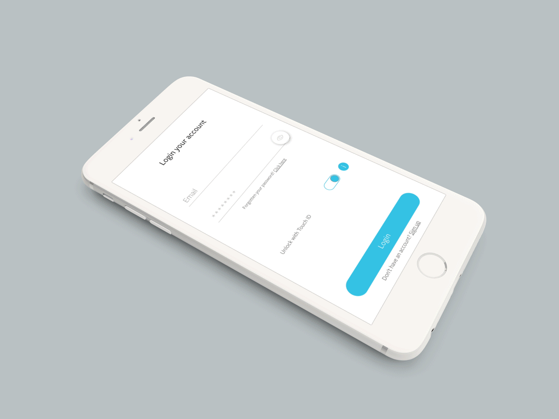
Putting the website together was fun and throwing ideas around with the team was great. I wanted the website to continue with the same theme used in the app with lovely curved shapes and vibrant blue colour which instantly shouted out confidence and adding the illustrations to complete the design just worked beautifully. Designing the website on XD and then cutting it up for the developers was easy and a great tool to work with. It does help having an understanding of your tools capabilities but as this was my first time using XD I had to learn while I worked on this project.
Test, test ,test
The funnels created in Firebase allow me to easily monitor the performance on a daily basis. I can look at A/B testing and see if certain methods were better than others and can measure how customers respond to certain features or points within their journey. Hotjar is another tool I have used to measure users’ experience on our website. With funnels and heat maps I can quickly determine how users respond to certain aspects of the website and with other percentages available to me can see how long they have browsed the site and what was their journey. This part of the role is just as important as making the products as attractive as possible and user-friendly of course.
Illustrations
Using illustration was a major part of the project and I need the illustration to provide information to the user just by looking at the design you could understand exactly what was going on before reading the information. We contracted an illustrator and together worked on the designs to build the project as one.
Big Group website
Project
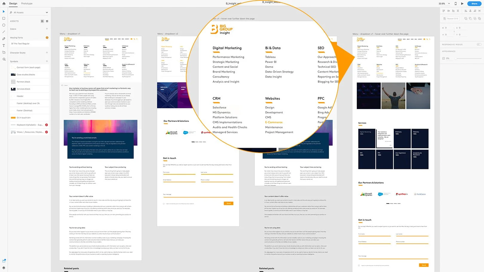
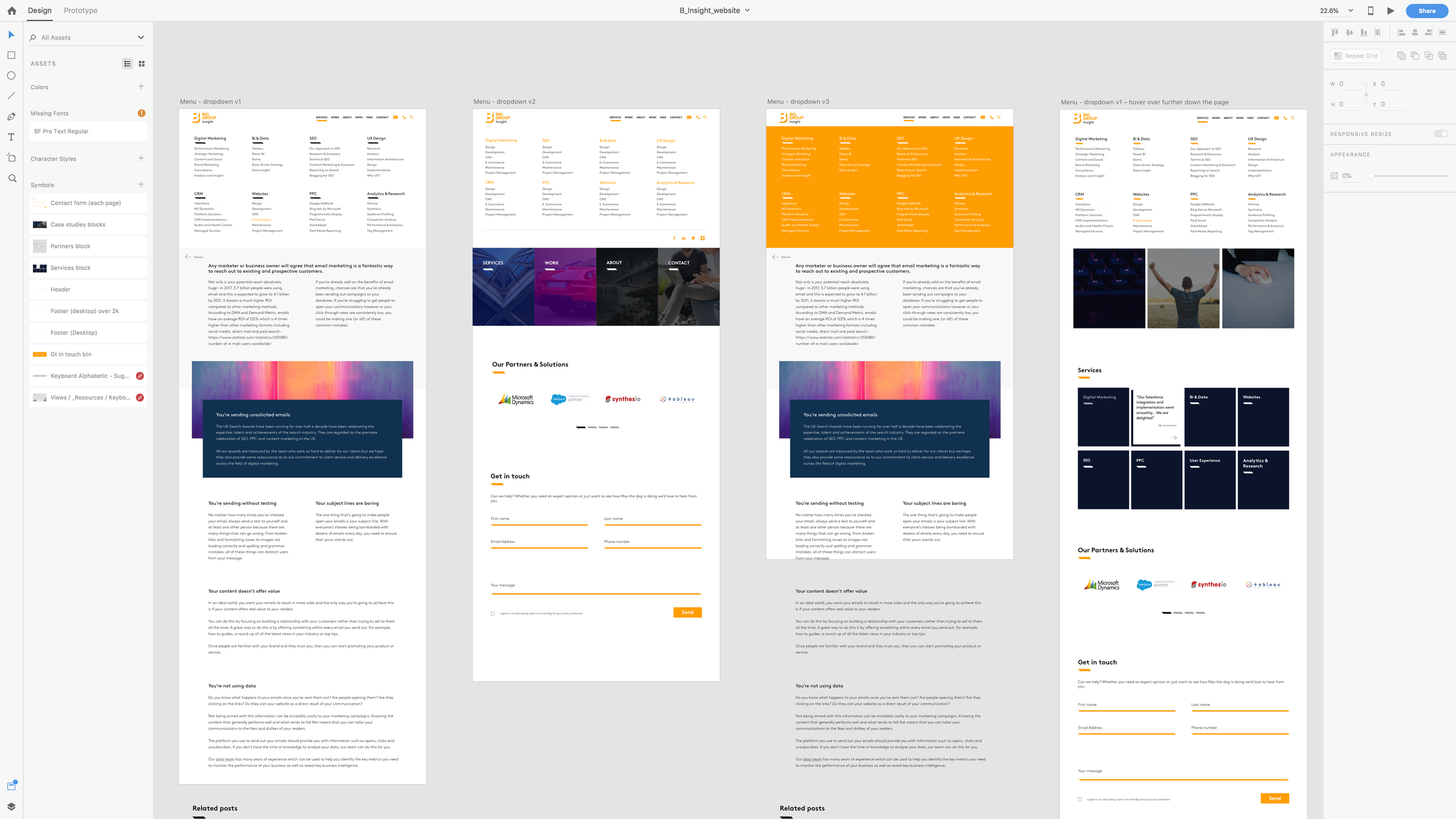
The Big Group were expanding and needed a webpage to include the next part of its extension, Insight. The only difference was that this webpage consisted of many levels to branch off to different parts of the Big Group company website as a whole. more to follow
Design system
Lorem ipsum dolor sit amet, consectetur adipiscing elit, sed do eiusmod tempor incididunt ut labore et dolore magna aliqua. Ut enim ad minim veniam, quis nostrud exercitation ullamco laboris nisi ut aliquip ex ea commodo consequat.
Lorem ipsum dolor sit amet, consectetur adipiscing elit, sed do eiusmod tempor incididunt ut labore et dolore magna aliqua. Ut enim ad minim veniam, quis nostrud exercitation ullamco laboris nisi ut aliquip ex ea commodo consequat.

Project
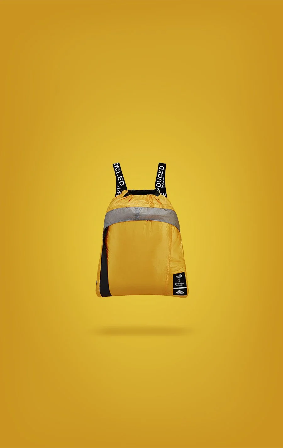
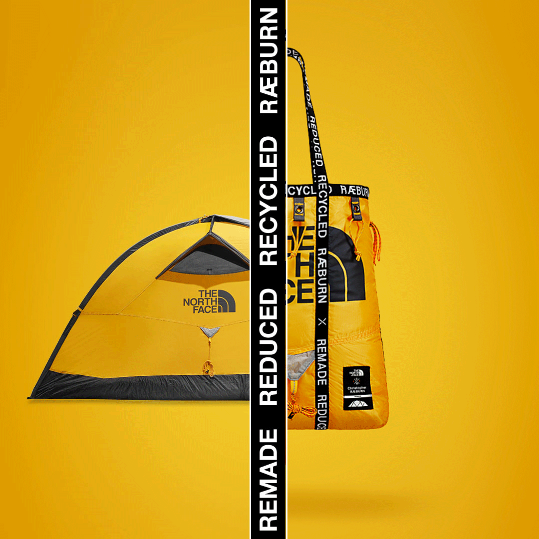
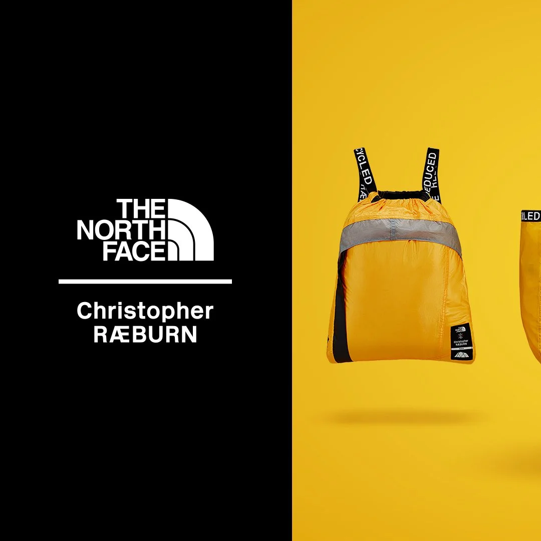
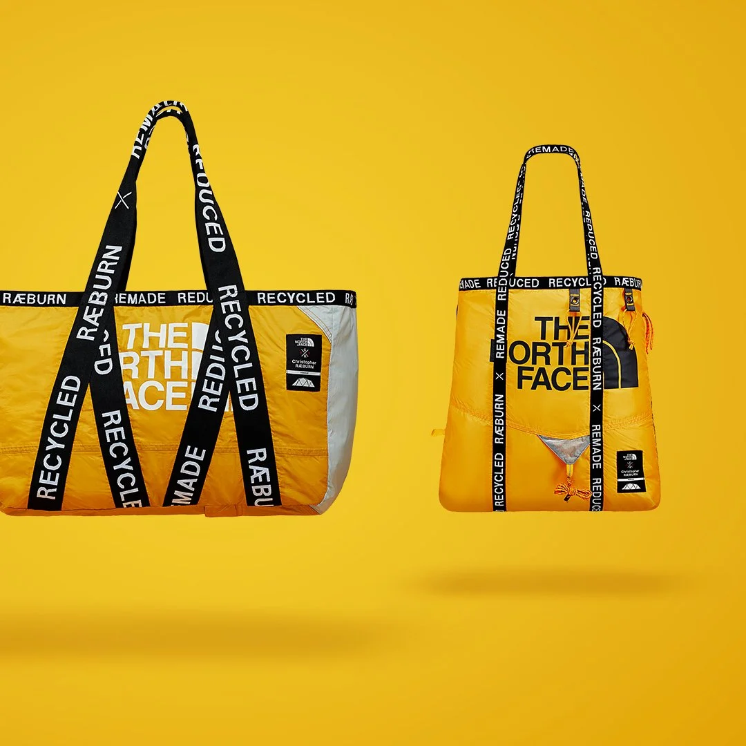
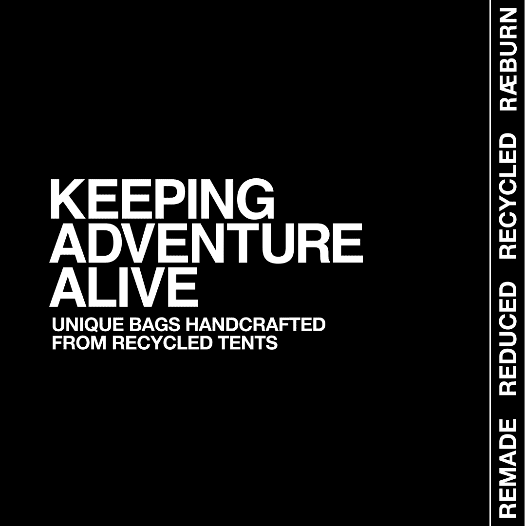
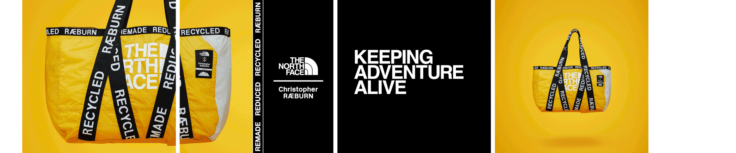
One of my favourite brands being an outdoor person was The North Face and I had this opportunity to work on their new merchandise which involved a British designer keen on using recycled tents and creating new products with them such as the bag you see below. The idea behind this task was to keep the design clean and minimalistic to keep the colour palette to a minimum achieved this and with added animation really made this a fine project to work on.
Let’s make bags
It all begins with an idea. Maybe you want to launch a business. Maybe you want to turn a hobby into something more or maybe you have a creative project.


Lorem ipsum dolor sit amet, consectetur adipiscing elit, sed do eiusmod tempor incididunt ut labore et dolore magna aliqua. Ut enim ad minim veniam, quis nostrud exercitation ullamco laboris nisi ut aliquip ex ea commodo consequat.
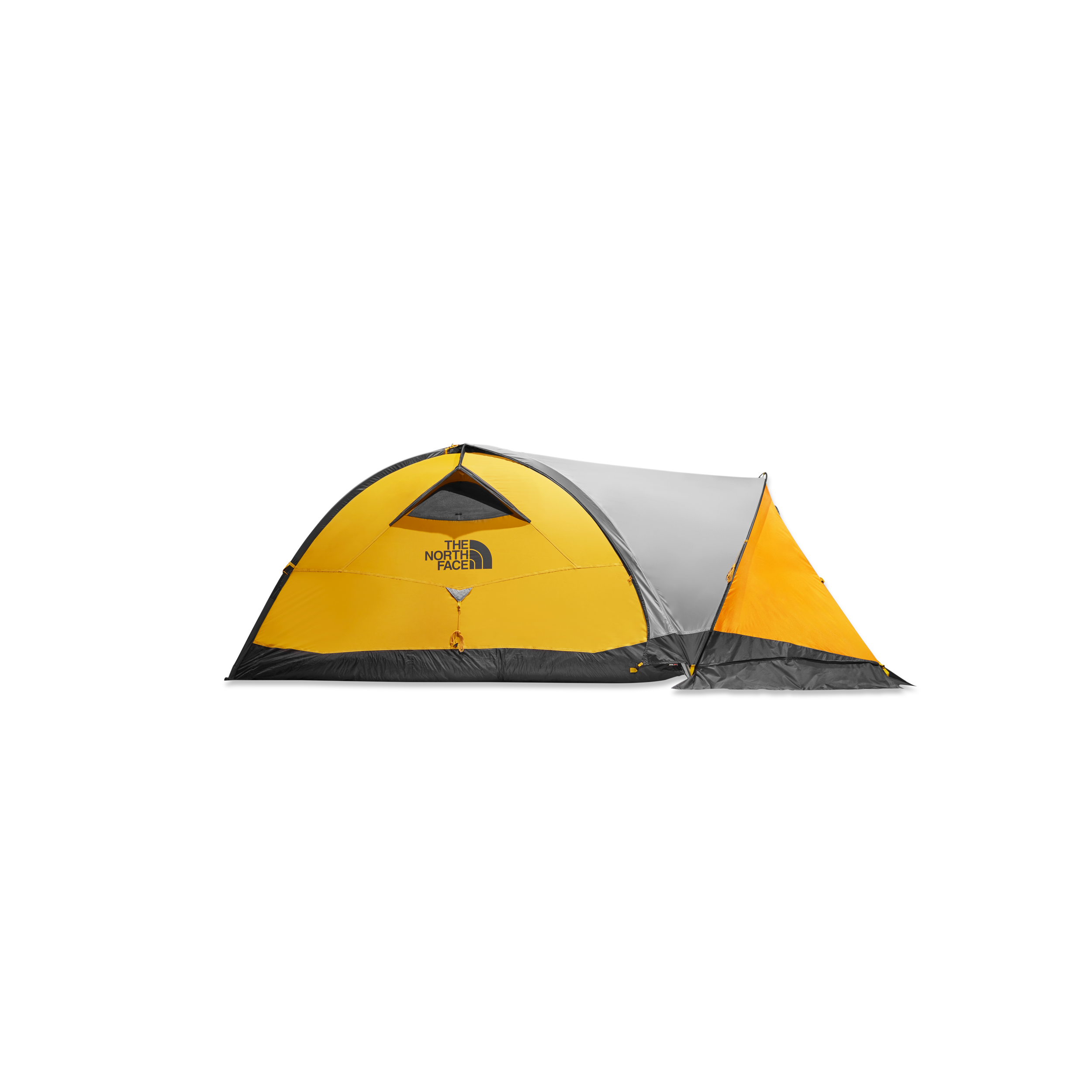
Use. Bin. Recycle.
Process
-
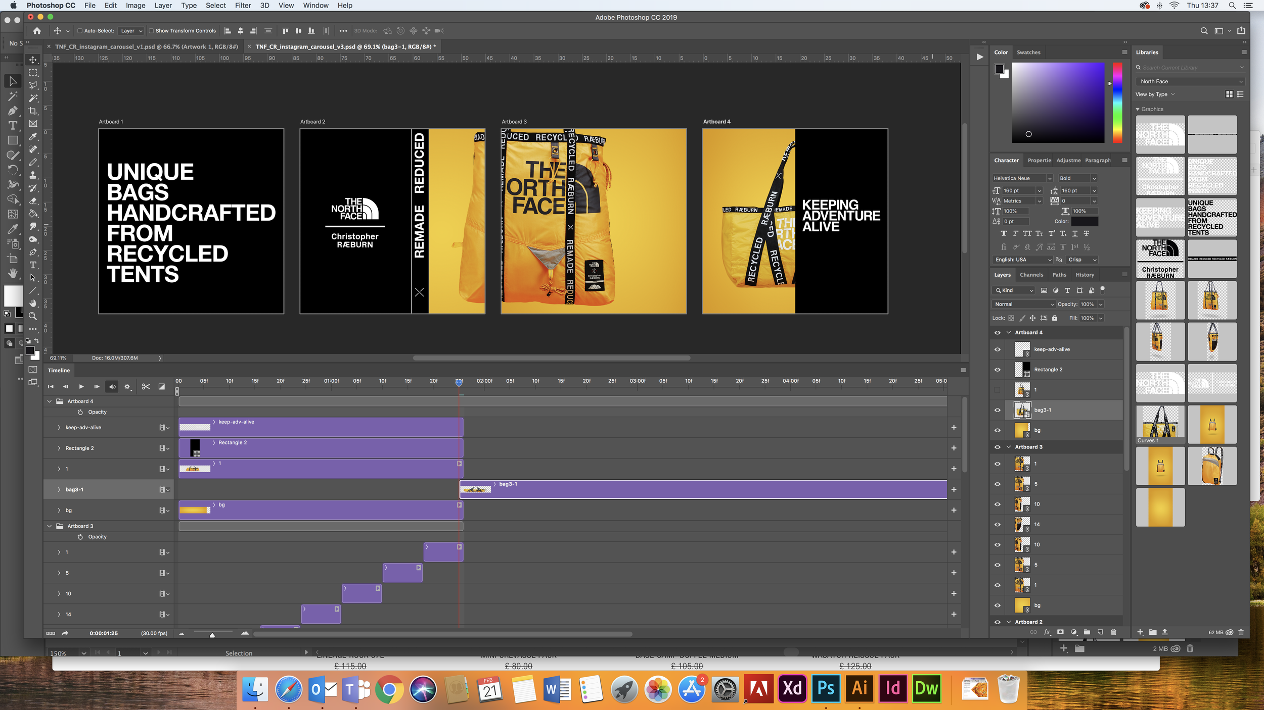
Photoshop timeline
-
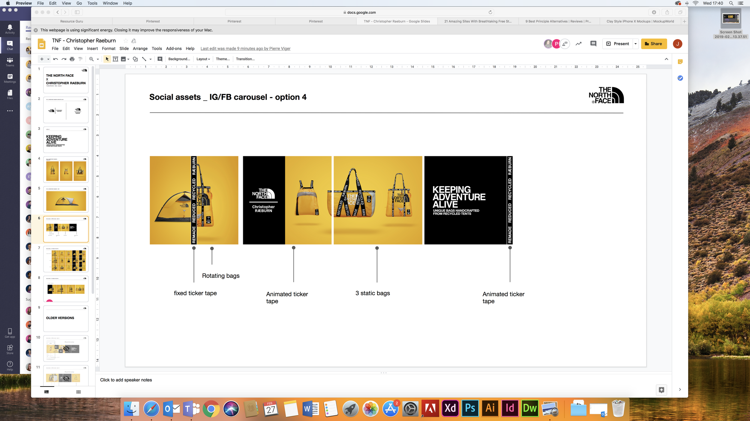
Google slide TNS presentation
Lorem ipsum dolor sit amet, consectetur adipiscing elit, sed do eiusmod tempor incididunt ut labore et dolore magna aliqua. Ut enim ad minim veniam, quis nostrud exercitation ullamco laboris nisi ut aliquip ex ea commodo consequat.
Final piece

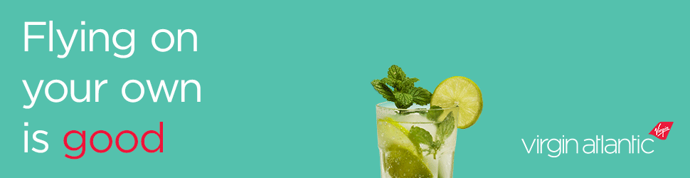
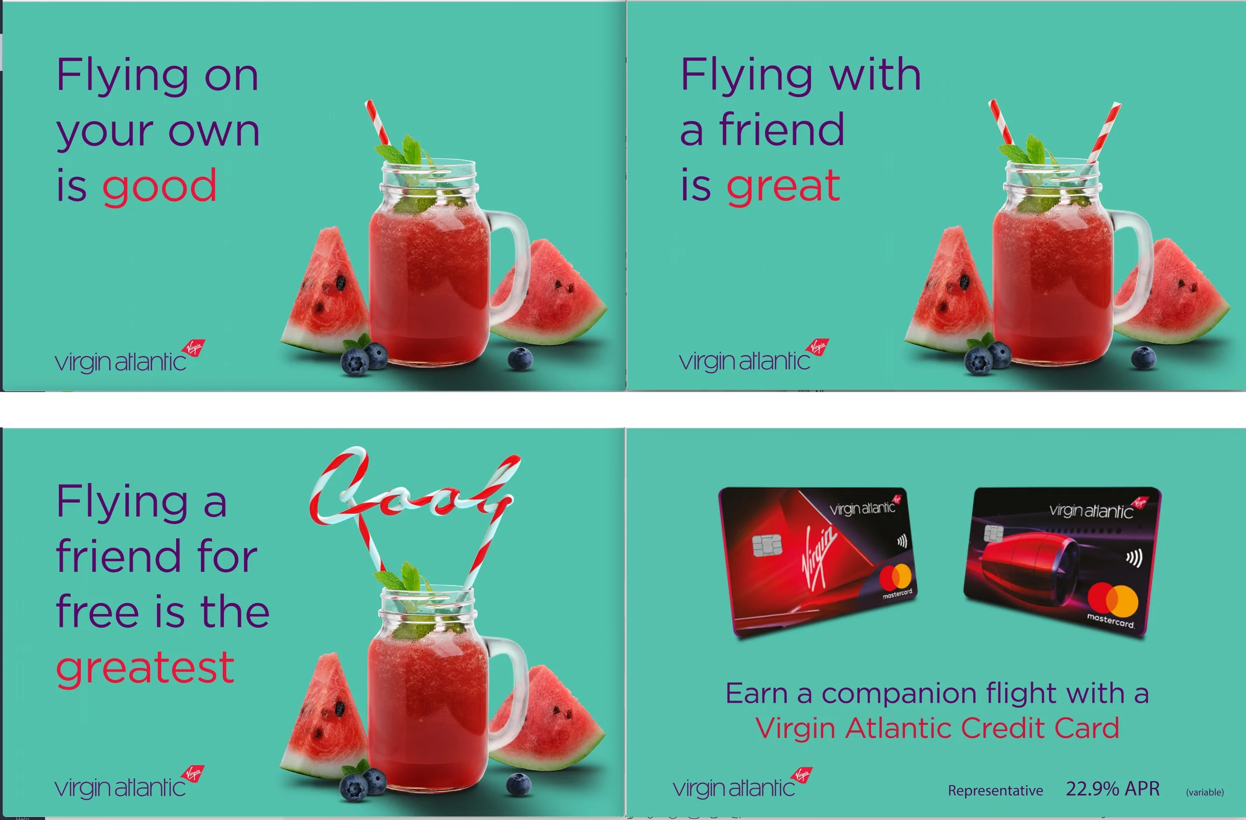
Project
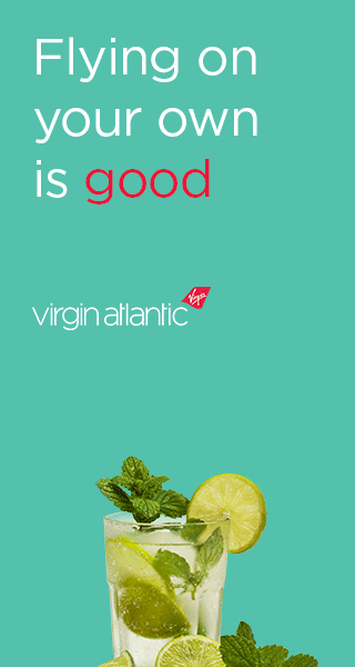
to create a banner to promote their credit card. Such companies always have their own guidelines to follow and timelines. Putting this task together using Photoshop and some animation worked great and Virgin was pleased with the outcome.
Come fly with me
It all begins with an idea. Maybe you want to launch a business. Maybe you want to turn a hobby into something more or maybe you have a creative project.
It all begins with an idea. Maybe you want to launch a business. Maybe you want to turn a hobby into something more or maybe you have a creative project.
We are a London-based marketing agency that has been helping our clients connect with their markets and customers for over 30 years. Whether it’s an immersive event or an award-winning integrated campaign, we always find the big solution.