
Favourites required manual curation
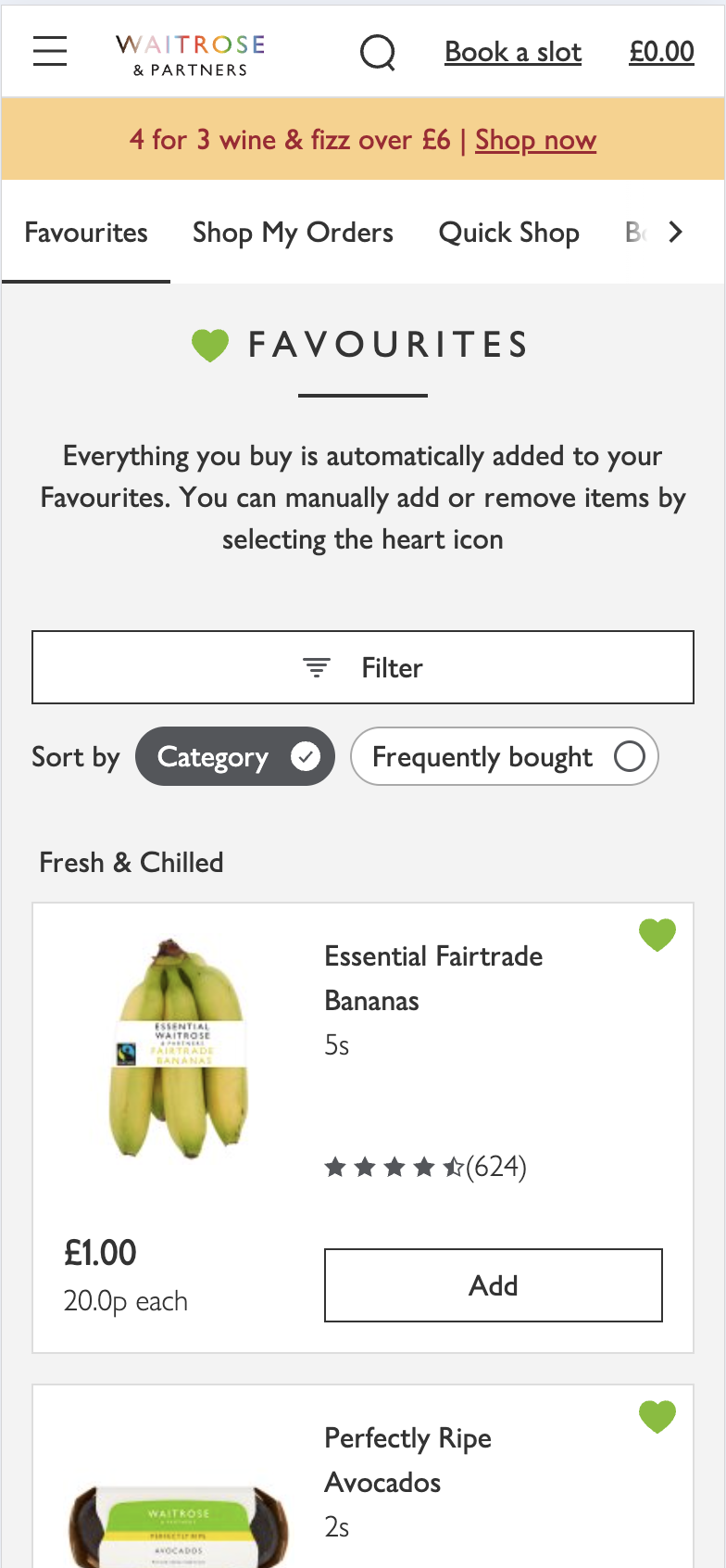
Customers were using Favourites as a workaround for rebuilding regular shops, but they still had to maintain the list themselves and decide what was relevant each time.
01 Case Study
Reducing weekly grocery friction through personalised basket building
A behaviour-led basket-building experience designed to help customers rebuild their regular shop faster using purchase history and recommendation confidence.
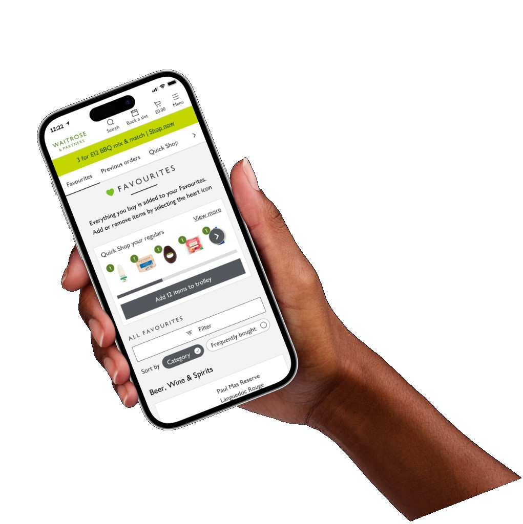

I led the translation of Data Science’s Basket Building Model into a customer-facing proposition. I defined how recommendation confidence influenced hierarchy, grouping and progression; designed and tested three interaction models; created a data-connected prototype capable of representing different customer behaviours; and worked with Product, Data Science and Engineering to narrow the initial release to Top Regulars.
02 The challenge
Most online grocery experiences treated every shopping session as a new browsing journey. Regular customers still searched, navigated categories and rebuilt similar baskets week after week.
Favourites preserved historical purchases, but historical behaviour did not always reflect current intent. As saved products accumulated, finding what mattered now became slower — especially when diets, households or routines changed.
QuickShop explored whether predictive personalisation could make routine shopping faster, clearer and more controlled without reducing customer confidence.
03 Existing behaviour
Customers already had ways to revisit familiar products, but each route placed work back onto them. The opportunity was not simply to create another list. It was to make rebuilding a routine shop faster and more relevant to the customer’s current needs.
Customers were using Favourites as a workaround for rebuilding regular shops, but they still had to maintain the list themselves and decide what was relevant each time.
Only 2.4% of total add-to-trolley actions came through Previous Orders. Customers had to open historic orders and identify what they wanted to buy again.
Rather than asking customers to maintain a list or browse previous baskets, QuickShop used recurring purchase behaviour to prioritise products they were most likely to need.
QuickShop shifted repeat shopping from remembering and searching towards recognising and confirming.
04 Research
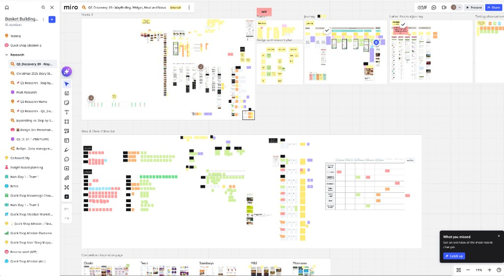
Working closely with the UX researcher, we combined behavioural evidence, customer conversations and prototype testing to understand where the existing experience broke down and which interaction model customers trusted most.
05 Participants
We compared the concepts with six experienced Waitrose online customers whose basket sizes, shopping responsibilities and routines varied substantially. This helped us test whether the interaction model worked beyond one narrow type of repeat shopper.
Participant 01
Participant 02
Participant 03
Participant 04
Participant 05
Participant 06
06 Insights
01
Products previously bought often remained visible after diets, preferences or household routines had changed.
02
A small number of visibly unsuitable recommendations could undermine confidence in the entire experience.
03
Participants found a staged journey easier to understand than one long, continuous product feed.
04
Customers evaluated variants, pack sizes, offers and substitutes together, even when the recommendation model scored them differently.
07 Behavioural model
I worked with Peter in Data Science to translate the existing Basket Building Model into a customer-facing experience. The model examined both how frequently and how regularly an individual customer purchased each product.
Together, these signals produced a predictability score for each customer-product relationship. A product bought frequently and at a consistent interval could be treated as a high-confidence recommendation. Occasional or irregular purchases required more cautious placement.
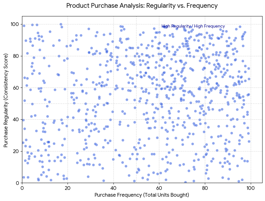
How often the customer purchased the product across their order history.
How consistently the purchase appeared within the customer’s routine.
The combined confidence that the product was relevant to the customer’s next shop.
The challenge was not only producing recommendations. It was deciding how much confidence was required before a recommendation deserved the customer’s attention.
08 Constraints and trade-offs
QuickShop needed to validate predictive basket building without blocking roadmap delivery. Real constraints around engineering effort, category scale and customer trust shaped what shipped first.
Constraints
We needed to prove the predictive shopping experience quickly without delaying broader roadmap delivery.
A fully guided multi-step experience demanded significant build effort before value was proven.
Maintaining useful recommendations across large product ranges added complexity to logic and presentation.
Too many layers could overwhelm customers and weaken confidence in what was being suggested.
The journey had to balance routine efficiency with enough discovery without slowing repeat shops.
Behavioural and commercial metrics needed to justify investment before expanding the experience.
Trade-offs
We launched a focused entry point first rather than the full multi-step basket-building experience.
Category breadth was reduced initially to improve delivery speed and learning clarity.
Testing showed continuous feeds caused cognitive fatigue and loss of orientation, so we prioritised step-based navigation.
Recipe-led and inspirational experiences waited until core behavioural assumptions were validated.
Selections stayed reviewable rather than relying too heavily on automated basket creation.
09 Design principles
A smaller set of relevant recommendations was more valuable than a large set of uncertain suggestions.
The experience should minimise unnecessary browsing, scanning and repeated searching.
Recommendations should follow routines, replenishment patterns and recognisable categories.
Customers needed to progress quickly while retaining the ability to review and refine their basket.
10 Concepts
A major part of the project focused on testing different interaction models for personalised basket building.
We put three clickable prototypes in front of six experienced Waitrose online customers — comparing how each model handled speed, orientation, trust and basket completion across different shopping routines.
How we tested
Participants worked through realistic repeat-shop tasks. We observed completion time, confidence in recommendations, ability to review selections and willingness to continue — then compared patterns across the three models.
An exploratory continuous feed designed to make browsing feel engaging.
Benefit: Continuous browsing created a fast, lightweight entry into recommendations.
Risk: It created scanning fatigue and weakened customers’ sense of progression.
Finding: Customers struggled to maintain context. Recommendations felt overwhelming, category switching created friction and lower-confidence products reduced trust.
A structured flow that grouped recommendations into manageable stages.
Benefit: Clear stages reduced cognitive load and gave customers a stronger sense of progression.
Finding: It provided the clearest orientation, strongest progression and best fit with routine shopping behaviour.
A collection-led model designed to encourage discovery across recommendation groups.
Benefit: Horizontal groups created clear category separation.
Risk: It felt visually familiar but required too much browsing for a task primarily driven by speed.
Finding: It improved category separation but created excessive lateral scanning, fragmented focus and weaker progression through basket building.
Direction chosen
Step-by-Step Shopping became the preferred direction because it matched how customers already thought about a weekly shop — handling regulars first, then moving through familiar categories with a clear sense of progress.
Carousel-style grouping still informed how related products were presented within each stage, but the overall journey was structured rather than feed-driven.
11 Prototyping the system
The proposed experience depended on customer-specific data, recommendation confidence, product categories, quantities, offers and grouping rules. Conventional Figma prototypes could show individual journeys, but they could not represent the behaviour of the wider system efficiently.
Manually connecting every possible state created prototypes that were difficult to edit, debug and maintain.
Static screens could not respond credibly to different customer histories and product recommendations.
Building a realistic journey could take up to two weeks, limiting the number of ideas we could test.
As personalisation increased, the number of screens and connections expanded faster than the prototype could support.
I used Figma Make with a structured Supabase dataset to create a more realistic prototype. This allowed different customer datasets and product rules to populate the same interface rather than manually rebuilding every possible journey.
Products included recommendation order, quantity, category, grouping, product type and offer information.
The same components could respond to different datasets and behavioural conditions.
We could test the behaviour of the recommendation system, not only the appearance of individual screens.
12 Interaction logic
The model produced scores and product attributes, but customers needed a clear, manageable shopping experience. I translated those outputs into a set of interface rules governing what appeared, where it appeared and how products were grouped.
01
Products above the agreed confidence threshold could be surfaced prominently as likely repeat purchases.
The prototype initially used a confidence threshold of approximately 60% to explore how many products could be shown before relevance and trust began to fall.
02
Alternative or related products could be assigned a shared grouping identifier and displayed together, reducing repetitive scrolling and supporting quicker comparison.
03
Product categories helped determine where recommendations appeared within the Step-by-Step journey, aligning the flow with recognisable shopping behaviour rather than a continuous recommendation feed.
04
Offer data could influence product presentation and quantity recommendations while keeping customers within the main flow.
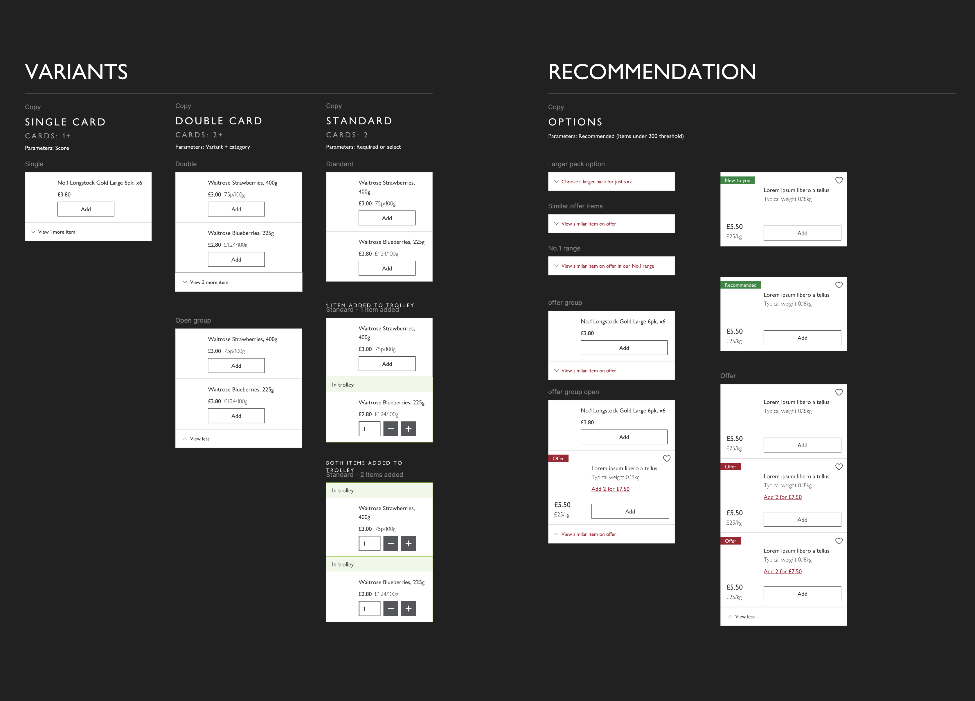
Product groups could use different presentation patterns such as standard, single and double depending on the recommendation context.
13 Validation and iteration
Testing focused on more than whether customers could complete the flow. We needed to understand how recommendation confidence, information density and progression affected trust.
Customers responded positively to Step-by-Step because it reduced overwhelm, improved clarity and created stronger progression.
Trust improved when recommendations felt relevant and behaviourally logical.
Customers prioritised speed, predictability and efficiency over visually exploratory browsing.
Lower-confidence recommendations made the experience feel less reliable when they appeared too prominently.
The winning direction was not the most visually novel. It was the one that best matched routine shopping behaviour.
14 Solution
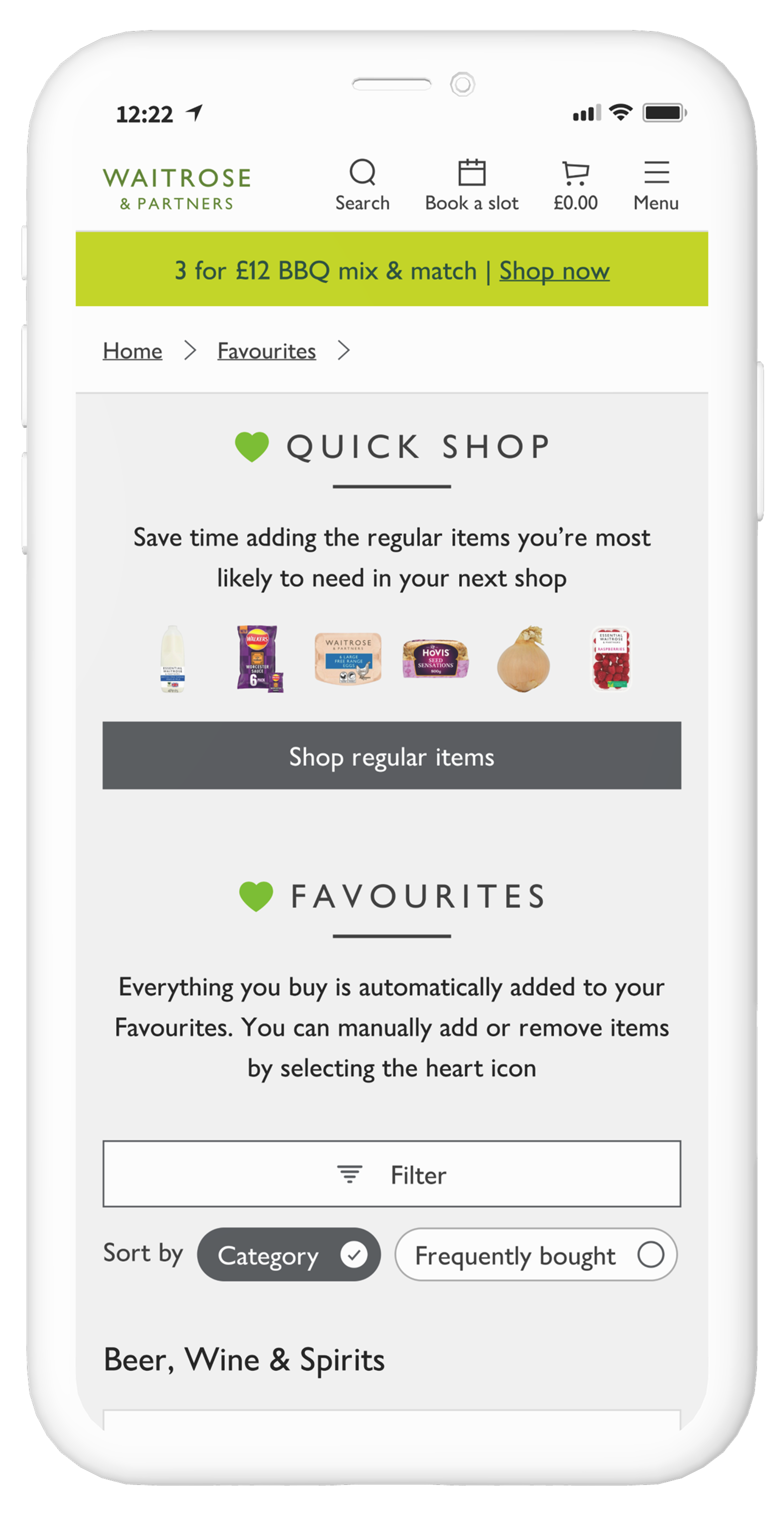
The broader Step-by-Step model established the long-term direction, but the first release focused on Top Regulars: the highest-confidence repeat purchases within each customer’s history.
Recommendations were prioritised using behavioural confidence and presented in a lightweight, reviewable flow. Customers could quickly select familiar products, adjust quantities and continue building their basket without handing complete control to automation.
High-confidence repeat purchases formed the foundation of the initial basket-building experience.
The broader design direction organised products around shopping behaviour and recognisable categories.
The experience prioritised rapid selection, clear progression and easy basket refinement.
15 Results
QuickShop delivered measurable gains in speed, basket value, engagement and repeat behaviour — showing the value of behaviour-led personalisation when it is designed around customer confidence and control.
25%
26 mins → 21 mins
5 minutes saved per shop
Completion time dropped from 26 minutes to 21 minutes, saving customers around 5 minutes per shop.
45% reduction from Favourites
Navigational add-to-basket actions from Favourites dropped by 45%.
10% reduction from Search
Add-to-basket actions from Search dropped by 10%, showing customers relied less on manual searching.
Browse and discovery remained stable, showing QuickShop reduced repeat-shopping friction without stopping spontaneous shopping behaviour.
16 Reflection
QuickShop showed that predictive technology alone does not create a useful experience. Customers judged the system through the quality, order and density of what appeared in front of them.
The most important design work was translating invisible behavioural signals into clear interface rules, then reducing the first release to the smallest proposition that could prove customer and commercial value.
Where and how a suggestion appeared mattered as much as the product itself.
Realistic data and rules exposed issues that static happy-path screens could not.
Top Regulars allowed the team to validate repeat-shopping value before investing in the broader Step-by-Step journey.